New Xbox Experience
The NXE is an attempt to catch up, so the changes aren’t huge, but it’s interesting to see how they affect the overall console experience.
Yesterday the ‘New Xbox Experience’ (NXE) upgrade was finally rolled out to all Xbox Live users. The old system (created by AKQA and known as the “blades”) was more dated than bad, but the market has shifted during its five-year lifespan. Online is now the default platform for many, casual gaming is the new black, and the previously masculine bias of the games industry has softened substantially in recent years. The NXE is an attempt to catch up, so the changes aren’t huge, but it’s interesting to see how they affect the overall console experience.
The avatar
Yes, that’s me. We can see the avatar as the natural extension of the Xbox gamertag, created back in 2003. Personification is the trend: game companies are keen to give players flexibility to define an identity for themselves online. Certainly a name alone no longer cuts it. It’s worth remembering that Xbox Live controversially remains a chargeable service, so there is a clear impetus to at least equalise with competitor online services, the Wii being the obvious parallel.
Rare, the avatar designers, say they were keen to find the balance between toylike and overly realistic (there’s that uncanny valley again), but I think the result is bland: approachable, but far too close to Nintendo’s territory and too limiting to create anything with real character.
However, the new avatars do have a couple of interesting features. A friend’s status is now reflected by their avatar’s pose (eg. asleep = offline) and apparently avatars will be embedded in small games in future. Microsoft have, in essence, created a hook around which gaming experiences can hang, which is a smart move.
Functionality
There are some minor functional changes, probably the most significant of which is that you can now install games to the hard drive and run them from that. Not only is this long overdue, given that it’s been standard practice on PCs for 20+ years, but it also tackles one of the 360’s major flaws: its extremely noisy DVD drive. It also allows for faster switching between games, which will suit those players who like to throw tantrums when they start losing.
There’s also the new ability to ask your Xbox to download items remotely, although this does of course rely on you leaving it on all the time.
Interface and IA
The interface itself isn’t much changed, except that the blades have become panels and adopted the increasingly-clichéd Cover Flow stance. More usefully, there’s a welcome tightening up of the IA, which means hours wasted fishing around in Settings should be a thing of the past.
Migration
The detail I’ve been most impressed by was the migration experience itself. Upgrades are one of the areas where just a little user focus can have a huge impact: compare firmware upgrades for the iPhone with most older handsets. The entire upgrade took just four minutes (excellent for what is essentially an entire OS upgrade), with seamless plug-and-play operation and an explanatory video upon relaunch.
Reaction
Somehow, we’ve reached the age where a firmware upgrade for a console can create a buzz—almost universally, people seem to love the NXE. The really interesting question is why, which I’ll write a followup post about shortly.
Personally, I’m not as glowing as others. I actually quite liked the old Xbox personality: hardcore over casual, masculine over feminine. This update softens that stance, and I think it’s a mistake to drift towards Wii territory. Minor gripes aside, it is an undeniably well-crafted piece of work, tackling known problems, creating extensibility and, most importantly, getting people talking about a rather old console in the lucrative run-up to Christmas.
Farewell to anti-intellectualism?
My personal hope for Obama’s presidency is the end (or, at worst, the long suspension) of a culture of anti-intellectualism that has plagued Western politics for years.
Until recently, I equated politics with duty: something that I must participate in, but that was never elevated above a choice between deeply unsatisfactory options.
I find most politics ideologically empty, and it is almost a truism to say that we know very little about how President Obama will govern. However, I do believe that yesterday’s election will make a profound difference to the world, and for the first time I’m genuinely excited at the prospect of political change. Of course the race issue is important, but my personal hope for Obama’s presidency is the end (or, at worst, the long suspension) of a culture of anti-intellectualism that has plagued Western politics for years.
Anti-intellectualism is not a uniquely right-wing stance, but it has been used with alarming regularity by the current US administration. Bush himself is the archetypal example but, consigning him to the history he deserves to inhabit, we’ve seen examples in the recent campaign too. Sarah Palin’s attempt to champion the cause of the “real America”, by conflating intellect and elitism, failed profoundly.
The right’s attack has not been constrained purely to intelligence: it has also involved the devaluation of education, reason and evidence. All have been systematically discarded by the incumbent government, state education boards, Supreme Court Justices and hawkish military generals.
This framing of intellectuals as The Other is counter-productive, dangerous, and hopefully moribund.
It is clear that Obama is an acutely intelligent man and a gifted orator. As such, he received his mandate from two ends of the spectrum: those with the lowest and highest privileges. His race and his stance on welfare made him attractive to disenfranchised minorities, while his sharp, rational demeanour made him almost entirely dominant amongst liberal urbanites. This top-and-bottom split was complemented by a generational shift: a fierce reaction against the hegemony of old, rich, white men. The campaign itself owes much of its success to the internet and, yes, even graphic design. Fairey’s Hope poster will stay with us as one of the most important political design works of our generation.
Republicans may wish to blame their loss on the economy. 63% of Americans say it was the primary issue. But I think the Republican attitude that the economy needs to be restored to its former glories is fundamentally wrong. It doesn’t. The way forward is a new, sustainable, evenhanded economy with environmental conscience, and checks and balances protecting the public purse from the risks of the free market. Where the poor get richer, not just the rich.
While I’m concerned I’ve compromised my cynicism and have gone a bit gooey over a single politician, yesterday feels to me as significant as 9/11, and as constructive as the aforementioned was destructive. I believe that, given the pace of innovation and change in our society, we are already caught up in a second Renaissance. Politics, historically, always lags behind social trends. Yesterday it caught up, and the 21st century can really begin
Why is technology so dull?
So let’s imagine an operating system that sees you’ve split up with your girlfriend and says sorry. A program that knows you were out drinking last night and therefore uses muted colours and suggests you take frequent breaks. A mobile that loves going on rollercoasters.
The concept of personality has us hooked; just look at Cosmo quizzes and the thousands of online personality tests. And rightly so: it’s something that has profound effects on our friendships, love lives (that old “she’s got a nice personality” chestnut) and careers. For instance, Bruce Tognazzini claims that designers must have an ‘N’ in their MBTI, one of the slightly less dubious profiling tools. (I actually agree with him on this. I’m an INTJmyself.)
However, we’re also a little infatuated with personality, and often assume that someone’s actions are caused by the ‘type’ of person they are, while ignoring the social and environmental forces that influence them (the fundamental attribution error). In reality, personality is always framed and affected by the world around us, meaning behaviour can be quite variable. Just because someone’s angry once, it doesn’t necessarily mean they’re an angry person. We have to work backwards, interpolating someone’s underlying personality from several observations of their behaviour. You can’t really get to know someone from a minute in their company.
For instance, at a football match, I drink, swear, and slip into a latent Welsh accent. This is no surprise—my environment almost demands it of me, since I’m surrounded by drunken, sweary Welshmen. But you’ll find me behave very differently in bed with a girl, going through airport security, or talking to my Nan. This behavioural variance is part of being human and people who lack it are deemed to be boring. If you behave the same in a nightclub as in a library, you won’t be invited out again.
Constrast this with technology, which behaves in a very rigid manner—the same in all environments. I think it’s time to make technology more interesting by introducing some mild behavioural variance. Sampled over a few readings, we can then start to form an opinion about the underlying personality, which is where we make those emotional connections.
Clearly we can’t go too far. Some behavioural consistency is essential for usability, and some devices are better suited to quirkiness than others. However, the dead zero we’re at now is clinical and drab.
Fortunately, we have the jigsaw pieces we need to imbue technology with personality. We just need to put them together. As mentioned above, behavioural variance generally comes from environmental influence. This meshes nicely with technology’s increasing context-awareness. Bluetooth, RFID, APIs, accelerometers, spimes etc, common geek parlance, all refer to ways technology is becoming more aware of itself, other technologies and us. But it doesn’t need to be this esoteric. Glade recently released a quite silly air freshener that only activates in the presence of a human.
The concept of an emotional response to technology isn’t new, by any means. For example, the uncanny valley. I happen to be sceptical of the uncanny valley idea (no real reason), but I challenge anyone to watch the following and not be slightly saddened:
So let’s imagine an operating system that sees you’ve split up with your girlfriend and says sorry. A program that knows you were out drinking last night and therefore uses muted colours and suggests you take frequent breaks. A mobile that loves going on rollercoasters.
This could be so much more fun. And the exciting part is I don’t think it’s too far out of our reach—for starters, we already give out plenty of these informational cues (knowingly or not):

Ultimately what we’re aiming for is intelligence (or at least pretence thereof) in technology. In the words of Piaget, “intelligence is the ability of an organism to adapt to a change”. I think behavioural variance is a perfect example of this adaptation, and for that reason I think we shouldn’t be scared of giving our future technology a personality of its own.
Based on my lightning talk “A rainy day, lost luggage and tangled Christmas tree lights” given at Skillswap On Speed, 29 Oct
Printing press workshop
Technology has made our outputs so much quicker and more reliable, but without the hard work, patience and dedication of centuries of craftsmen we would be far, far behind.
A slightly shortened week, since Clearleft took Monday off for a day of printing press revelry at Ditchling Museum. Ditchling was, for many years, the home of sculptor, typographer and unspeakable pervert Eric Gill, and a large proportion of the museum is therefore dedicated to his work.
The first half of the day was dedicated to examining the museum’s collection and creating our own original works inspired by it.
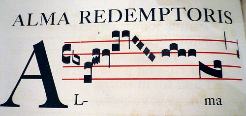
I contented myself with the (terrifyingly precious) first edition of Gill’s Cantica Natalia, and was quickly absorbed in transcribing it and noting down the unusual trills and marks that aren’t represented in modern notation. My rather sketchy original work was a worms-eye map of a seaside town using only these odd musical ligatures from the score. Slightly Klee-esque, without the talent.
In the afternoon we got our hands extremely dirty playing with the Stanhope press. Jeremy and, who else, Richard probably got the best from it, setting the following plug for UX London in 60pt Baskerville:
My efforts were less successful, but I did manage to print a new header for this blog, which I will at least try to integrate over the next couple of weeks.
It was, of course, very refreshing to spend some time out of the office and learning more about the foundations of our industry. The other point I took from the day was a renewed sense of humility. Technology has made our outputs so much quicker and more reliable, but without the hard work, patience and dedication of centuries of craftsmen we would be far, far behind.
The survival of web apps
I’ll admit it: I’m a little scared. I was too late for the bursting of the first bubble; every year I’ve spent in the industry has been one of growth. A potentially contracting market is a new thing for me.
I’ve had a busy time of late, in particular thanks to a couple of days in Switzerland and Austria, followed by the Future Of Web Apps (FOWA) conference in the Docklands.FOWA’s a little large for my tastes, but it’s undeniably well organised. Three sessions stood out (the uniformly excellent Gavin Bell, Benjamin Huh’s history of Icanhascheezburgerand Kathy Sierra being her enthusiastic self) but my particular interest, and one I’d love to have heard more about, is in the eponymous future bit.
I’ve been thinking for a while about how our field will develop and while I believe mobile, the Cloud and the Semantic Web are going to be big factors, I’ll park them for future posts and talk about the clearest issue on our horizon: the economic downturn.
Truly this was FOWA’s cri de coeur. A majority of sessions made mention of it, and Sun’s Tim Bray scrapped his keynote at the last minute to deliver Get through the tough times – which, although somewhat cataclysmic, is definitely worth 30 minutes of your time. Over a matter of days, the economy has become the dominant topic of the web. Dan Saffer askswhat designers can do to help (in short, make stuff). Khoi Vinh cautions us to be careful about our data. Andy Budd talks about how to survive a global recession.
I’ll admit it: I’m a little scared. I was too late for the bursting of the first bubble; every year I’ve spent in the industry has been one of growth. A potentially contracting market is a new thing for me.
Of course, self-correction is a fundamental part of the system we live in. Boom precedes bust. And I’m confident there’ll always be work for smart people at the top of their game. To paraphrase Naomi Klein, if capitalism has one strength, it’s that it has a knack of creating new jobs to replace those that are lost.
But our environment will undoubtedly change. Andy makes the point that it’s now even more important for businesses to understand their customers; after all, retention is far cheaper than acquisition. He’s right, but unfortunately I think few will accept the perceived risk: tight budgets make waterfall, big requirements and long research phases a thing of the past, if they weren’t already. UX designers in particular might find it hard to be relevant in these short-term times. To survive, we have to become more agile (both lower-case and upper-case ‘a’) and demonstrate our value from day one. Quick, practical research. Quick, volatile design. I’m currently writing an article on how we can do this; but, looking beyond survival tactics, is there still room for user experience to make a difference strategically?
Perhaps, if we make the case clear. Now is a particularly bad time to compete solely on features – the cost is of that arms race is simply too high. I forsee UX people increasingly filling the role of strategic chaperone, dragging businesses away from unsuitable functionality and focusing them on the core product. Cash-strapped businesses are already going to build just half a product; we have to help them focus on the right half.
I also think lower levels of capital will catalyse a far deeper trend: the end of the website as destination. Once upon a time, creating a brochureware site or, recently, another social networking app was a viable strategy – there was market share to be gained, and there was capital available. ‘Me too’ sites captured their share of eyeballs, CPA and other such meaningless trivia. These days are gone, and if this is your future model, the question will be one of survival, not expansion.
Historically, companies that thrive in recessions aren’t those that drive efficiency and cut costs: they’re those who can execute on an idea that changes everything. So the next phase of the web, now upon us, will see it evolve as an enabler, not a medium. The real value now is in getting devices talking, connecting products and services, and synthesising information in new, valuable ways. Services like Dopplr are already halfway there: so laden with APIs and interconnectedness that they exist as intermediaries – a ‘social physics engine’, to use Matt Biddulph’s wonderful phrase – the site itself is largely redundant. All that counts is the value that it brings to people’s lives.
The good news is this is still very much dependent on a user experience focus – it’s just a different flavour of UX. It’s less about making fractional sales improvements or reducing numbers of customer service interventions. Our role now has to be more about trying to make a genuine difference to the world through innovation. This is noble and, as I said earlier, scary. Change always is, and it’s appropriate that we remain alert in difficult times. But, for good people, the sky isn’t falling quite yet.
The MAYA principle
The adult public’s taste is not necessarily ready to accept the logical solutions to their requirements if the solution implies too vast a departure from what they have been conditioned into accepting as the norm.
One of the benefits of following smart people on Twitter is that I regularly pick up on techniques and principles I’ve not heard of. I don’t remember who first mentioned theMAYA Principle, but I investigated and found a powerful idea I think is worth sharing.
MAYA, Most Advanced Yet Acceptable, is a heuristic coined by Raymond Loewy, who explains it thus:
The adult public’s taste is not necessarily ready to accept the logical solutions to their requirements if the solution implies too vast a departure from what they have been conditioned into accepting as the norm.
What Loewy is saying is that a local maximum exists for creative work: the behaviour, understanding and mental models of our userbase anchor us and cause work that’s too far removed to fail.
Matthew Dent’s recent Royal Mint coin designs are a great example of the MAYA Principle in practice.
The task of redesigning currency is daunting. British coins hadn’t changed since 1968, and as such represented a great deal of tradition and cultural identity. Over the years, we’ve literally come to accept the portcullis, three feathers, thistle, lion, double rose and Britannia as icons of our nationality.
Individually, Dent’s new coins are unashamedly modern. They feature aggressive cropping and striking full bleed layout, with the 5p being a particularly bold example. Britannia they aren’t. However, taken as a holistic whole, the full suite of coins form the royal shield of arms. The design makes admirable use of the concept of closure, whereby our minds fill in the gaps to maintain a coherent pattern. The coins are also wonderfully tactile and interactive: the process of arranging them, jigsaw-like, to reproduce the bigger picture is novel and enjoyable.
Both the common historical thread and the design’s interactive nature were a conscious choice:
I can imagine people playing with them, having them on a tabletop and enjoying them… I felt it was important to have a theme running through from one to another. – Matthew Dent, in The Times
While a traditionalist may not appreciate the individual coin treatment, the strong nod to British history should placate him. The designs also encourage us to reexamine these everyday objects as a result of their interactivity, causing us to refocus on our money, the patterns they display and the connection to our identity they inevitably form. In short, this redesign skilfully mixes the old and the new in a way that is advanced, yet acceptable, to a potentially intransigent public.
Escalation
More and more, I find myself less interested in what web designers have to say.
More and more, I find myself less interested in what web designers have to say.
That’s not to say that there aren’t some very clever people out there – hell, I’m lucky enough to work with some of them. However, I’m worried that as a community we are blinded by our self-importance. Proudly we don the mantles of digital pioneers and imperiously believe we’re the first to encounter the problems we face. How do we make things that people enjoy? How can we help people to share and learn from each other? Can new technologies alleviate social ills? The more I learn about other fields, the more I find that bright minds have been tackling identical problems for years, and the less surprised I am by this discovery.
I’ve reached a stage of my career where I learn more about user experience from outside the field than in. My non-fiction reading list, previously full of every reputable web/UX design book I could devour, now bulges with architecture, Tufte, typography and semiotics.
Most of the intelligent, ambitious web people I know seem to be undergoing a similar escalation of interests. Whether I can count myself as one of them is moot, but I do know that I’m increasingly skipping RSS feeds that talk about web methods, techniques and tricks. I spend my conference budget on inspiration, not tuition, and endeavour to aim equally high when I’m fortunate enough to present to others.
The UX mailing lists, a barometric aggregate of the field’s current interests, seem to be moving upmarket too. Discussions about design thinking are in the ascendency; those about the location of confirmation buttons are bottoming out. Despite the occasional futile game of Defining The Damn Thing, the trend is increasingly highbrow and diverse.
Below, an example of some advice I’ve recently found particularly enlightening:
“Engineers tend to be concerned with physical things in and of themselves. Architects are more directly concerned with the human interface with physical things.”
“Being non-specific in an effort to appeal to everyone usually results in reaching no one.”
Crystalline, and applicable to all design fields. These quotes, as of course you guessed, are not from a web design book. Instead, they are two of many useful aphorisms from 101 things I learned in architecture school by Matthew Frederick – and yet are still more a commentary on design process than advice on a specific discipline.
In similar circles, I’ve recently been inspired by Stewart Brand’s marvellous documentary How Buildings Learn, the companion to the elusive book of the same name. The first episode alone has so many parallels with web design that we ought to be ashamed at how we’ve not drunk more deeply from a well some thousands of years older than our own.
There is, of course, an exquisite irony in a web designer harping on about the questionable wisdom of web designers (particularly when opening with such a shambolic oxymoron). I do think the industry has a great deal to offer its devotees, and there’s still a place for learning from our experts (and I’m looking forward to UX London hugely for this reason), but I do think our community would benefit from removing the blinkers every now and then. Forming a human pyramid is no match for standing on the shoulders of giants.
What if the design gods forsake us?
To this day, I haven’t a clue about the cause; yes, I could have run some usability tests but for a lone image it would have been pure self-placating overkill.
In some design Utopia, everything would be tested. An unseen army of usability specialists would verify everything and free our minds from worrying about unforeseen outcomes. Our users would be empowered, our messages would hit home, our harps would be perfectly tuned, and our gins and tonic perfectly mixed (lime, not lemon, thank you).
Until that day, we’re stuck with the real world, in which designers sometimes have to trust instinct and speculation rather than proof. We try to insure ourselves against getting things totally wrong; to wit, an arsenal of design fundamentals. Mapping. Affordance. Redundancy. Theories with impressive German names. We’ve spent time reading the books, listening to others and forming our own intuitive principles from practical observation. This helps us sleep at night. We’re professionals, dammit.
In a previous job, I ran a new graphical element on our site. The theory was watertight: better visual weight, higher legibility, stronger typography, aesthetically harmonious. A no-brainer. Yet it failed. Horribly. After causing a noticeable dip on conversion (most of e-commerce UX design is predicated on increasing sales), we quickly conceded defeat and rolled it back.
It was embarrassing, needless to say. Whilst not staking my career on this design, I’d taken the time to argue its merits, explaining to the powers that be that although some of them disliked it visually, it was the right solution for many reasons.
This story, to me, explains a significant problem with designing by metrics. You get rapid feedback on whether an approach works, but none whatsoever on why. Sure enough, when we reverted to the ‘weaker’ version, normal service was resumed. To this day, I haven’t a clue about the cause; yes, I could have run some usability tests but for a lone image it would have been pure self-placating overkill.
So, when the design gods forsake us, where do we turn? Obviously, we need rapid feedback. A poorly-received design can be measured in many ways – in this case a simple conversion metric, but in other instances it might surface as reduced clickthroughs, backchannel mutterings, failed usability tests or customer complaints. Remaining alert will depend greatly on our relationship with other parts of the business and the market itself. We also deserve the occasional reminder that user experience design is a subjective matter. Theory is valuable and useful, but the outside world has an uncanny habit of regularly throwing us off our ivory towers. Perhaps this is no bad thing.
That’s why, on reflection, I’m glad this episode happened, despite the hurt pride. Doing what I do wouldn’t be nearly as fun if things worked every time. Who wants to work in a field reducible to process, heuristics and how-tos?
Agile and the horizon effect
We work on each piece, not knowing whether or not disaster lies around the corner. We have to delay solving potentially tricky problems, and can never be really sure that the site will work until we’ve completed it.
The 1960s saw the first ideological skirmish in computer chess programming (and by extension much of the nascent field of AI) between two schools of thought: ‘brute force’ and ‘selective search’. Brute force methods involved looking at every possible position on the board, whereas selective search advocated pruning the game tree by ignoring moves that looked plain wrong.
With the hindsight of Moore’s Law, this was never really a contest. Brute force’s superiority was reinforced with each new clock speed, and this is how all chess programs work today. Each move is considered, as is each reply, and so on. A computer will typically analyse ~250 million positions per second, evaluate them all and choose the computationally best branch of play.
Early brute force machines were set to calculate all variations to a fixed depth, such as five moves. However, programmers soon found that this seemingly fool-proof method was still leading to some terrible chess. The cause was a phenomenon dubbed the horizon effect, whereby the losing move lay beyond the point at which the computer stopped calculating. A computer playing to a fixed depth may therefore set out on what seems the best path, unaware of the disaster lurking around the corner. Frustratingly, it even may ‘see’ the losing move but find a way to delay it by a couple of meaningless forcing moves, thus pushing it beyond the fixed horizon. Out of sight, out of mind.
For humans, the horizon effect isn’t much of a problem. Intuition plays a surprisingly large role in chess, and experienced players can vocalise when a position “feels like trouble” even though the fireworks may be a few moves off. Famous studies by Adriaan de Groot show that much of this intuition is based on pattern recognition, so that over time a skilled player builds a pattern library and, with it, an innate early warning system.
Programmers, of course, wished to mimic this intuition in computers, and did so by introducing a concept known as quiescence; in effect, a measure of a position’s stability. At the end of each variation, quiescence is calculated. If the position is placid (quiescent), the variation can terminate and work starts on another branch. However, if the position is still deemed to have danger in it, the computer is allowed to look a little further, until it again finds a quiescent state. Quiescence fills the role of the human’s alarm bells, and substitutes for the intuition that certain scenarios are going to need a bit more care to solve.
Any system where work is conducted to a fixed depth is susceptible to the same effect, and of course Agile is no exception. As we all know, Agile often doesn’t afford us a long discovery phase, and asks us to focus on short, practical iterations. This goes against a designer’s natural instincts; one of the more common complaints designers have of Agile is that it rarely gives us the chance to conceive an over-arching ‘solution’ of the problem space. The horizon effect again. We work on each piece, not knowing whether or not disaster lies around the corner. We have to delay solving potentially tricky problems, and can never be really sure that the site will work until we’ve completed it.
Although in theory Agile is comfortable with the idea of rework, the real world penalties are high. At worst, we might have to scrap a whole approach because of an unforeseen problem in a future iteration, repeatedly pushed beyond our horizons until it is too late. Try telling your clients that the last £10,000 they paid you were wasted and see how far theory gets you.
As good designers, we therefore need our own quiescence search. Just as the computer develops an intuition for choppy waters ahead, so must we. We build up a box of tricks to handle these scenarios: starting work on tricky stories early (while keeping it secret from Agile dogmatists!), pushing easier user stories up the chart to buy us time, and so on. But these techniques only come with years of experience. As with the chess player, we rely on pattern recognition, experience and skill to act as our early warning system and flag difficult stories in advance.
The more I think about Agile design, the more I’m convinced it needs senior staff. Send a junior IA into the middle of an experienced Agile team and they’ll struggle to keep their heads above water. With senior design staff still at a premium, I suspect many companies will have to compromise the integrity of either their user-centred design or their Agile processes. I’ll leave it to you to decide which is more likely.
The illusion of control
The Door Close button is a result of this pretence of control. On the majority of lifts it has absolutely no function since the lift is on a predetermined timer. However, tests show that users like the peace of mind.
If everything seems under control, you’re just not going fast enough.” – Mario Andretti
Control is a slippery thing. It’s important to our lives; we need it to rationalise and justify our decisions, but sometimes it’s simply beyond our influence. The well-known fundamental attribution error is a clear example of how we overstate human involvement in random events – in short, we don’t like the idea that we or, failing that, another human, are not in full control of a situation.
With technology this is particularly prevalent. When we are asked to to let a machine act on our behalf we become nervous if we don’t feel at least partially in control. One example of this is the excellent writing tool Scrivener which has an elegant autosave built in, running after every pause of two seconds. This ensures that flow, very important for writers, isn’t interrupted, but provides the peace of mind that reams of text won’t be lost in the event of a crash. However, even with this tight policy in place, Scrivener offers a force save mapped to the regular keyboard shortcut Cmd-S.
Gmail offers a similar redundant safety net when composing a new mail. State is of course saved in the background via Ajax but Google again allow users the comfort of saving at a point of their choosing.

Sometimes genuine control is not possible, in which case the answer can be to hide this from the user to keep them happy. Lift buttons are a classic example.
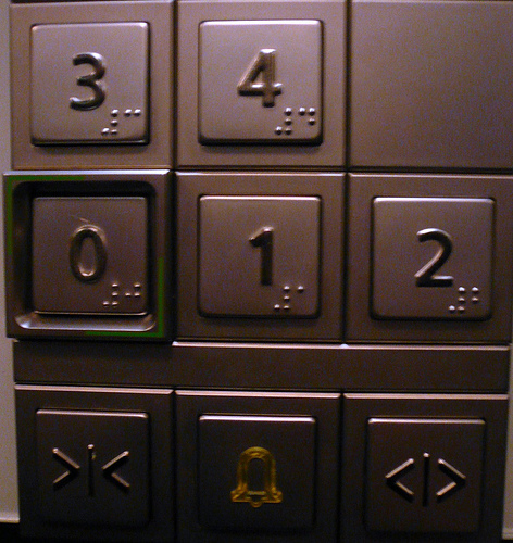
Lift / elevator passengers essentially volunteer to be shut inside a metal box suspended hundreds of metres off the ground. Not only that, but they abdicate responsibility for their safety to a computer. Few sane humans would be willing to do this on these terms. As a result, lift designers have to be very careful to ensure passengers feel in control of the system, even though in reality they have only partial control at best.
The Door Close button is a result of this pretence of control. On the majority of lifts it has absolutely no function since the lift is on a predetermined timer. However, tests show that users like the peace of mind of the Door Close button, providing as it does the belief that there is no element of the lift experience that we cannot influence. Ethically, there might be concerns that this is flat-out manipulation of users. However, situations where a little interaction white lie works to reduce anxiety of users, it’s probably acceptable.
Appendix 1: As it happens, some lift models do have an important role for the Door Close: enabling debugging modes for engineers. Certain button combinations (e.g. floor number + Door Close) activate express modes, stop the lift running, and so on. Other models use a lock and key to prevent public access to these functions.
Appendix 2: For more info, try Up And Then Down, an excellent New Yorker feature article on elevators, their design challenges, and a mildly terrifying account of Nicholas White, who was stuck in a lift for 41 hours.
First day at Clearleft
So yes, it’s official, the new job is with the lovely Clearleft.
It’s official, the new job is with the lovely Clearleft.
Just back from my first day, and I can officially confirm that commuting from Highbury will kill me. Therefore I’m also on the move to Brighton. London’s been fine to me, but I’m sure this is the right move: quality of life, walking to the office, the time of year, house prices. Lots of personal factors but mostly, of course, it’s down to the work. I’d be daft to pass up the chance to work with people this damn good, help out with dConstruct (and maybe Silverback), finally use a Mac each day, and many other things that make a web geek happy. Consider me officially chuffed, and thanks to the Clearleft guys for a splendid first day!
Pragmatism, not idealism
It seems daft for designers to reject the basic language of web standards and development. As an analogy, take reading music. As a member of a band, it helps to have an understanding of what it’s like to play other instruments; you don’t want to write parts that no one can play.
I’m currently taking a short break before starting my new job (more to follow on that).
Obviously I’m relaxing and enjoying the weather, but I’m also brushing up on XHTML andCSS so I can ditch Visio wireframing and start creating live prototypes. I had planned to use this blog as my sandbox, but to do the job properly would require PHP knowledge I neither have nor want, so I’ve dropped in the WP Premium theme with a view to perhaps revisit at a later date.
I’m rather overdue in making the switch, since Visio is increasingly obsolescent for modern user experience work. Aside from its limited functionality, the page-based format makes rich interaction design hard to document. Much like with Blogger (see earlier posts), I only stuck with it to delay the productivity dip I’d get from ditching it, so this seems the perfect time.
One effect of the move to HTML is that, although I’ll still remain a user experience specialist, I expect to become a little more hands-on and versatile. This is in line with the way I personally want to develop, and I’m sure it’s the way to create better websites. Iain Tate talked about his company’s ideal hire being a “creative mini-CEO” – perhaps this is analogous, if miniaturised. Clearly designers are more useful when they talk the same language as developers and business people; think the T-shaped model but stretching out on the z-axis too.
However, as I make this move, I do notice some tendency in UX for people to drift in the other direction, and claim the high ground of hyper-specialisation. Particularly this is the case with newcomers and HCI graduates. The more I interact with them, the more I realise they clearly know the right theory, but there’s an astonishing lack of knowledge and interest in living, breathing web design. HTML seems to be a dirty word, something left to the developers.
This can’t be right.
User Experience folks are already accused (mostly behind our backs) of a certain prima donna quality, stuck in our ivory towers of cognitive psychology, user testing and LIS. We certainly don’t need more of this. Perhaps it doesn’t help that Jakob is still very much the poster child for the academic HCI community. Much as I respect some of his work, he seems to be the sole gateway drug, as witnessed by neophytes swearing fealty to all he says, to the point of dogmatism.
It seems daft for designers to reject the basic language of web standards and development. As an analogy, take reading music. As a member of a band, it helps to have an understanding of what it’s like to play other instruments; you don’t want to write parts that no one can play. And isn’t that a perfect crystalisation of the user-centred approach anyway? Understanding our customers’ environments so thoroughly that our solutions are naturally harmonious?
I’ve talked to a number of people about this issue, whilst mulling over the change. Developers in particular seem to love the idea (for natural reasons: it brings them closer to designers, and vice versa). But I also think the leaders of enlightened web companies are increasingly looking for people who have the flexibility, the breadth of understanding to help them adapt. The future needs specialists, sure, and we can still fill those roles – but more than anything the future needs specialists with extra strings to their bow: midfielders with an eye for goal, singer/songwriters, designers who can get down and dirty with the rest of the web.
Learning to cook
As well as, obviously, the eating, I think I’m drawn to the alchemy of cooking. Getting the raw materials and following a recipe, however mechanically, is a quite fascinating thing
As with most people, when I get busy, blogging suffers. Instead, I’m unwinding by learning to cook. It’s been a long journey, levelling up on the slopes of Mt. Noob and now reaching the stages where I’m at least mildly competent.
Lessons learnt thus far: the sheer ubiquity of onions and garlic. What happens if you don’t watch your fingers when chopping said onions. The numerous types of vinegar (white wine, balsamic, malt, cider – I don’t even like vinegar). Why people spend £100 on a knife. The delights of thyme, parsley, cumin, turmeric, garam masala, bay leaves, parsley, oregano, rosemary, and many others. How to buy meat that isn’t pre-packed. How bloody expensive prawns, grapes, saffron and vanilla are.
As well as, obviously, the eating, I think I’m drawn to the alchemy of cooking. Getting the raw materials and following a recipe, however mechanically (I’m certainly not at the stage to remember them, let alone improve upon them) is a quite fascinating thing – seeing a concoction of unrelated, immiscible fluids emerge two hours later as a rather delicious casserole is remarkable.
My other surprise was just how much planning it takes. Getting all the right ingredients at the right time, particularly the perishable ones, takes dedication and an anticipation of where food will fit in with your week’s routine. It requires an application of Just-In-Time inventory that would rival a small factory. But yet, somehow, this hassle makes the whole process more rewarding.
What this all comes down to, of course, is an admission that I’m pushing 30. Now that’s out of the way, does anyone have any recipes to share?
The Fox goes shopping: cognitive dissonance in e-commerce
In short, the more opportunities we give them to introduce negative modifying statements, the less likely they’ll buy from us.
One of the most widely used metrics in e-commerce is conversion: simply a measure of the proportion of people who go from x to Sale, where x might be simply visiting the site, or perhaps adding something to the basket.
Of course, increasing conversion is generally a Good Thing because it makes big red lines point up and to the right. To achieve this wonderful state of affairs, e-commerce designers tend to focus on incremental improvements, hoping to push 17.0% to 17.3%, for instance. There are some straightforward means of doing this: tweaking help copy, clarifying calls to action, shiny Buy Now buttons, etc. And it works, but it’s far from sophisticated, and I think we’re missing a bigger trick here. For the last few days I’ve been playing around with the idea of approaching it from the other angle, and exploring the role of cognitive dissonance in the purchase process.
Cognitive dissonance is a tension arising when we have to choose between contradictory beliefs and actions. A classic example is the fable of The Fox And The Grapes. In it, we see our protagonist conflicted by a dissonant state which he then rationalises, much to his satisfaction.
Initial dissonant state:
Fox wants grapes
Fox can’t reach them
Resolved consonant state:
Fox did want those grapes
Fox couldn’t reach them
It’s ok, they were sour anyway.
Although written 2,500 years ago, this fable perfectly outlines our typical response to cognitive dissonance: we seek to resolve its tension immediately, in one of two ways. The easy way is to change the belief, usually by introducing a new one that modifies it. The hard way (much less frequently practised) is to change the behaviour that’s causing us the conflict. In our example, the fox took the easy way out, reducing his mental anguish by introducing a new belief: the grapes were sour.
The Fox goes shopping
The same process happens regularly in commerce (for example, I’d contend that both buyer’s remorse and store cards both have their roots in cognitive dissonance). Let’s say a potential buyer is about to spend £50 on a Super Widget. It’s highly likely they’ll experience some dissonance:
“I want a new Super Widget”
“£50 is a lot of money, I could buy Jake a new cricket bat with that”
Being human, our shopper will find this dissonance uncomfortable and want to resolve it as soon as possible. So typically a third thought is thrown into the balance, which will modify one of the existing thoughts. This will cause consonance and will result either in the purchase being approved or rejected. A negative consonant state could be:
“I want a new Super Widget… but I don’t know if this one’s the right size”
“£50 is a lot of money, I could buy Jake a new cricket bat with that”
Net result: no sale. A positive consonant state could be:
“I want a new Super Widget”
“£100 is a lot of money, I could buy Jake a new cricket bat with that… but I’ve spoiled Jake rotten this year, his old bat will last until next summer”
In which case, the Super Widget is bought.
A lot of the time, we can’t do much to bring about a positive modifying statement. It’s often intrinsically generated, based on one’s life circumstances (“I’ve earned it!” / “It’s OK, I’ve been to the gym a lot recently” etc). But we can do a lot about negative statements, because a lot of the time we simply hand them to our users on a silver plate. People with biases look for means to confirm them. And by forcing them to surrender their details before the appropriate juncture, giving them tiny photos, burying our phone numbers, we make it all too easy. In short, the more opportunities we give them to introduce negative modifying statements, the less likely they’ll buy from us.
I’m sure I’m not the first person to have thought of this, but looking at things from the other side can reveal facets previously hidden in shadow. So here starts an experiment: rather than focusing on increasing sales (in effect, pushing people into purchasing), I propose we’re far better off removing the barriers that prevent them. It seems to me a more humanistic, less sales-driven approach, and one I think is better for us all in the long run.
The death of page views, and why we should care
Ask any web geek and they’ll tell you that the page, as we know it, is terminally ill.
Ask any web geek and they’ll tell you that the page, as we know it, is terminally ill. For many years, it was the proud atom of the web: an unbreakable, fundamental unit. However, much like the atom, it has now been broken down further, and in modern times is being bypassed by Ajax, Flash, desktop widgets, APIs, and RSS.
This breakdown of the atomic structure of the web is, in principle, laudable since it opens the door to a Semantic future. However, it causes at least two sizeable issues: first, the question of how we plan, architect and design this new world, and second, the impact on how websites make money. I’m going to focus on the second for now; the first is another post altogether.
Millions of commercial sites rely, of course, on advertising, for which page views (PVs) have been the predominant measure for years. Crude though PVs may be, it’s fair to say that if lots of people looked at lots of pages, your site was a good proposition. Same principle as why a TV ad during Corrie costs a lot more than one on UKTV Style. However, the page no longer means what it once did so, as the page dies, the PV goes with it.
The web advertising industry has yet to find a suitable replacement. The auditing companies (ComScore, ABC, etc) are of course striving to find a suitable heir to the throne; unfortunately, the obvious choices each have disadvantages:
- Time spent per visit can be heavily skewed by the type of site, and can’t cope withRSS.
- Unique visitors can’t differentiate between a passing glimpse and a whole evening spent browsing.
- Click-through rate generally isn’t very appealing to advertisers who are looking to build brand awareness rather than get direct response.
So there’s a good chance that we’ll end up with a hybrid measure that mixes these ingredients with how much users are actually doing on the site. So far this equation has been lumbered with unpleasant, mechanistic labels like “engagement” or “attention”, or clunky acronym (I’ve heard recently of the “User-Initiated Rich Media Event” – yuck). Whatever we call it, this magical new measure will quantify how much people are interacting with the sites they use.
And this is why I’m worried. There’s always been something of a creative tension between maximising advertising bucks and acting in the best interests of users. To earn the cash, a site should increase PVs by splitting articles over numerous pages, hiding content deep down in navigation, and so on. However, this clearly isn’t good news for the user. The recent Guardian redesign, for example, has been accused (fairly or unfairly, you decide) of maximising page views at the expense of findability. It’s an emotive issue, to say the least. (As an aside, Merlin Mann has a fantastic solution:
“Thank newspapers for paged site content by sending subscription checks in 10 torn pieces. Y’know. For convenience.”)
My concern is that if the primary commercial measure of a site’s success won’t be page views, but user interactions, this broadens for the scope for evildoing. Bad practice won’t be restricted to nerfing navigation and adding unnecessary pages; site owners can now inject this nastiness into the page itself. More mouse clicks, more reveals, more forcing the user to request information they ought to be given straight up. In short, an interaction design nightmare.
Sure, it’s self-regulating to an extent. A site that takes the piss won’t have users for long. But if a site owner can double her revenue while losing just 10% of her users, will she be tempted? (And would she really be wrong to do it? Yikes.)
This, to me, is a real challenge the web design community needs to shout up about. It’s easy to consider it as purely the domain of advertisers, commercial managers and auditors, but as with so many things if the user isn’t considered in this process we could end up with a system that encourages sites to act in a very user-hostile way.
Postscript
It’s tempting to say, ultimately, there are big question marks over sites that rely purely on an advertising model. Perhaps. I think certainly it’ll take a couple of years for the less smart advertisers to accept the demise of the PV model. Maybe, as a result, the next few years will favour subscriber models, while ad-supported sites gently stagnate in an old PV model until the industry catches up.
Functional footers are the new black
Seems that quite a few sites are now getting rather bottom-heavy and, you know, I think I quite like it.
Time to share a current geeky web design crush: big footers. Seems that quite a few sites are now getting rather bottom-heavy and, you know, I think I quite like it.
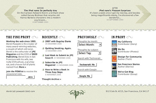
There doesn’t seem to be a name yet for this type of expanded area of functionality. Ho hum. I’m calling it a ‘functional footer’ until someone comes up with a better term. Regardless of the name, this fad actually makes some kind of sense:
- The fold doesn’t matter so much any more
- Obvious SEO benefits
- Logical spot for backup navigation if all else fails and the user is truly lost
- As resolutions increase, we don’t need to be quite as frugal with screen real estate
- Useful way to clear the navigational decks – if business owners are insisting on a particular link being available, a functional footer is a great place to put it so it doesn’t impinge on the main visual space
- Wishful thinking perhaps, but I do hope in some small way it encourages fuller all-the-way-down reading by users
- Rounds off the page nicely
What can I put here?
The really interesting bit is that some sites are mixing it up and going beyond the typical legal / contact / careers links. Blogs are adding links to previous posts, popular posts, “about me”s. Some are getting creative and repurposing some typical sidebar content – del.icio.us links, Flickr thumbnails (I really like this one). At the extreme end, the new waitrose.com has its entire sitemap in the footer.
Standard design disclaimer applies – ‘it depends’ – it may not work for your site, but it looks like it’s worth a shot if you’ve a lot of content and not enough space.
Old interfaces die hard
One thing bothers me about Bill Gates’s assertion that touch interfaces will be all the rage over the next few years.
One thing bothers me about Bill Gates’s assertion that touch interfaces will be all the rage over the next few years.
Let’s start at the beginning. Gestural and touch interfaces are absolutely nothing new. Here’s some of Bruce Tognazzini’s concept film Starfire, made at Sun in 1992. (Quite amazing just how much great stuff there is in here, dress code aside).
Not a giant leap from Starfire to reach Microsoft Surface.
Honestly, Surface gets attention mostly because it looks great. Really great. It’s elegant beyond anything Microsoft have ever done, and has that futuristic appeal that causes lazy journalists to spawn lazy phrases like ‘the Minority Report interface’. However, as any interaction designer will tell you, these kinds of interfaces simply aren’t as successful as they should be.
First, tactile response, or lack thereof. Example: a button has a satisfying ‘click’ when you depress it. A brake pedal resists the harder you push it. The right key fits snugly into the lock. A touch-based or gestural interface doesn’t do this, because there’s no direct feedback. The iPhone keyboard, while a remarkable achievement, is a long way from perfection. Fingers obscure the view, and there’s no feel for where one button ends and another begins. So in reality, it owes much of its success to its excellent autocorrection. For SMSs, it works beautifully, but have you ever tried typing in a tricky URL? It’d be quicker to type it in Morse Code.
Second, waving your arms around is seriously hard work. Play some Wii Sports, or conduct an orchestra for an hour and you’ll agree. Interfaces like Surface and Wii simply require far too much effort to be usable for long periods. The Minority Report interface needs grand, full-scale movement. Sure, you could downscale it, but haven’t we done that already with the trackpad?
Subtle, well-considered gestural interfaces will become more prominent, but I really do think the mouse and the keyboard will be our predominant input devices for years yet. They’re simple, cheap, reliable, require minimal effort and can be used in a number of environments. Eventually, sure, they’ll die out. I don’t know what will replace them (and if I did, I’d be rich), but I’ll stick my neck out and say it won’t be the surfaces of giant LCD coffee tables.
The Aiwa Facebook: £149 at Currys
Nice Facebook analogy from Iain Tait: Facebook is an all-in-one stereo system - fine for beginners but ultimately a bit limiting and of mediocre quality (web 2.0 is separates, natch). See also Wired's article Slap In The Facebook.
This was also one of the recurring themes at BarCamp Brighton, particularly with such a strong Microformats and semantic web flavour pervading the whole weekend. Lots of bold words about Facebook's inevitable (albeit it far-off) demise.
Although in principle I agree, I thought this was a little strong - I'm still rather ambivalent about it all. Facebook's certainly a useful tool and it's great to see so many people contributing to the web, sharing media and so on. I just regret that there's this great big mainstream love affair with a walled garden concept I hoped the web had outgrown.
Of course, the interesting question is how those of us nearer the front of the curve can convince our less geeky friends that separates are better, without sounding like horrible snobs. Believe me, I've tried, and believe me, I sounded like a horrible snob.
Why become an information architect?
I can't remember where I heard it, but I was surprised it came from someone in the field. The sarcastic tone surprised me even more than the chuckles of agreement.
Hang on, I thought with astonishment, surely we've not reached the stage where we reduce ourselves to hackneyed self-criticism? In my experience, passion for their craft is common to every IA, and it's one of the few careers you can't really 'phone in'. So, it's taken me a while, but for the record here is my response.
[Note: Yes, some of what I'm talking about could be called interaction design, user experience etc. Change the post title if you like. I'll leave defining the damn thing to others.]
It's creative
Every job has its drudgery. I'm sure some IAs would say that churning out wireframes comes pretty close sometimes, and certainly it can if you allow yourself to drift on autopilot. But any job that pays you to think and to listen, then to turn that into something meaningful, usable by everyone but retaining one's own creative influence, is a rare thing.
It's important
You're making decisions that can have a lasting effect. We all know that bad site > unhappy users > no revenue, but IA can matter beyond the realms of the bottom line. I have true respect for IAs working, say, on medical information sites, improving access to information that can change (or even save) lives.
It's varied
IA undoubtedly can lay claim to some of the largest changes of scale of any job in this domain. You may be looking at wide strategic decisions affecting thousands (millions, if you're with the big guys) of people. Or you may be arguing whether 18pt leading is appropriate for this type, or whether icon A is sufficiently differentiated from icon B. I've spent mornings looking at numerous shades of pea green and drowning in a sea of RGB hex, followed by afternoons trying to convince others that semantic markup should be a central platform for our business.
It pays
Salaries are going up, and not showing many signs of abating. This is a specialised profession in great demand. Of course, we will have to wait and see how it survives the next tech dip, but even the IAI's year-old figures are pretty impressive.
It's part of something bigger
This, for me, is what seals it. The chance to help create the future of the web, to create a shared language of interactions, of new features and that wonderfully vague world of 'cool stuff'. Things that will turn a sceptic into an ardent supporter. Sure, of course I'm here to make money for my employer, but ultimately I think I'm also here for the greater good - to make the web a better place. And because the industry isn't at 'idea saturation point', in a small way I can help to shape the whole industry. How many accountants can say that?
Perhaps this all needs to be balanced with the negative aspects. Perhaps that's another post. But try adding the prefix "Only you know" before any of the above headings for a flavour.
WordCount
I rediscovered an old site I'd meant to post about long ago: WordCount. It's another of those interesting visualisation tools, this time showing the commonality of English words. Derived from Oxford University's British National Corpus of 100 million words, it's an obvious practical example of the long tail. Since we get by on an estimated average vocabulary of 21,000 words* (compared to the 86,800 in Wordcount), there's plenty of undiscovered material to play with.
Aside from the interest derived from simply playing with it and learning more about our language, some wags have created games from forming sentences from words appearing consecutively in the list:
"Despotism clinching internet" (seems somewhat prescient of the net neutrality debate)
"America ensure oil opportunity"
"Apple formula: imagination"
Or, of course, you can play the slightly smug vocabulary-testing game, by testing your favourite obscure word and keeping score. Me? I started with a mediocre 'abstemious' (61282nd) but quickly followed it up with an impressive 'ziggurat' (83305th). No triple-word score sadly. There's also QueryCount, which is an exploration of the most frequently sought-out terms, and is of course considerably more profane.
Of course, sites like this don't really have a purpose per se, of course, other than exploration. But isn't it nice sometimes to release ourselves from the current task-based focus of the web, and get back to good old-fashioned surfing?
* For an alarmist aside, read Are iPods shrinking the British vocabulary?.