The illusion of control
If everything seems under control, you’re just not going fast enough.” – Mario Andretti
Control is a slippery thing. It’s important to our lives; we need it to rationalise and justify our decisions, but sometimes it’s simply beyond our influence. The well-known fundamental attribution error is a clear example of how we overstate human involvement in random events – in short, we don’t like the idea that we or, failing that, another human, are not in full control of a situation.
With technology this is particularly prevalent. When we are asked to to let a machine act on our behalf we become nervous if we don’t feel at least partially in control. One example of this is the excellent writing tool Scrivener which has an elegant autosave built in, running after every pause of two seconds. This ensures that flow, very important for writers, isn’t interrupted, but provides the peace of mind that reams of text won’t be lost in the event of a crash. However, even with this tight policy in place, Scrivener offers a force save mapped to the regular keyboard shortcut Cmd-S.
Gmail offers a similar redundant safety net when composing a new mail. State is of course saved in the background via Ajax but Google again allow users the comfort of saving at a point of their choosing.
Sometimes genuine control is not possible, in which case the answer can be to hide this from the user to keep them happy. Lift buttons are a classic example.
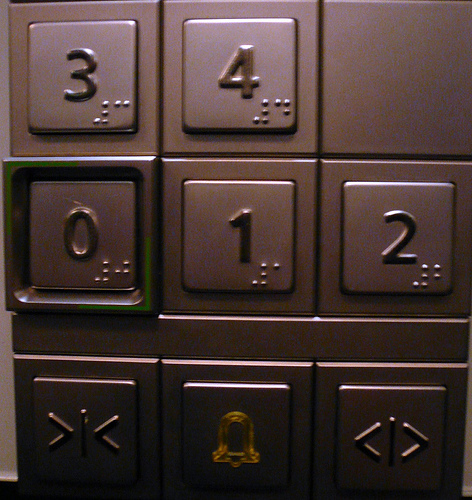
Lift / elevator passengers essentially volunteer to be shut inside a metal box suspended hundreds of metres off the ground. Not only that, but they abdicate responsibility for their safety to a computer. Few sane humans would be willing to do this on these terms. As a result, lift designers have to be very careful to ensure passengers feel in control of the system, even though in reality they have only partial control at best.
The Door Close button is a result of this pretence of control. On the majority of lifts it has absolutely no function since the lift is on a predetermined timer. However, tests show that users like the peace of mind of the Door Close button, providing as it does the belief that there is no element of the lift experience that we cannot influence. Ethically, there might be concerns that this is flat-out manipulation of users. However, situations where a little interaction white lie works to reduce anxiety of users, it’s probably acceptable.
Appendix 1: As it happens, some lift models do have an important role for the Door Close: enabling debugging modes for engineers. Certain button combinations (e.g. floor number + Door Close) activate express modes, stop the lift running, and so on. Other models use a lock and key to prevent public access to these functions.
Appendix 2: For more info, try Up And Then Down, an excellent New Yorker feature article on elevators, their design challenges, and a mildly terrifying account of Nicholas White, who was stuck in a lift for 41 hours.

