Functional footers are the new black
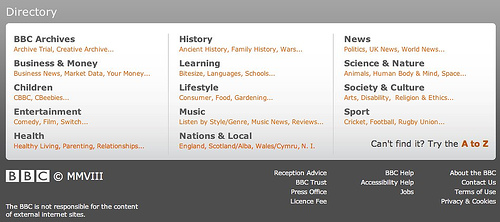
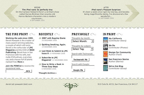
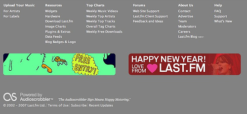
Time to share a current geeky web design crush: big footers. Seems that quite a few sites are now getting rather bottom-heavy and, you know, I think I quite like it.
There doesn’t seem to be a name yet for this type of expanded area of functionality. Ho hum. I’m calling it a ‘functional footer’ until someone comes up with a better term. Regardless of the name, this fad actually makes some kind of sense:
- The fold doesn’t matter so much any more
- Obvious SEO benefits
- Logical spot for backup navigation if all else fails and the user is truly lost
- As resolutions increase, we don’t need to be quite as frugal with screen real estate
- Useful way to clear the navigational decks – if business owners are insisting on a particular link being available, a functional footer is a great place to put it so it doesn’t impinge on the main visual space
- Wishful thinking perhaps, but I do hope in some small way it encourages fuller all-the-way-down reading by users
- Rounds off the page nicely
What can I put here?
The really interesting bit is that some sites are mixing it up and going beyond the typical legal / contact / careers links. Blogs are adding links to previous posts, popular posts, “about me”s. Some are getting creative and repurposing some typical sidebar content – del.icio.us links, Flickr thumbnails (I really like this one). At the extreme end, the new waitrose.com has its entire sitemap in the footer.
Standard design disclaimer applies – ‘it depends’ – it may not work for your site, but it looks like it’s worth a shot if you’ve a lot of content and not enough space.


