The making of Undercover UX Design
After 200 pages, 50,000 words and over 1000 hours, we’re done. Undercover User Experience Design is now available for pre-order from Amazon UK and Amazon US. It’ll hit the shelves from 17 September.
After 200 pages, 50,000 words and over 1000 hours, we’re done. Undercover User Experience Design is now available for pre-order from Amazon UK and Amazon US. It’ll hit the shelves from 17 September.

The writing process
Writing a book has been the most complex information architecture challenge of my life. The permutations in which you can sculpt, exclude, clarify and link information are staggering. No surprise then that we relied on our familiar design process, heading up the chain of goals, structure, content and surface. We appropriated the tools of our trade: personas, content analysis, user feedback and deep iteration—but it was trial and error that finally unearthed the process that worked for us.
- Research. The scale of the project demanded hundreds of hours of research: absorbing other books and articles, recombining miscellaneous thoughts into coherent patterns. The trick was knowing when to stop. The only way to write the perfect book is first to read every book. We repeatedly had to refocus on our audience and mark tight boundaries around curiosity. Several high-level ideas, although fascinating to us, weren’t relevant for the punchy style of the book.
- Outline. We then turned our scrappy notes into a hierarchical structure with the help of OmniOutliner. Somewhere between a vast card sort and a minimax search; an exhaustive attempt to craft as coherent a flow as possible.
- “Pigeon”. Turning this outline straight into high-quality prose proved too great a step, so first we threw words onto the page without regard for their quality.
- First draft. Only then did we turn this “pigeon” prose into tight writing. Even with this narrow remit, this step challenged our writing skills and patience. We reshuffled and excised enormous swathes of text, while juggling minutiae of definitions and style. Here too we finally cast off our Britishness and accepted dollar signs and American spellings, although we’re proud to say we drew the line at “gotten”.
- Diagrams. Undercover UX Design is printed using two inks—black and the blood-red Pantone 484U—meaning our illustrations could only use these colours. We had to recreate several deliverables from scratch to suit this setup, and spent many hours struggling with the technical requirements of the printers.
- Templating. The first draft then had to go into an awkward Word template for the publisher. Mind-numbing hours of copying, pasting, and style formatting, including smart quotes and other preferred typographical treatment.
- Author review. Our two wonderful editors Wendy and Jacqueline then reviewed our work at both the logical and technical level, and returned corrections in a haze of Track Changes. Most points were minor—grammatical or logical errors we kicked ourselves for not seeing—but even at this stage we found ourselves in deep spirals of “What are we really trying to say here?”. Our response was usually to leave the offending sections on the cutting floor.
- Proof. Finally, we returned the author review and the compositors laid the text and images out in a PDF which we then proof-read alongside the publishers. Proof-reading was impossibly tedious but immensely valuable, giving us the chance to fix clunky phrases and embarrassing typos.
The tools
I relied on the excellent Scrivener throughout, and I can’t recommend it highly enough. It suited my non-linear writing style and its stability is truly impressive. As we worked concurrently on chapters, James and I shared our work with a hacky Dropbox sync. Only once did we overwrite each other’s work. There’s a strong case for a more formal version control system, but the very thought depressed us. Dropbox worked for us, and again I gladly recommend it.
Our other essential tools included Skype, Illustrator, a good thesaurus, and several Stars of the Lid albums. Trial and error again showed me which albums I could successfully listen to while writing. Anything with vocals or strong percussion was out, creating a last.fm-skewing portfolio.
The effort
Everyone knows writing a book is hard, and I won’t play the martyr. But I will say the extent to which my life ground to a halt surprised me. A writer isn’t just an author; he is a project manager, juggling chapters, drafts, reviews, illustrations and copyright releases, as well as personal time and client time. A book is a constant source of ideas, questions, and worry. The pressure made me regress into quasi-adolescent nail-biting and insomnia, and I’m enjoying the quiet return of my regular life.
I was initially advised not to partner with a co-author and not to write a book while in full-time employment. Excellent advice, which we ignored. For six months I’ve been fond of saying “Having a co-author doesn’t mean you each write half a book. You each write a book”. It would have been substantially easier for either James or myself to write this book alone, but without my co-author’s inspiration, efforts and motivation, Undercover UX Design would be a shadow of its final form.
The money
Our financial return from Undercover UX Design will depend of course on sales, but we shan’t end up rich. Tech & design books don’t sell in the quantities required to turn huge profits, and what initially seemed a decent advance was quickly demolished by currency conversion, tax, bank fees, and other costs. Both James and I had to register as self-employed, go through the US tax system with its obscene forms and mandatory trips to the US Embassy, hire an accountant, and so on. As a wage slave all my life, it’s been a major upheaval, but money was never a priority for this project. Royalties will be a happy accident rather than the main reward.
The illustrations
Early on, we decided we wanted to make a book that was slightly different to other tech books. We politely insisted on a 9×6-inch format (rather than New Riders’ customary 9×7) for aesthetic and usability reasons, and commissioned my friend Chris Summerlin to produce chapter illustrations for the book.

He did a spectacular job. The results lie somewhere between Kevin Cornell‘s A List Apart illustrations and The Perry Bible Fellowship, demanding a second or third look before the penny drops. They’re quirky, slightly tangential and wonderfully drawn. We hope our readers will love them as much as we do.
The result
Undercover User Experience Design ended up shorter than expected, mostly thanks to rigorous editing. There’s no wasted space, and the book’s concision is definitely a feature, not a bug. As befits the title, we’ve tried to create a down-to-earth, practical book that avoids the more ponderous tendencies of the field. We’re proud of the results and I’m hopeful UUXD will become an essential guide for people who can’t do UX by the numbers.
It’s too early to say whether writing a book has changed me, but it has certainly sparked further interest in writing. I’ve learned a great deal about making a coherent argument and writing well. My client work is suddenly full of content challenges I never previously saw. I’m no longer frightened to wield an axe on my favourite ideas, and I now see a good editor as the solution to most of the world’s communication problems. (More on that later.)
Now we wait, and hope others will respond well to our work. James and I would be eternally grateful if you could spread the word about Undercover User Experience Design. Please feel free point people at the website or suggest they pre-order on Amazon. (Please use these links so we get a small referral fee per sale: Amazon UK and Amazon US. Note that the RRP is still unconfirmed, so there’s a very good chance the book will end up cheaper. Pre-order now and you’ll get the lowest price available.)
Thanks to everyone who supported us, and we hope you enjoy the book!
On writing
Writing is a jealous lover. Every hour I’m apart from her, she saddles me with guilt. Time is my new currency, a precious gemstone traded on rare occasions.
Writing is a jealous lover. Every hour I’m apart from her, she saddles me with guilt. Time is my new currency, a precious gemstone traded on rare occasions.
Writing is about control. I’ve learned to suppress my florid linguistic tendencies – hence this brief stretching of the legs – and tolerated the cruelties of American English until they became mere indiscretions. I’ve learned that the tyranny of the blank page can only be defeated with words, and that structure is the heart of the battle. I’ve learned to spot ambiguous pronouns at ranges of up to a mile.
Writing is as punishing, as unglamorous, as stressful as any author warns. Would I do it again? Absolutely.
IA Summit 2010 in review
The eleventh IA Summit found strength in reconciliation, but the spirit of free speech still ran strong.
“Graduation is only a few days away and the recruits of Platoon 3092 are salty. They are ready to eat their own guts and ask for seconds. The drill instructors are proud to see that we are growing beyond their control.” – Joker, Full Metal Jacket
“Show me your kill face!” Dan Willis‘s UX Deathmatch encouraged us to unleash the beast within, taking sides in the battle between agency and in-house design. The sparring was sharp but good-spirited, with claws largely sheathed after the scars of 2009.
The eleventh IA Summit found strength in reconciliation, but the spirit of free speech still ran strong. Whitney Hess was the recruit unexpectedly promoted to squad leader, to the muttered chagrin of a few veterans. She accepted the role with surprising vulnerability and humility. Extrapolating Jesse James Garrett’s dream of a UX designer-turned-CEO, Whitney proposed that it’s time to graduate and take on the world. Keynote compatriot Richard Saul Wurman, meanwhile, headed straight for a Section 8. Meandering and rude, he demonstrated why hypertext is best delivered on screen, not in speech. The audience killed its idol through backchannel sarcasm and planned for a better world.
This hunger to improve led, unsurprisingly, into continued debates about the format of the Summit. There’s no doubt that it’s grown beyond its original constraints and that it suffers from a lack of vision compared to more recent events. I expect that 2011 will see a notably different Summit – indeed, Lou Rosenfeld has fired the first salvo in the battle for reformation. But the conference’s strength is still its outstanding content. Of particular note this year were Kevin Hoffman‘s detailed thoughts on kickoff meetings (sending many agencies scurrying back to their drawing boards), Karl Fast’s tour of the semantic richness of a messy desk and Cindy Blue revealing the face of the supposed enemy in Adventures of an IA in business school. My session The future of wayfinding appeared to be well received, and I’m delighted to have been able to contribute.
It’s a pity that more didn’t share these excellent three days with us, but slipping attendance is understandable in the face of alternatives and the maturation of our field. Although we revel in the company of our passionate yet introverted peers, the field is increasingly eager to take the fight to the outside world. It’s natural therefore that practitioners will look outside the industry for maximum impact – but with some rejuvenation, I’m confident the IA Summit will find a niche of reflection and ‘going deep’. I for one can’t wait for next year’s boot camp in Denver.
The perils of persuasion
As with politics, one’s stance is a matter of preference and most mainstream modes are appropriate. The problems lie in the extremes: let’s call them radical UCD and radical persuasion design.
On graduation, I found the business world laughable. I saw otherwise intelligent people wrapped up in circular rituals of ‘doing business’, oblivious to customer disinterest. My cynicism lasted until I discovered user-centred design and realised there were others who shared my viewpoint. From that point, I saw user experience as a refreshing break from the almost Fordist attitudes I’d witnessed, where business tried to create the market and efficient production appeared more important than demand.
My mindset was naive, but I stand by the principle. One of the things that excites me about UCD is that it isn’t only a mode of design: its values amplify the voice of those previously ignored, who now form part of our network economy.
The success of UCD has sustained demand for user experience design skills, and the land rush has continued in 2010. UX is becoming a cookie cutter add-on for digital agencies and I rarely meet a web designer now who doesn’t claim UX proficiency, although not all can articulate what that means. And it’s not just the designers: I also see back-end developers,SEO professionals and marketers rapidly appending these two magical letters to their CVs.
Many of these people do have genuine user empathy and knowledge of the diverse skills required of UX design. Many do not. I welcome them to the field regardless and hope we can all learn from each other. However, I am concerned at the expansion of the User Experience label to include activities I see as contrary to the values of user empowerment. In particular, I’m worried about persuasion design. Although it’s a powerful and topical approach, I also believe it has the potential to severely damage our industry.
A political model of design
Interaction designers often advocate design as an agent of behaviour change. Jesse James Garrett frames this as an extension of the classic information architecture v interaction design debate, with IA optimising for the way people think, and IxD attempting to drive particular user actions.
When I try to make sense of this struggle, the crude model I keep returning to is a political spectrum. User-centred design, empathetic and inclusive, sits left of centre. Persuasion design, individualised and competitive, sits right of centre.
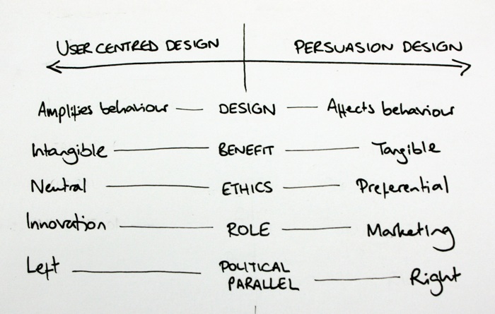
As with politics, one’s stance is a matter of preference and most mainstream modes are appropriate. The problems lie in the extremes: let’s call them radical UCD and radical persuasion design.
Radical UCD
Under radical UCD, the user’s priorities outweigh others. It’s here that we see the notion of design ‘dissolving into behaviour’ realised. Design becomes an ethically neutral activity whose role is to amplify and liberate the end user. The rewards are intangible, long-term and altruistic: we hope to engender loyalty and word of mouth referrals, but the effects are notoriously hard to measure.
However, as with the political equivalent, radical UCD is economically unrealistic and unworkable. At this extreme, design could only cause consensus-building timidity that reinforces current modes – an accusation already pointed at milder contemporary user-centred practice.
Radical persuasion design
Persuasion design doesn’t share UCD’s ethical neutrality. Instead, it makes an implicit but undeniable judgment that certain behaviours are preferable to others. We need only look at the vocabulary of persuasion design to see this. Jon Kolko’s infamous Johnny Holland article talks of design’s contribution “to the behaviour of the masses, [helping to] define the culture of our society.”
While I respect Jon’s intellect, I find this to be dangerous rhetoric from which we can draw uncomfortable parody: Fear not, huddled masses – the design elite will lead you to the promised land. Persuasion design’s assured ethical superiority is unfortunate. Although some of the cases put forward are compelling – guiding people toward better macroscopic decisions about environment, health etc – we must recognise that, for all the good deeds behaviour change can encourage, it is prone to murkier applications.
What privileges the designer to dictate desired behaviour? And since we’re for hire, does that mean we’re ethical relativists, bending people toward whatever agenda lines our pockets?
Whomever the paymaster, the common pattern I observe in digital persuasion design is that its values are uniformly technocratic. Science is better than faith. Action is better than reflection. Progress is better than the status quo. These values strike me as practically Futurist and, at the risk of invoking Godwin’s Law, I’m concerned that radical persuasion design is vulnerable to similar autocratic pitfalls as the Futurists themselves.
Persuasion design is marketing. UX isn’t.
I have struggled for months to unify my understanding of these two political wings, and now conclude that I cannot. I believe that persuasion design is not part of user experience design. It is marketing. Persuasion design prioritises business goals above those of the user, and its values are irreconcilable with empathy, the central value of UX.
That’s not to say that persuasion design isn’t highly valuable and attractive to business. After all, it matches the recognised business patterns of marketing, making its effects felt in tangible measures that UCD’s intangible altruism cannot: conversion rates, signups, and so on.
I subscribe to Peter Drucker‘s view that business has only two functions: innovation and marketing. Under this model, user experience design is innovation. It uncovers people’s needs and and gives makers the knowledge to develop new products and services that meet those needs.
This, finally, is why I disagree with Josh Porter’s assertion that UX is really just good marketing – however, my disagreement isn’t with his framing of marketing, but of user experience. As far as persuasion design is concerned, he is right – but the equation does not apply to UCD and UX.
Opinions and unwinnable arguments
I am of course straying close to two notoriously unwinnable arguments: semantics and politics. I have neither time nor inclination to enter into political debate or vanish down the rabbithole of Defining The Damn Thing, and I am all too aware that, like any model, the one I give is simplistic. It overlooks the complexities of authoritarianism and liberalism, which are not necessarily tied to economic left or right, and belies the greys that lie between black and white. I raise it instead as a way to highlight the risky territory I believe we are heading toward. All I ask is that the community considers these issues carefully and reaches its own conclusions. I’m happy if those differ from mine.
Even if my thoughts turn out to be at odds with those of the broader UX community, I’ll take heart from the words of Dieter Rams, who also took a stance against the involvement of persuasive techniques:
Braun categorically rejects the idea of motivating people to buy its products by adding features that toy with the psychological sub-terrain of the consumer’s consciousness. Braun refuses to swell sales by exploiting human frailties: neither its products nor its advertising use such seduction techniques.
Those who wish to employ persuasive techniques are welcome to do so. But my focus continues to be on striving to make better products by listening, not driving behaviour change. At times I will use tactics from the persuasion design toolkit, as I do with other tools of marketing, but I will do so only when I have fully considered the ethical implications. I hope that others will do the same.
[Minor edits to fix incorrect refs and typos, May 2017.]
Beauty in web design, part 3
However, the key to creating beautiful websites that our users actually love, rather than merely tolerate, is to think at the reflective level.
The final part of a 3-part essay, based on my presentation at SXSW Interactive.
In Part 1 we saw that the web presents an ideal vehicle for beauty, and in Part 2 I argued that beautiful design is reflective, exploring message and meaning. How can we use this knowledge to create beautiful websites?
Making the web beautiful
We are certainly making progress, and perhaps I’m being harsh on a field still in its infancy. The web is only 7,000 days old, after all. Technological improvements such as new authoring tools, better screen resolutions, more bandwidth and technical convergence will free us to experiment.
We’re already seeing fresh visceral approaches courtesy of developments such as CSS3, typographic tools like Typekit and Fontdeck, Canvas and SVG. Even the death of web-safe colours freed us to try new visceral design techniques. Better understanding of usability, better design patterns and better web education has also freed us to try new behavioural approaches, such as the horizontal, keyboard-driven navigation on Thinking For A Living. It’s too early to know whether these paradigms will stick, but it’s heartening to see previously locked-in approaches challenged.
However, the key to creating beautiful websites that our users actually love, rather than merely tolerate, is to think at the reflective level.
1. Get emotional
Appealing to emotion is an important way to create reflective design. It means we must understand people, not merely user tasks. What makes them tick? What would they never dream of asking for? How can we improve their life beyond this one visit? The focus is therefore on experience, not just usability. These days I see calling a website ‘easy to use’ as like praising a restaurant for serving edible food. It should be a given, not an exception.
One way to engender emotion is through stories – an area where what we patronisingly call ‘old media’ is streets ahead. Advertisers, writers and film makers have long known the power of narrative and created emotional content to reinforce their message. Content strategists in particular should therefore take centre stage in our quest for emotion, using not just text but other content types. Some of the most emotionally resonant content on the web today is photographic, such as Pictory or the Boston Globe Big Picture.
2. Think bigger
User and business form the classic duality of design. We’re well accustomed to solving for the needs of both, making compromises and tradeoffs where appropriate. I now believe this model overlooks a third piece of the puzzle: the ecosystem. We should design systems that are good for the surrounding web and for society.
Many experienced designers already consider this intuitively through their work, but there’s benefit in explicitly considering these issues in our design process. Are we trying to make a genuine difference, or just churning out more wireframes to keep the client happy?
3. Lead
When did you last see a statue of a committee? The classics of design have typically been created by one person with strong vision and the technical and political skills required to execute upon it. In film, this is known as the auteur theory: the director is regarded as the custodian of the creative vision and the final product is his or her realisation of it. At the least we need to appoint leaders who formulate and communicate a vision for the site.
Assuming leadership can be difficult in real business contexts and can foster problematic attitudes, but without strong leadership, clear vision and faithful execution, we have no hope of creating beauty.
4. Think long term
It’s relatively easy to make something viscerally attractive, but how can we maintain interest after the initial lust wears off? Just as in a romantic relationship, we should consider long-term seduction. The odd surprise can be rewarding, bringing joy in unexpected moments of the experience. By varying things we prevent over-familiarity and the contempt that this can breed.
Possible approaches include rewarding people who explore to deep areas of the system – a tactic frequently used by game designers – or something as simple as unannounced free shipping on your tenth order. Google’s holiday logos provide a real example of how the tiniest detail can keep users interested.
5. Notice everyday beauty
My mother, a retired teacher, told me recently of the ‘golden moment’ in education. It’s the point you always remember, when you discovered something and suddenly your worldview was shifted – that “one way valve to a new way of seeing” again. Educational theory suggests that to create golden moments, you must recognise them for yourself. So notice the world. Where’s the beauty around you?
As we previously discussed, there’s beauty all around us: art, writing, architecture, music, products, nature. We should breathe it in and learn from it. It may even be that inspiration lies close to home. Perhaps web standards specialists could take inspiration from developments in the Flash world, and vice versa. Maybe designers can be inspired by developers. We should be aware and scan the horizon to find our own golden moments.
6. Be brave
Finally, since reflective design is about meaning and message, we needn’t fear making statements. We should stand for something and convey ideals through our work: both ours and those of our clients. Surprisingly, the web design community seems reluctant to do this. At last year’s IA Summit, Jesse James Garrett asked why there are no schools of UX thought. Why indeed are there no major schools of web design thought? Our movements and sub-communities are, instead, almost entirely technique-driven. To me, it’s sad that we’re more interested in endlessly debating topics such as HTML5 v Flash, rather than exploring the important philosophical approaches that drive our work.
Caveats
There are of course some dangers to these approaches. The demands of client work mean we’d be unwise to blindly apply these rules, and there are some difficult questions left unanswered. The most important is whether beauty is always appropriate. I suspect not. When I’m filing a tax return, I don’t want the system to speak about who I am; I just want it to work. When getting the job done is more important than enjoying it, beauty is cruft. Better for designers to let the task and usability have priority.
Reflective design shouldn’t become dogma. Fortunately, when we take time to truly understand users and what they want, it soon becomes clear when it’s appropriate to strive for beauty in design.
Hero design
It would be easy to misinterpret our discussion of leadership and bravery and overestimate our authority. Designers aren’t heroes; instead we must serve our industry, our clients and our users faithfully, discarding ego. Too frequently, I see design that is more about impressing other designers than solving the problem and making the web better. There’s no beauty in hero design, only narcissism.
That said, I think web designers should appreciate that we can play an important role in society. We’re lucky enough to work on the coalface of the most exciting innovation of modern times. We’re on the brink of wonderful things. So yes, we’ve underachieved, but given the evolution of beauty and the tools now available to us, the web is an ideal vehicle for beautiful design. We’re the generation to turn that promise into action.
I hope in five years to look back on this essay and laugh. If we work hard, aim for reflective design, and believe in the power of the web, I’m convinced we can create our own beautiful design landmarks.
Beauty in web design, part 2
In Part 1 we saw that the web presents an ideal vehicle for beauty. But how will we know it when we see it? What is beauty anyway? I consider beauty to be presented in three main modes: universal, sociocultural and subjective.
The second part of a 3-part essay, based on my presentation at SXSW Interactive.
Three types of beauty
In Part 1 we saw that the web presents an ideal vehicle for beauty. But how will we know it when we see it? What is beauty anyway? I consider beauty to be presented in three main modes: universal, sociocultural and subjective.
Universal beauty
Universal beauty is based on timeless, globally accepted principles. It seems to hit at some innate response within us all, as demonstrated by the concept of human ‘averageness’. Here, we see a composite image of dozens of female faces created by Face Research. We might expect to see average attractiveness as a result, but this prototype is certainly more attractive than average. One theory is that prototypicality shows the mate has no defects and thus is likely to produce healthy offspring. Another theory claims that average faces are pleasing because the brain finds them easier to process. (Perhaps the average face is Plato’s ideal Form in the flesh).
Designing for universal beauty involves careful consideration of the fundamental aesthetic principles of design, such as symmetry, harmony, the rule of thirds and the golden ratio.
Sociocultural beauty
Sociocultural beauty is governed by the preferences of a particular time or place. This is most clearly seen in sexual attitudes.
Here we see Rubens’ Venus and a modern runway model: a clear depiction of changing sociocultural attitudes to beauty. (Please forgive these rather sexist examples. Since throughout history nothing has been studied for its beauty as much as the female form, it makes for clear illustration.)
However, there are more subtle examples: fashion, music trends and even philosophical interpretations of the world all go in and out of style, regardless of their inherent universal beauty.
Subjective beauty
Subjective beauty is the wholly personal encapsulation of one’s likes and dislikes. If you like big butts and cannot lie, you’re merely exercising your right to a subjective opinion on beauty. While Rubens’ work is reflective of the Baroque era, it also reveals his subjective preference for larger models.
These three types of beauty are hierarchical. Subjective beauty can overrule sociocultural beauty: we can individually find beauty in things that society considers out of fashion. Sociocultural beauty can in turn overrule universal beauty: universally beautiful things may simply not be en vogue in a particular time or place.
Three modes of design
So how can we design for these types of beauty? Don Norman’s book Emotional Design gives a deep exploration of the role of emotion & beauty in design. Adapting an established model of cognitive processing, Norman claims design typically falls into one of three dominant modes.
Visceral design is aimed at our gut. We experience a visceral reaction when we bite into a sweet apple, see a stunning sunset or hear a harmonious chord – it’s entirely sensory, before the brain has a chance to shape the feeling. A positive visceral response is often called attraction – it’s what draws bees to flowers, or babies to a beautiful face.
To design for visceral response, we should concentrate on immediate properties of a system: shape, colour and form. These can make the instant impact required for a visceral reaction – we know, for instance, that visceral response to a website can occur in fractions of a second.
Visceral design was an early frontier of exploration for the web, once the technology was sufficiently mature. This early landrush of artistic, highly visual sites was helped by the advent of visually-oriented authoring tools such as Dreamweaver, which helped graphic specialists make the leap into the web arena with familiar UIs.
It is easy to belittle visceral design as ‘eye candy’, but without this immediate attraction, sites struggle to succeed in other modes of design. That said, visceral design’s clear failing is that it rewards attraction over usability and real beauty. Command-Shift-3, which describes itself as the HotOrNot of web design, has all the depth of a wet T-shirt contest. Since we can’t use the sites it features, we must judge solely on aesthetics. Visceral sites often win awards (since awards are rarely concerned with use) and appear in those ‘Top 20’ lists we all know and dread.
Behavioural design
Behavioural design is concerned with use. Does the system work? Is it easy to perform my tasks? Does it sustain flow, or make us suffer constant interruptions by not doing what we expect? To achieve successful behavioural design, we can call on our nearest ergonomist or usability specialist. She will ensure our design has appropriate dimensions, is well mapped to user mental models, is forgiving of improper use, sends clear messages about function, and so on.
No one can deny that the web usability movement has been successful. However, understanding the user’s tasks and crafting a site around them isn’t sufficient to bring us genuine beauty. The reason is that behavioural design doesn’t always trump visceral design. Social psychologists have found, for instance, that women prefer prototypically attractive men (square jaws, broad shoulders etc) for one-night stands and flings, but they choose more feminine, ‘nicer’ men for commitment: the so-called “cads and dads” theory. This pattern is particularly pronounced at certain points of the female ovulation cycle. In short, we don’t always plump for reliability; sometimes we need something more exciting.
Perhaps the usability movement has created too many dads, and too few cads. Critics often claim it has ‘made the web boring’ – and it’s true that, when misapplied, usability approaches can create very mediocre products. For a slightly daft example, look at the work of artists Vitaly Komar & Alexander Melamid, who surveyed the musical preferences of the general public. They asked opinions on instrumentation, tempo, pitch, duration and lyrical subject and assembled these into two musical extremes: the Most Wanted Song and the Most Unwanted Song.
The Most Wanted Song features a soft rock / R&B sound, using well established instruments. To quote the artists, it creates “a musical work that will be unavoidably and uncontrollably liked by 72% of listeners”. Unsurprisingly, this crowdsourced composition, designed for maximum ‘ease of listening’, is anything but beautiful.
The Most Unwanted Song is 25 minutes long, veering wildly between extremes of loud & quiet, fast & slow, low & high pitch. It also features the world’s most hated instruments: the accordion, bagpipe, banjo & tuba, a rapping operatic soprano and a children’s choir. “Assuming no covariance, fewer than 200 individuals of the world’s total population would enjoy this piece.”
Listening to The Most Wanted Song, we can almost understand why some people equate usability with tedium. While it can help our sites to become useful and profitable, it can’t make them beautiful. For that, we should aim at the third, most complex mode of design.
Reflective design
Reflective design reaches beyond visceral and behavioural design to look at message and meaning. It asks difficult questions. What does this system say about who I am? Does it improve my life? Am I glad I did it? These questions are subjective and complex, and our responses will vary with experience, personality, culture and even mood. But there are strong benefits to asking them. Successful reflective design makes us feel good: we show it off, tell others and repeat the experience. It can even change the way we think about things. In short, I believe that successful reflective design and beautiful design are one and the same.

Consider the Nextime Word Clock. It’s made from two cylinders that rotate so that the time can be read from the face: “Five minutes to ten” or “It’s about four”. It’s less accurate than a cheap digital watch and hence less usable – and, while it looks good, it’s not as elegant as an analogue clock. But, to me, this clock is an excellent example of reflective design. Its accuracy is appropriate for the living room (do you really need to know the difference between 2:57 and 2:58?) and its unconventional design is a conversation starter. I see beauty in the concept, and the product says something about me. It’s for these reasons, rather than usability or attraction, that I count this clock as one of my favourite possessions.
Where usability focuses on behavioural design, reflective design is more the domain of user experience. It involves truly understanding what makes people tick and what makes them excited. It involves creating something meaningful that changes perceptions. Reflective design is a relatively recent focus on the web, which is perhaps why we’ve not yet created beautiful websites. But with sufficient focus on experience, I believe we will.
Rates of change
These three modes of design – visceral, behavioural and reflective – move at different speeds, creating shearing layers (familiar from Stewart Brand’s How Buildings Learn).
Visceral trends come and go in a matter of months. Top 20 trends are quickly dated, be they illustration, fat footers or any other pattern du jour. Behavioural innovation is slower. Interaction design patterns and de facto standards (search box in the top right, logo and link to homepage in top left) emerge over the course of years and require more traction and mass support to become established. Reflective design moves the slowest of all. This is best demonstrated by ‘movements’ that define how we interact with the web – social media, the realtime web and so on – which take many years to emerge and stabilise.
Concluded in Beauty in web design, part 3
Beauty in web design, part 1
The web is full of cool, impressive and useful sites, but beauty is missing from modern web design. This is a surprise, given its prominence in other design fields.
The first part of a 3-part essay, based on my presentation at SXSW Interactive.
I think we’re underachieving. And I’m not alone in that belief. Armin Vit’s Landmark websites, where art thou? contended that the web design field has created nothing to rival the greats from other design fields, giving the examples of the NYC subway map, the Se7en titles and Paul Rand’s IBM logo. Jonathan Harris of WeFeelFine fame infamously contended at Flash On The Beach that there have been no masterpieces.
These acts of criticism stung the community. “But the web has changed the world!” This protectionist instinct is understandable, but while the web has indeed shaped modern life, I agree with Vit and Harris. The web’s sum is substantially greater than its parts. No one site stands as a landmark of design. Looking at some likely candidates – Google, Amazon, eBay, Facebook – we would all agree that they’ve changed how we interact with information, commerce and each other, but are they truly design classics or, instead, disruptive business models?
The web is full of cool, impressive and useful sites, but beauty is missing from modern web design. This is a surprise, given its prominence in other design fields.
Automotive design gives us beautiful cars that arouse passion and extraordinary desire. Product design also gives us 1954’s Fender Stratocaster, one of the most important cultural artifacts of the last century.
We see beauty in architecture, for example the Beijing National Stadium, which inspired a city, a country and a global watching public in a way no website has.
In visual fields, Harry Beck’s beautiful 1933 Tube map (which I’ll take over the NYC subway any day) clarified the complexity of the Underground through the metaphor of wiring. Not only is it a classic of wayfinding, but it has become part of the collective consciousness and emotional fabric of the city.

We also see a more chilling beauty in Charles Minard’s map of Napoleonic advance, made famous by Edward Tufte. The beige line represents the French army’s advance to Moscow; the black their ignominious retreat. The width of the line demonstrates the size of the army and hence the appalling human cost.
The point of beauty
But why focus on beauty? Why does it matter that other design fields lead the way? Because beauty affects us in profound ways, however we may try to resist.
Studies have shown, for instance, that attractive people are more likely to be acquitted by a jury. We transfer this lenience to content, as demonstrated in the 1960 Nixon-Kennedy presidential debates. The radio audience believed Nixon to have won the debate, while the TV audience felt the more attractive Kennedy had the upper hand. Surprisingly, this isn’t a learned bias; it seems to be hard-wired, even seen in infants.
Beauty also makes things easier to use. Our brains literally work in a different way, becoming more flexible when using a thing of beauty. This is the aesthetic-usability effect. Apple know the value of this effect more than most. The colour iMac heralded the first mainstream melding of beauty and hardware. When combined with the good user experience of the Mac OS, the iMac brought previously unengaged users to computing for the first time.
Beauty is also infectious. Because it makes us feel good, we naturally want to share it. Why do we put art on walls and take photos of sunsets? Because it allows us and others to relive the experience. This pattern of telling others about beautiful things is the cornerstone of loyalty and advocacy, powerful and much sought-after concepts.
But I believe the most powerful aspect of beauty is that it can change our perspective on the world. In the classic How Designers Think, architect and psychologist Bryan Lawson describes this as a “one way valve to a new way of seeing.” Not only could a beautiful web make our users happy, productive and loyal, but it could help to change the way the world thinks.
But can the web, an abstract, impermanent and functional medium, truly be beautiful? Let’s answer that by looking at a common vehicle for beauty: art.
The evolution of beauty
In Greek and Roman times, art (and the ideals of beauty it contained) was mimetic: that is, intended to mimic and replicate nature. This is consistent with the philosophy of the day. Plato’s Theory of Forms proposed that there exists one idealised, perfect instance of everything in the world – the perfect cow, the perfect grape – that exists on a plane that none can see. With beauty resident only in these ideal forms, art and sculpture were a means to study them. Every (literally) chiselled jaw is an exploration of the heavenly ideal. It’s from the Roman era that the word ‘art’ originates, tellingly coming from the Latin ars, meaning ‘skill’.
This style continued into Renaissance times; but while religious influence continued the thought that beauty exists in a heavenly plane, the Renaissance also introduced the earliest stirrings of humanism. From this point, beauty became apparent in things that mankind created.

As we advance into the Romantic era, art is no longer literal. Representation becomes central. Turner’s 1839 The Fighting Temeraire is beautiful but not accurate. Instead, the viewer finds joy in the colours and emotive qualities of both the scene and the meaning. This abandonment of the literal was catalysed by 19th century technology. The invention of the daguerrotype, the microphone, and the printing press some centuries previous, allowed reality to be easily replicated for the first time.
As we reach the modern era, art takes a jarring yet consistent turn. Duchamp’s concept of objets trouvés (such as Fountain) mean anything can have artistic meaning in the right context. Subjectivity dominates: it’s beautiful if you find it beautiful.
Contemporary conceptual art now sees execution as secondary. Beauty lies within the thought, while the artifact itself can be banal and everyday. Tracey Emin’s Everyone I Have Ever Slept With 1963-1995 stitched the names of former lovers, friends and unborn children into the fabric of a cheap tent. Damien Hirst’s diamond-encrusted skull (For The Love Of God) was made by technicians and interns: Hirst himself was director and project manager only. Duchamp himself permitted several replicas of his work. The idea is all.
Finally, we can examine installation art, designed for a specific space and a specific duration. It is by its nature temporary, and often interactive. 2005 Turner Prize winner ShedBoatShed (Mobile Architecture No. 2) was disassembled and reconstructed as a boat and sailed down a river. Tate Modern’s helter skelter ‘Test Site’ created enormous school holiday queues. Is it art? You choose. (Although to my mind, the answer to “But is it art?” is always “yes”.)
Classification aside, it’s certain that many people find this work powerful.
So our understanding of beauty has broadened and shifted. Beautiful things can be abstract, temporary, duplicate and interactive.
The web is all of these.
Continued in Beauty in web design, part 2.
Happiness in numbers
I’ve learned that Sundays fill me with dread, that sleep makes no difference to my mood and that my leisure activities don’t make me happy. Am I wasting my time on them, or is happiness not my motivation?
Prompted by a mention in Stephen P Anderson’s recent article, I’ve been playing withTrack Your Happiness. Part application, part experiment, it’s an idea I’ve always found fascinating. A scrobbler for emotion so that, by matching patterns, we can try to understand what drives us.

I’ve learned that Sundays fill me with dread, that sleep makes no difference to my mood and that my leisure activities don’t make me happy. Am I wasting my time on them, or is happiness not my motivation? Let’s take the example of games, marked Playing at the foot of the graph.
Games can be infuriating. I’m frequently shot by teenagers, eaten by ravenous Turing machine monsters or beaten courtesy of a defensive howler. So why play? Because games provide other rewards. They’re an outlet for stress, and provide the challenge of competition and a feeling of mastery. By focusing on their unimportant syntax, I can break from quotidian thoughts without idly wandering into boredom, and experience emotions that contrast my collaborative professional work.
So do games make me happy? Apparently not. But they’re important vitamin supplements, making up for the deficiencies in my mental diet.
Announcing Undercover User Experience
At last, the big announcement. I’m delighted to confirm that Undercover User Experience, written by myself and fellow Clearleftie James Box, will be published by New Riders this autumn.
At last, the big announcement. I’m delighted to confirm that Undercover User Experience, written by myself and fellow Clearleftie James Box, will be published by New Riders this autumn.
Once you catch the user experience bug, the world changes. Doors open the wrong way, websites don’t work, and companies don’t seem to care. Fortunately, anyone can learn the UX remedies – usability testing, personas, prototyping and so on – but, unless your organization ‘gets it’, putting them into practice is trickier.
Undercover User Experience will show you how to do great UX work with tiny budgets, no time, and even without official clearance.
The idea came about in a Utrecht hotel, where James and I got talking about the early stages of our careers, when we didn’t have the luxury of doings things ‘by the book’. Through the IA Institute mentoring scheme I’ve met several people in the same situation. For them, what makes UX work difficult isn’t lack of skill, but not knowing how to make headway in companies that don’t appreciate the need. Pioneering UX and inspiring colleagues who’ve never cared about design takes improvisation, persistence and diplomacy. So we’ll cover guerrilla approaches to the UX techniques we know and love, along with frank advice on how to make them most of them in your business.
On a personal note, I’m thrilled to be partnering with New Riders. They were our first choice publisher due to their outstanding UX portfolio, including the classics Don’t Make Me Think!, Designing for Interaction and Elements of User Experience.
The writing experience is already demanding and rewarding. There’s been much to-ing and fro-ing over titles and much confusion over the US tax system and self-assessment, but we’re well under way and hoping to wrap the writing up by June.
But enough – I’ve no wish to turn this blog into a marketing vehicle. If you want to keep up to date with our progress and be the first to hear when the book’s due out, follow @UndercoverUX on Twitter or visit the Undercover User Experience website and sign up for updates.
!?
So far, so functional. However, chess notation also provides means of passing judgment on the moves.
It’s said there are more books about chess than all other games combined.
To non-players, a chess book is an arcane mystery of jumbled letters and references to openings with such exotic names as the Nimzo-Indian Defence, the Nescafé Frappé Attack, and the Sicilian Najdorf Poisoned Pawn Variation.
But notation is deceptively simple. Each move simply lists the moving piece and the co-ordinates of its destination. Be4 is a bishop move to a central square. Rxa8 tells us the rook is capturing whatever’s in the top-left corner.
(I’m talking here about algebraic notation. – the Pawn-to-Queen’s-Bishop-3 stuff of old movies – is deprecated as complex and ambiguous.)
So far, so functional. However, chess notation also provides means of passing judgment on the moves. Expert annotators earn their living by peppering games with punctational shorthand:
! – good move
!! – excellent move
? – bad move
?? – terrible move
These symbols can be combined. ?! denotes a dubious, but not awful, move. !? is used to mark an novel idea that looks promising but may prove to be unsound.
It’s the !? moves that I’m most interested in.
Map design in Modern Warfare 2
What makes MW2‘s multiplayer experience so rewarding? The answer is of course that the developers Infinity Ward have designed the game meticulously, in particular the maps on which the action takes place. By deconstructing these maps, we can attempt to understand the underlying gameplay design principles.
It’s no surprise that Modern Warfare 2 has broken records. Notoriety sells after all, but fortunately the game lives up to the hype. For devoted fans the single-player storyline, cause of the controversy, isn’t the appeal – it’s the multiplayer mode that’s kept gamers coming back for more.
What makes MW2‘s multiplayer experience so rewarding? The answer is of course that the developers Infinity Ward have designed the game meticulously, in particular the maps on which the action takes place. By deconstructing these maps, we can attempt to understand the underlying gameplay design principles.
The most obvious principle is that Infinity Ward have ensured there is no dominant position on any map. Advantageous positions of course make it easier for you to kill the enemy, and harder for them to kill you. Features of advantageous positions include:
- Elevation. This reduces your exposure, improves visibility and offers a better angle for headshots on the enemy
- Cover. A solid object to hide behind means you can pop up into firing position and quickly drop into safety to reload.
- Limited access. The fewer routes the enemy can approach from, the easier to spot attackers and quickly take aim.
and so on. To make the game fair and therefore enjoyable, game designers must use these features with caution. Omitting them would simply create extremely dull environments, so MW2’s maps make subtle use of these advantageous features, coupling strong positions with serious weaknesses.
This ledge on the Afghan map gives clear long-range lines of sight but is exceptionally vulnerable from the rear. At the far end of the map are reinforced bunkers, from which the following screenshot is taken. Cover and vantage are both good, and the low light leaves the shooter cloaked in darkness, making them hard to spot at distance.
However, since these bunkers are potentially very strong points, the map designer clusters two together, so that each poses a tactical threat to the other. To make these appealing spots even riskier, explosive barrels are placed in a particularly juicy spot, further deterring a player from camping there at least until the barrels have been destroyed.
(Camp (v.): To stay concealed in a safe spot and kill enemy players as they run past. Often considered a cheap tactic.)
For the few spots that offer clear tactical advantage without high vulnerability, Infinity Ward has wisely made reaching them a risky proposition. The Highrise map features a second-floor window (below) with excellent angles, low light and few weaknesses; however, it can only be reached by jumping around on dangerously high and sorely exposed crane beams. I’ve had many a profitable game repeatedly picking off beam-runners too stubborn to accept that I wasn’t going to let them reach their beloved camping spot.
Highrise also boasts a very unorthodox but effective position (‘A’ below), which allows a player to surprise anyone emerging from the southern building. Position A is suspended off the building on a platform and therefore hard to notice if you’re focusing on the more obvious threats near the helipad ahead. However, this excellent spot is awkward to reach and treacherous to leave. Your only exit route is to laboriously climb up over the side, leaving the player vulnerable for a few seconds – as such, once your cover is blown at A, you’re pretty much screwed.
By balancing the maps’ positions of strength, MW2 keeps players continually on the move as hiding spots become discovered and teams move to flank their opponents if repelled in a frontal attack. It doesn’t take an expert to see that movement makes for a more exciting game than static trench warfare; indeed, movement impetus and variable pacing is a well-known tactic of game design. By running around, players cover more ground and experience greater ranges of contact, from long range to hand-to-hand. In short, players are pushed into experiencing as much as the game as possible. Map scale also follows this principle. Although the maps are generally larger than MW2’s predecessors there is still ample variety, with both compact and sprawling maps encouraging bloody scrambles, patient stealth and all gameplay tactics in between.
Through prolonged play it becomes apparent that Infinity Ward also designed the multiplayer maps not to punish players for their choice of weapon and style of play. (Me? I hang back with the M4A1 or ACR, playing the percentage game with mid-to-long shots. I’m a poor run-and-gunner.)
As we’ve seen earlier, Afghan has some excellent sniping spots; but for those more inclined for close quarters combat, the map also features twisty cave areas and this tight rocky outcrop.
For those who enjoy a sneaky ambush, the maps offer plenty of safe havens and cover from which to spring. Terminal, set in an airport, offers some novel cover spots including this flower bed.
That said, some levels are better suited to some loadouts and styles of play. (Loadout = combination of weapons, perks and upgrades.)
This is healthy for the game, since it prevents a strong player sticking to the weapon and tactics they’ve perfected and dominating every map. Wasteland, for instance, is a sniper’s paradise.
This sort of position is close to ideal for a sniper: sure, it’s open, but the lines of sight are immense. Given this much visibility, even a modest sniper can pick off an unprepared enemy with ease. Short range weapons here are far less useful; however, Modern Warfare 2 offers players multiple ways to use territory to their advantage. For those who don’t like the patient precision required of snipers but want to use this spot effectively, the map designers helpfully place a machine gun nearby.
In the right hands the machine gun can be just as effective as sniping, rewarding those who get their kicks by spraying bullets indiscriminately. For the sake of equality, there’s a gun at the other end too and the long grass can quickly give a well-camouflaged player cover from fire.
This interplay demonstrates that every strategy has a valid counter-strategy. If you’re facing a sniper, the maps give many opportunities to hide. To counter this, snipers can flush out hiding opponents by using thermal sights and heartbeat sensors. To counter that, players can employ perks that make them invisible to these devices. Rock beats scissors beats paper beats rock. And for those who’d like to avoid this long range battle altogether, Wasteland also features an intense and dark section of trenches. Here, I’ve planted a Claymore landmine by one of the trench entrances to trap anyone who comes this way.
These indoor areas also give vital cover from the game’s aerial attacks, earned by successful killstreaks, for example killing five players in a row. At the first warning of an incoming enemy helicopter or Harrier, there’s typically a mad panic to get indoors. Skilled opponents will of course follow, but again the game provides an alternative to the hunt. Brave players can switch to a loadout armed with anti-aircraft weapons and perks and shoot the air support down for the good of the team. Thus good play gets its reward (air support usually brings many more kills) but not to the extent that it leaves the opposition team entirely devoid of options.
Through careful design, and no doubt thousands of hours of playtesting, Modern Warfare 2’s maps reward some surprisingly different approaches: caution and risk, patience and aggression, short range and long range. Admittedly the balance will never be perfect, and Infinity Ward are continually tweaking the game to overcome new glitches and overpowered strategies. But I consider Modern Warfare 2 a great example of thoughtful design achieving some difficult goals, and being clearly rewarded by the sales figures.
The best gig of my life
I’ve never felt so in touch with a machine in my life, and I doubt I will again.
It’s 2003 and I’m playing the best gig of my life.
The graduate slacker persona is getting old and we can no longer ignore the need for paying jobs, so it’s one last hurrah for old times’ sake. Local pub and a sympathetic crowd. I play the guitar, as all seven-year indie veterans do. A Stratocaster. Never did like Les Pauls. The mic craning in front of me indicates I drew short straw with vocals too, which I avoid by writing mostly instrumental songs.
A final nod and we hurtle into the opener we always play too fast. I realise that the weight of a typical performance is gone. No more worrying about whether people will come to see us again. Only the minutes matter.
We’ve abolished pauses between songs to sustain momentum and delay the audience response. It works. Our transitions are tight and the audience knows full well we’re teasing them. I see them grin. The songs sound demanding, you see, but they’re deceptively simple to play. The complexity is all rhythm, abstract numbers and melodic set pieces. Without fear of getting it wrong, a performance can rely on expression, not mechanics.
We pull into the new song on another wave of feedback. Two basses and a weighty tempo. As the intro builds, I keep my fingers away from the strings. We’ve practised so much that my fingers are sore, and I want to pounce at the last minute.
Then the kick in, blatantly telegraphed but somehow still a surprise even to myself. I shout something indecipherable and punch the pedals. It’s ecstatic. Not just the sound and the emotion, but the feel of the instrument. Frets worn down to just the right spot, strap lowered an inch a year as my confidence grows. I’m trying to beat the shit out of this thing and it’s responding. It could rebel at any stage, but it knows me and acquiesces. Even as it screams around the room, all fizz and distortion, I know I’m in command. I strangle its enthusiasm at the count of four, muting it sharply and jumping on the pedals with both feet. I hear a yell of appreciation, but it’s not for show this time. It’s a way to remind my guitar who’s boss.
I’ve never felt so in touch with a machine in my life, and I doubt I will again.
Eyetracking Web Usability: review
Remember those design principles you learned ten years ago? Eyetracking shows they’re right. Carry on.
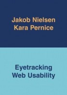
Time to pick sides: Jakob Nielsen has written an eyetracking book. I can scarcely think of a more divisive pairing: mention either within earshot of a UX aficionado and you’re in for impassioned advocacy or scornful ridicule. Me? I’ll confess both subject and author have left me unconvinced in the past, but I approached Nielsen and co-author Kara Pernice‘s new book with curiosity and as objective an outlook as I could muster.
Eyetracking Web Usability is the outcome of the largest eyetracking study ever undertaken: 1.5 million fixations from 300 participants. Nielsen and Pernice are clearly keen to stress the magnitude and legitimacy of their research. Their test script, posted in full, is well considered and comprehensive, covering a range of tasks representative of real web use.
After a brief recap of eye physiology and saccades, the book begins in earnest with a detailed breakdown of research methods. Findings then stretch across chapters discussing specific web elements in turn: navigation, forms, images and so on. At their best, these chapters reveal flashes of usefulness. A chart of eye fixations versus layout density shows minimal correlation, demonstrating that busy pages simply dilute attention from the most important information. The book also touches on the important role of information scent and microcopy, declaring insightfully that “a link is a promise”.
In typical Nielsen style the text is heavily punctuated by summary boxes. Sadly, it quickly becomes apparent that these make the point just as effectively as the full text. Eyetracking Web Usability is all fat, no meat. Wasted space includes a page on why a 7-point Likert scale is better than a 5-point one, and five pages on male users’ propensity to fixate on dog genitals. The writing, meanwhile, veers from redundant to simply cringeworthy: “Give that Wii a rest, and go prioritise your Web page layout design. You can do it!”
A chapter on adverts (whose raison d‘être is of course to attract the eye) starts promisingly. An ad has a 36% chance of being seen by a user, a figure surprisingly unaffected by user task. However, it soon descends into known generalities: banner blindness and users’ dislike of irrelevant advertising. The chapter encapsulates Eyetracking Web Usability’s main shortcoming. Eyetracking demands specificity: carefully planned tasks on an individual site. Nielsen and Pernice’s 300-person test can only dilute potentially salient points into generalisations that even a novice designer will already know. The conclusions cover ground so well trodden as to be barren.
Despite the authors’ focus on rigour and transparency, serious concerns surround the research methods themselves. Heatmaps from the tests are dated from late 2005. With lab time accounting for five months, the study was therefore complete by summer 2006. Why then was this book not published until the brink of 2010? It is hard to avoid the impression that the results sat untouched for years and were subsequently rushed out in a lull of client work. Eyetracking Web Usability also misses a huge opportunity by focusing solely on informational websites. Web apps are discounted since eyetracking can’t handle dynamic elements, including Ajax and even dropdowns. The results are thus only valid for an increasingly small part of the UX designer’s 2010 workload.
Most worryingly of all, it seems that the tests were conducted in Internet Explorer 6. Browser choice does not appear to have been offered to users, and where browser chrome is shown (it is stripped in the vast majority of the heatmaps), it is unmistakeably IE6. If this is indeed the case, it nullifies many findings since the primary browser innovation of the 2000s – the tab – is unavailable. In IE6 a link is an entirely binary choice: go there, or stay here. Modern browsers allow an important new behaviour: Open In New Tab, creating tentative and plural navigation steps. It’s likely Nielsen’s participants relied far more on the Back button and their short-term memory than today’s users. Their search engine use is also likely to be different, since IE6 lacks an inbuilt search box in the UI.
Eyetracking Web Usability thus lacks the rigour required to be taken seriously as an empirical work; however, its adherence to factual reportage make it a chore to read. Even the most ardent enthusiast will skip over paragraphs that merely disclose participant actions in minute detail. It’s sixth form science at best; utterly literal, over-eager for the praise of the adjudicators. The effect is exacerbated by the disappointingly scant acknowledgment of others’ work. Few external insights or breakthroughs are admitted, although NN/g reports are of course suggested as ways for the reader to supplement his knowledge.
The book’s conclusion will come as no surprise to the reader. “Eyetracking fills in the details… Most companies should not bother conducting their own eyetracking studies.” It is hard to disagree. The book does nothing for the eyetracking industry except cement its status as an expensive diversion; the excessive cover price of £44 only reinforces this. If this is the accumulated wisdom of the largest eyetracking survey in history, we can safely consider the technology inconsequential.
Remember those design principles you learned ten years ago? Eyetracking shows they’re right. Carry on.
Looking back, looking forward
2009 has been kind.
2009 has been kind.
Professionally it’s been unsurpassed, despite the recession. Clearleft have grown to double figures, moved into a studio with decent wallspace, produced some great work, run two successful conferences and were humbled to be voted Agency Of The Year in the .net awards.
(Personally, I nominate UXCampLondon, Cardiff v Arsenal away and various ATPs, weddings and zombie crawls as additional highlights.)
As the office winds down, colleagues jet off overseas and lunches linger into the afternoon, thoughts turn to gifts and time off. Since I opt out of the commercial trappings of the season, I’ve chosen this year to make my annual donation to WWF and Reprieve, two fantastic clients I’ve worked with this year. I’ll be spending a unique Christmas on a military base. In lieu of ubiquitous WiFi, it’ll be an opportunity to spend time with family, read, write and get my breath back.
2010 will be a year of abundance – and the first casualty, sadly, will be my carbon footprint. I have three speaking gigs booked so far (South by Southwest, the IA Summit and UX London) and as a punter I’m hoping to grab a seat at Paris’s Content Strategy Forum, Berlin’s UXCampEurope and New York’s Design for Conversion. But of course 2010 is likely to be dominated by the book. Emails are a-flying and chapters are a-forming. More on that soon.
Thanks for sharing this year with me and here’s to the next one! Merry Christmas.
{PS. It’s also the done thing to list your favourite albums of the decade. In no order, I’ll throw out Michigan, Tarot Sport, Change, Turn On The Bright Lights and Leaves Turn Inside You.}
I blame the designer
In which Cennydd has a downright sense of humour failure over a silly web comic.
[In which Cennydd has a downright sense of humour failure over a silly web comic.]
Here’s an excerpt of a comic that recently did the rounds in the web design community.
You know what? I’m tired of this attitude.
Clients From Hell is admittedly pretty funny. Sometimes clients say stupid things; but hey, so do designers. I’ve said lots of them myself. But this sort of thing is different. It’s not an amusingly misguided email. Rather, it epitomises a harmful arrogance and entitlement that pervades the design community. It carries a bitter subtext that clients are idiots with no design skill, and it’s a designer’s duty to disempower them by any means possible.
And I’m tired of it. Of course clients aren’t skilled designers; that’s why they had the foresight to hire us. But you know what? They know business. They’re as passionate, committed and talented as anyone. Many of them put their livelihoods on the line to make the web happen. And let’s be blunt: they also pay our salaries.
If a web design project goes to hell this way, I usually blame the designer. He wasn’t skillful enough to make the situation work. He didn’t provide the force of argument required, couldn’t handle the politics, or couldn’t convince the client of the value of good design. On the rare occasion when the relationship with a client goes entirely rotten, the designer should end the relationship gracefully rather than passive-aggressively working to rule.
Unconvinced? I suggest you read Scott McCloud’s excellent post about criticism and the equally insightful comment from Mike L:
“The most common misconception about criticism is that one has to be on a similar skill level as the creator in order to have a valid opinion. I read stuff from many different artists from many different disciplines who cannot abide ramblings of people that couldn’t compete with them in some way. If said person is not an artist, their opinion doesn’t matter. But isn’t art, all art about communication? And who is the artist generally trying to communicate with? … My #1 critic is someone who cannot draw at all. He tells me things I can’t see because I overthink them as an artist.”
(Oh, and here’s what ‘pop’ means.)
Statistical significance & other A/B pitfalls
It’s logical and laudable that designers should seek data in our quest for verifiability and return on investment. But data must be handled with care, and mathematical rigour isn’t a common part of a designer’s repertoire.

Photo by snellgrove.
Last week I tossed a coin a hundred times. 49 heads. Then I changed into a red t-shirt and tossed the same coin another hundred times. 51 heads. From this, I conclude that wearing a red shirt gives a 4.1% increase in conversion in throwing heads.
A ridiculous experiment (yes, I really did it) with a ridiculous conclusion, yet I sometimes see similarly unreliable analysis in A/B testing.
It’s logical and laudable that designers should seek data in our quest for verifiability and return on investment. But data must be handled with care, and mathematical rigour isn’t a common part of a designer’s repertoire.
Here’s an example from ABTests.com, a worthwhile project that I feel slightly bad to pick on.
The two versions are subtly different:
- Version A: Upload button bold, Convert button bold, Convert button has a right arrow
- Version B: All buttons regular weight, no right arrow on Convert button
Although minor changes can cause major surprises, I wouldn’t expect these small differences to improve the form’s usability. With the caveat that I don’t know the users or product, I’d even speculate that Version B could perform worse since it reduces the priority of the calls to action and removes the signifier of progression.
The designer claims that version B showed a 30.4% conversion improvement in an A/B test. Here’s why this isn’t quite accurate.
The role of chance
Any A/B test is a trial, so called because we’re observing evidence gained by trying something out. I can never truly know that there’s a 50% chance of a coin landing as a head or a tail – I can only run trials and observe the evidence. Similarly, we can never truly know that a design leads to higher conversion – we can only run trials and observe the evidence. If that empirical evidence is strong enough, we conclude that the design is an improvement. If not, we don’t.
To be valid, trials need to be sufficiently large. By tossing my coin 100 or 1000 times I reduce the influence of chance, but even then I’ll still get slightly different results with each trial. Similarly, a design may have 27.5% conversion on Monday, 31.3% on Tuesday and 26.0% on Wednesday. This random variation should always be the first cause considered of any change in observed results.
The null hypothesis
Statisticians use something called a null hypothesis to account for this possibility. The null hypothesis for the A/B test above might be something like this:
The difference in conversion between Version A and Version B is caused by random variation.
It’s then the job of the trial to disprove the null hypothesis. If it does, we can adopt the alternative explanation:
The difference in conversion between Version A and Version B is caused by the design differences between the two.
To determine whether we can reject the null hypothesis, we use certain mathematical equations to calculate the likelihood that the observed variation could be caused by chance. These equations are beyond the scope of this post but include Student’s t test, χ-squared and ANOVA (Wikipedia links given for the eager). Here’s a site that does the calculations for you, assuming a standard A/B conversion test with a clear Yes or No outcome.
Statistical significance
If the arithmetic shows that the likelihood of the result being random is very small (usually below 5%), we reject the null hypothesis. In effect we’re saying “it’s very unlikely that this result is down to chance. Instead, it’s probably caused by the change we introduced” – in which case we say the results are statistically significant. Note that we still can’t guarantee that this is the right interpretation – significance is about proof only beyond reasonable doubt.
Running the calculations on the above data shows that the results aren’t statistically significant: the evidence isn’t strong enough to reject the null hypothesis that the difference in conversion is simply down to luck. The main problem is the small sample size (128 and 108 users respectively), so I would advise the designer, Johann, to repeat the test with more users. Assuming the observed conversions seen didn’t change (a big assumption) a sample size of approximately 200 users per variant should be sufficient for significance. He could then either reject the null hypothesis or the results would remain inconclusive, in which case there’s no evidence the design has made a difference. In Johann’s defence, he recently posted that he takes the point about significance, and I’m looking forward to seeing more conclusive data for this intriguing test.
Percentage confusion
Significance isn’t the only slippery problem A/B tests face. For starters, quoting conversion improvements is always fraught with difficulty. Since conversion is usually measured in percentages (in this example, 31.3% and 40.7%) there are two ways to quote improvements. We can say that conversions increased by:
- 9.4% – the difference between the two
- 30.4% – the amount that 40.7% is bigger than 31.3%*
Any percentage improvement quoted in isolation should be challenged: which of these two calculations has been used? It’s dangerously easy to assume the wrong figure without sufficient context.
The A/B death spiral
A/B tests also suffer from a common quantitative problem, in that they tell us what but not why. I’ve written about this previously in What if the design gods forsake us. It’s wise to back up numerical tests with qualitative evaluation (eg. a guerrilla usability test) so we can make informed decisions if data suggests we need to rethink a design.
Even with backup, sometimes A/B tests are simply the wrong tool for the job. They can provide powerful insight in some cases, but in the wrong place they can be a blind alley or, worse, a weapon of disempowerment. Logical positivism and design don’t mix – not everything we do can be empirically verified – yet some businesses fall back on A/B testing in lieu of genuine design thinking. I call this the “A/B death spiral”, and it plays out something like this:
Designer: Here’s a new design for this screen. You’ll see it has a new navigation style, tweaked colour palette and I’ve moved the main interactions to a tabbed area.
Product owner: Wow, those are pretty big changes for such a high-risk screen. I tell you what: let’s test them individually to see which of these changes works and which doesn’t…
As the proverb suggests, sometimes you can’t jump a twenty foot chasm in two ten foot leaps. Cherry-picking only those design elements that are “proven” by an A/B test can be a route to fragmented, incoherent design. It may earn marginally more money in the short term, but it becomes hard to avoid a descent into poor UX and the long-term harm this causes.
Being faithful to data
Given the potential hazards, I’m concerned about the naïveté with which some designers approach quantitative testing. The world of statistics rewards an honest search for the truth, not dilettantism, and I’d advise any designer moving in statistical circles to pick up some basic stats theory, or at least partner with someone knowledgeable.
A flawed A/B test, be it statistically insignificant, misapplied or misquoted, is nothing more than anecdotal evidence. It’s the same crime as making a website red on the feedback of one user. Yet an impatient designer, seeing the example I quoted above, could quickly jump to a false conclusion: “I should remove arrows from continue buttons: it’s 30.4% better.” Perhaps this designer deserves what he gets. It’s likely he’s only really interested in shortcuts to good UX, and linkbait lists of “Twelve ways to make your site more usable.” Since he understands neither the mathematics nor the context of this trial (timescales, userbase, surrounding task) he will inevitably grab the wrong end of the stick. Nonetheless, he is out there.
Don’t let yourself be that designer.
* subject to rounding
Q&A: getting into user experience
It’s not that surprising to find that a room of similarly qualified students share similar concerns. What’s more interesting is that many of them can also help to answer each other’s questions.
For the past few years I’ve given an annual talk at UCL to students of the HCI with Ergonomics M.Sc. It’s always a pleasure to share my questionable world view with impressionable minds, and I look forward to the sessions in much the same way as one secretly enjoys a visit from a drunken uncle.
In an effort to make this year’s session a little more interactive, I pulled out an old Knowledge Management set piece:
- Distribute post-its
- Ask everyone to write one question they wish they knew the answer to (preferably about the topic at hand).
- Stick the post-its on the walls. (It’s surprising how much people group them, despite your invitation to use any of the three free walls)
- Ask everyone to read each post-it.
- If they too want to find out the answer to a question, tell them to mark the post-it with a question mark. If they think they have an answer, mark it with a tick.
It’s not that surprising to find that a room of similarly qualified students share similar concerns. What’s more interesting is that many of them can also help to answer each other’s questions.
The purpose of this exercise is of course to show that networking and collaborating is valuable, and not just a case of awkward conversation and limp handshakes. However, having made this slightly facile point, I realised that most of the posted questions were damn smart and deserved to be shared more broadly. So here are a few that were particularly interesting, and some proposed answers from myself.
Is the graphic design of a site more important than usability when initially attracting users to the site?
I say yes. Research shows users form an opinion on the credibility of a site within milliseconds of visiting it. To form a valid opinion on usability takes use, which may not happen if those impressions are negative. However, the line between the two is of course blurred, and a site can successfully convey usability through layout, visual design and information hierarchy. There are plenty of other factors that have an impact too: load times, content and proposition spring to mind.
How many hours do you work a week?
Define “work”. I’m paid for 37 hours, and most of that is spent on billable client work. But add in commuting, writing articles and conference talks, mentoring, and reading about my field and it would exceed 60. Yes, I’m aware that’s a little unhealthy. Good thing I enjoy it.
What’s the most useless skill you think we’ll learn from this course?
Probably rifling through academic papers to find an authoritative source that proves or disproves a detailed HCI argument. Truth is, not many people in industry will care. It’s more important to judge the the problem at hand and make the right design decisions based on context. HCI theory can give a strong advantage here, but you’ll need to state your case with something more real: usually how your client will make more money by following your advice.
How much do you get paid?
Not telling. But here are some approximate London figures: £25,000 is fair for a graduate-level position, rising to £35–40,000 with a couple of years of experience. Senior people should be looking at £60,000 and up (seven years and above, probably managerial responsibility). Freelance rates typically range between £275-£400/day.
What are the best design tools in HCI?
Thinking, conversation, sketching, software. In that order.
Can you be a good UX designer and a good programmer at the same time?
You can be good at both, yes. But who wants to be just good? Deep specialists tend to better than jacks-of-all-trades, and only extremely rare superheroes can be world class at both. I do, however, strongly recommend that all designers learn to code to a reasonable standard, and that all developers learn the fundamentals of design. Speaking each other’s language is the easiest way to ensure good designer-developer relationships, and one of the easiest ways to become substantially better at your job in a short time.
Do you need to draw well / be arty to be a user experience designer?
Some drawing talent helps, but sketching well is a skill that can be learned and that comes with practice. Its main value is when communicating with clients – a well-crafted sketch can simply convey more information than a poor one. However, it’s more important to develop a designer’s mindset. As Jason Santa Maria says, “sketchbooks are not about being a good artist, they’re about being a good thinker.”
EuroIA 09 in review
This sense of mutual destiny – two nations connected by a single structure – feels entirely European. EuroIA was similarly interwoven with shared experiences of linguistically awkward networking and untold cultural unity.
It’s important to accrue tactics to cope with the disruption of travelling. Quick currency conversions, self-conscious squints at unfamiliar coins, departure lounge distractions (ask Alain de Botton). In Scandinavia, I’ve learned to open clearly with “Hello” to announce myself as a foreigner, since the local salutation “Hej” is a homophone with informal English equivalents.
Copenhagen, site of EuroIA 2009, and Malmö, where my evening sofa awaited, share more than greetings, efficiency and cost of living. They are joined by the 7.8km Öresund Bridge, a zoetrope giving glimpses of distant wind turbines in the water.
This sense of mutual destiny – two nations connected by a single structure – feels entirely European. EuroIA was similarly interwoven with shared experiences of linguistically awkward networking and untold cultural unity. The sessions ranged from poor to intriguing (I’m still no fan of the blind review process) but there was something of a BarCamp atmosphere of willing each other to succeed. EuroIA is a gathering of the underdogs, feisty and proud, and it doesn’t have to be the way they write it in the States.
I particularly enjoyed Joe Lamantia‘s peek into the architecture of fun, Sylvie Daumal‘s struggle for acceptance in a hostile environment, and Andrea Resmini‘s intricate analysis of how IA can bridge the real and digital worlds. Perhaps it was a shame that these sessions were book-ended by an American keynote and closer. Their sessions were undoubtedly interesting, but I hope to see a European presence in these elevated slots next year.
My talk The Future Of Wayfinding seemed to be well received. The topic fitted well with the conference theme of Beyond Structure. Topics such as the Semantic Web, ubiquitous computing and what I can only clumsily label ‘unhierarchy’ were prevalent, and I fully expect them to be reflected in next spring’s US circuit.
Next year we visit Paris, capital of a country almost entirely oblivious to user experience work. It seems we Europeans really do pull together in the face of a challenge.
dConstruct 09 in review
At its best, the fifth dConstruct was simply outstanding. In its rare low points, it disappointed. As such, it’s at a crossroads.
‘After you build forty or fifty websites there really isn’t any magic in it.’
dConstruct’s comfortable niche as the thinking person’s web conference was quickly disrupted by Adam Greenfield’s early remarks. Decrying web and UX design is a risky strategy in a room made largely of web designers and developers, yet it was a thought entirely consistent with our theme of Designing For Tomorrow. The phrase wrapped topics that have been of recent interest to us Clearlefties: ubicomp, gestural interfaces, networked devices and what lies beyond our familiar digital horizons.
Adam led us into a world where information is omnipresent and persistent, where actions stick to identities and the presentation of self is a largely forgotten luxury. A world where objects become services, shared not owned, implies a post-capitalist swing perhaps alluded to by recent economic events. As a recent and voracious reader of Everyware, I was thrilled by Adam’s talk. I’m sure the imminent podcast will reward careful re-evaluation.
Mike Migurksi provided a practical counterpoint with a case history of Stamen’s information design work, with subsequent colour commentary by Ben Cerveny. Ben’s dense, rapid idea stream was perhaps a step too far after such an analytical opening; although Stamen’s work is undeniably excellent, many felt a gap between the metaphysics and the design output, and some of Ben’s more elaborate statements seemed hard to grasp.
Brian Fling explored the mobile field with characteristic flair and pace. Focusing on the future lives of the post-millenials native to the digital age, Brian proposed that history will judge the mobile (and the iPhone in particular) as the flying car we have been waiting for. We are living through a second industrial revolution, based on the portable, personal power of bringing people closer through technology.
Next up, an elaborate Gaia theory of sci-fi and interaction from Nathan Shedroff and Chris Noessel. In an entertaining presentation, the over-used Minority Report example was only (multi)touched upon once, and Jurassic Park’s ridiculous UNIX scene was rightly used for cheap laughs. Of particular interest was the pair’s evidence that anthropomorphism can exist at non-visual levels (consider R2D2’s bleeps and Amazon 1-click servant), although, like Ben before, some other claims seemed rather hazier.
Robin Hunicke, known for her work on “the Maslow’s Hierarchy game known as The Sims”, unfortunately alienated her audience with a spoiler (albeit well meaning) for a film still on general release, and struggled to recover favour. Her West Coast bubbliness sat awkwardly at odds with her academic subject matter, which was coincidentally recapped by August De Los Reyes. Any Microsoft speaker knows he has an uphill battle to win over a sceptical audience; fortunately August’s self-deprecating humour was an instant hit. We imbue objects with intelligence (slide rules, other technological tools), so why not emotion too? Heartbroken families insist on the repair, not replacement, of their Roombas – can we conjure similarly powerful dynamics in the systems we create? August closed with Office Labs’ concept video, a surprisingly rousing vision that raised hairs on necks across the Dome.
The stage was set for a wonderful denouement from Russell Davies, who produced a performance straight from the traditions of British music hall. Russell predicted that digital buildings will give us “Blade Runner brought to you by the makers of Cillit Bang”, and that as technology matures the only way we will escape cliché is to redomain, appropriating ideas from other fields. Russell provided a marvellous reminder that, despite the intelligent contributions of the day, as an industry we are prone to hubris. We’d be daft to disregard the marvellous infrastructure our media predecessors have created.
At its best, the fifth dConstruct was simply outstanding. In its rare low points, it disappointed. As such, it’s at a crossroads. The trend has certainly been cerebral, and this year’s theme certainly encouraged abstract exploration. Early feedback says our audience is happy with this, and that the differentiation from other conferences is an important part of dConstruct’s appeal. Yet there’s always a danger of vanishing into pretension, and the conference must of course appeal to 700+ attendees.
I’m sure Clearleft won’t be taking any snap decisions. dConstruct has become part of the fabric of our company and hopefully the annual schedule, and, in line with our chosen theme for the year, we’ll be thinking carefully about what happens next. I’d love to hear your thoughts on the day and your preferred direction for dConstruct 2010.
Photos: Matt Biddulph, FriiSpray, Tom Jenkins.
Sweating the small stuff
Outrage. Ikea recently switched corporate typeface, moving from Futura to Verdana across all their marketing, including their printed catalogue and ads.
Outrage. Ikea recently switched corporate typeface, moving from Futura to Verdana across all their marketing, including their printed catalogue and ads.

To typography enthusiasts, this is like Mozart announcing a kazoo concerto. Futura is a type classic, skilfully designed by a master craftsman and demonstrating real artistry. It’s excellent for distinctive identity and brand work – so much so that Ikea had practically made it their own until now.
Verdana was created to act as body text on low resolution computer monitors. And it’s well designed for that purpose, but it doesn’t suit print work or any size above petite. At large sizes it looks plain fugly, with characters that appear juvenile at best. Use of Verdana in this way definitely constitutes bad typography.
The slight is all the greater coming from a company that has, to an extent, brought design into the lives of many people who previously believed it was the domain of turtlenecked pseuds.
Ikea’s reason was ostensibly to ensure consistent use of fonts across web and print platforms, and to ensure global compatibility across all languages. A strange choice, given that Verdana has notable deficiencies in its character set. However, it’s possible that Ikea isn’t as naive as we think. My colleague Paul Lloyd hypothesises that the switch is a deliberate ploy to make the company appear less expensive. It’s an old strategy: cheapen the aesthetic and the perception of price goes down. Plausible, at least.
By all means we can point, laugh and lament the lack of design skill at the company. However, some of the outrage has been ridiculous, particularly since we can never truly know the reasons behind the choice. Hell, there’s even a petition to reverse the change.
I believe that if companies make bad design choices that’s their prerogative. If I worked for Ikea, I would have fought tooth and nail to dissuade them from this choice – but no, I won’t sign a petition. Let them eat cake, and if design is as important as we say it is, the market will prove their mistake.
Herein lies my bemusement at the design community’s reaction. Behind the indignation, does any of us really believe that this typographic gaffe will affect Ikea’s sales? Is it really as egregious an error as we make out? Or are we merely acting out the stereotype designers fight so hard to shake off: the aforementioned turtlenecked pseud complaining that their soup isn’t hot enough?
Typography matters. Used well, it can elevate communication in astonishing ways. But, asAegir points out, there are bigger design challenges facing Ikea and indeed the global manufacturing industry than choice of corporate typeface.
Design is about sweating the big stuff; hopefully even changing the world. Often that involves the small stuff too, but focus solely on the trivia and it’s hard to avoid becoming trivial yourself.