The year gone by
Please indulge me for the customary year-end contemplation.
Please indulge me for the customary year-end contemplation.
I’ve recently returned from a family break in Cornwall; a chance to repay my sleep debt, help around the house, and rediscover the warmth of a novel. In quiet moments I watched a fox inch across the garden, wagtails bounce on the patio, acrobatic squirrels wrap their haunches around the bird feeder. Seems I’m becoming more sentimental about the natural world as I get older.
The break was also a chance to take stock of a dizzying year. Although 2010 has been fruitful, burnout has stalked me like a shadow. I can’t sustain the tempo, so next year’s themes will be enjoyment, travel, and the opportunity to breathe the air.
I’m keen to do more public speaking and have a few gigs already lined up, not least the plenary. I also want to write more. This year I’ve been seduced by the romance of the written word—and experienced its occasional drudgery—and I now regard myself as both a designer and a writer. Design will always be my passion and pay my bills, but next year I hope to broaden my writing horizons and scratch out whatever reward I can earn. I’m not yet ready to write another book, but please bear me in mind if you have any suitable projects.
Finally, I must confess that it’s been a year of maturation. I’ve learned a lot about the humbling experience of having an audience. I’ve surprised myself with my determination and occasional temper. But above all, I’ve found that my love for what I do is stronger than ever. And for that, I’m truly thankful.
See you next year.
Behaviour change
Evidence that, despite my scepticism, there’s something in this technology-as-behaviour-change-catalyst argument.
Here’s a graph showing how many articles I’ve saved to Delicious each day since 1 July (moving average). My Kindle arrived on 22 September. Evidence that, despite my scepticism, there’s something in this technology-as-behaviour-change-catalyst argument.

On UX and advertising
Can UX designers make a difference in the advertising field? Possibly. But I see it as a a quixotic endeavour, swimming against the tide of a value system that frequently causes the disempowerment of the user.
Peter Merholz’s rant The Pernicious Effects of Advertising and Marketing Agencies Trying To Deliver User Experience Design is bold, uncomfortable and dogmatic, as all rants should be. I too have been thinking hard about the role of UX in advertising and, reaching similar conclusions, rushed to slap Peter’s back. However, my comments were somewhat splenetic after a difficult week, and after some time to think (and yes, to feel some of the sting of the backlash too), I’d like to make a more reasoned case for the offense.
I’ve never worked in an ad agency. However, I’ve mentored and befriended enough designers in the industry to recognise many of the patterns that Peter condemns. Harmful practices such as spec work, bait and switch, and employee exploitation pervade a worrying proportion of the agency world. So the post is a heavy punch, but a fair one. And I’m glad that, ignoring a few blow-the-belt blows, the critical reaction has been constructive. Most of it, of course, comes from ad agency designers who feel hurt by the article. They have fought their corner and accused Peter of tarring all agencies with the same brush. It’s a fair counter, but to shrug our shoulders and blame the other guy doesn’t make the smell disappear.
Are all ad agencies “soulless holes”? No, but some certainly are. Can UX designers make a difference in the advertising field? Possibly. But I see it as a a quixotic endeavour, swimming against the tide of a value system that frequently causes the disempowerment of the user. So I stand by my comment that a UX designer at an ad agency is an oxymoron. I have never made a “campaign site”. Nor will I, particularly after this post. To me, user-centred design must have higher aims, and I don’t understand how a UX designer can be excited or rewarded working on advertising projects.
And this, to me, is the crux of the debate. Peter’s post is an ideological gambit, and an old one at that: First Things First for the next generation. The debate was, and is, unwinnable as it revolves around sacrosanct personal values. Those who subscribe to the worldview that “advertising as it is widely practiced is an inherently unethical and, frankly, poisonous endeavor” (for the avoidance of doubt, clearly I do – but note my italicisation) will approve of Peter’s stance. Others won’t.
So far, so idealistic, and I know well that my belief in turning design toward The World’s Big Problems will be seen as naive or elitist. But just because an argument is unwinnable it doesn’t mean it’s not worth having. Difficult, scary questions lie beneath the surface of the post, although for some readers the aggressive language caused those questions to be lost in the froth. How do we come to terms with the fact that a wide range of organisations now practise (or claim to practise) user experience design? How will this affect the perceived value of our work? Does user-centred design contain values that conflict with a capitalist society? How do we decide which projects are most worthy of our attention, and is it right for designers to play the role of ethical judiciary?
These are questions that truly matter in our industry, and I hope the conversation can move beyond personal affront and politics. If it can, then I think Peter’s role as agent provocateur will have been worthwhile, whatever your feelings about his comments.
Update: Peter’s followup post.
Closing the IA Summit 2011
Several weeks ago, I opened a late-night email from Livia Labate, the IA Summit conference chair. I responded with blinking disbelief, the sort you get upon learning you were raised by wolves.

Finally, I can reveal that I’ll be giving the closing plenary at the 2011 IA Summit in Denver, Colorado.
Several weeks ago, I opened a late-night email from Livia Labate, the IA Summit conference chair. I responded with blinking disbelief, the sort you get upon learning you were raised by wolves.
Needless to say, to give the closing plenary is both an immense honour and surprise. Sure, I write a lot and talk a bit, but my achievements pale in comparison to those of my illustrious predecessors: Andrew Dillon, Peter Merholz, Rashmi Sinha, Andrew Hinton, Jesse James Garett and Whitney Hess. So for weeks now I’ve been thinking hard about what I can bring to the role, researching and synthesising the topics that truly matter in user experience today.
One noteworthy point is that, as far as I can tell, I will be the first non-American to give either a closing plenary or the opening keynote at the IA Summit. I see this as a tribute to the growth of the European and British UX communities, and I’ll certainly be using this opportunity to discuss the realities and implications of global practice.
Wherever you hail from, I’d be delighted if you’d like to join me at the IA Summit. There are ten days left to submit a proposal, and successful presenters receive a complimentary ticket. But it’s not just about the sessions. The IA Summit is about community, putting names to faces, and learning from the wisdom of others. I’m thrilled to be a part of its history.
End hover abuse now
All around the web, hover states are being abused, and only you can put a stop to it.

All around the web, hover states are being abused. Let’s put a stop to it.
Whatever a mouse user is doing, they are perpetually hovering. They may be hovering over a specific control, or over several places in the course of another action: dragging a scrollbar, selecting a word, even just idling around the screen. But until they click, the user has taken no positive action. A click is unambiguous: the caveman pointing at the mammoth, the dog scratching at the door to go out. It cannot be done in the course of anything else.
Hover states can provide subtle visual cues that help the user understand how something works. A faint glow around a “favourite” star. An underline appearing underneath a link. But they should not be used for anything else. Hovering does not demonstrate intent.
Designers who pop up information panels or move page elements on hover are using flawed logic, second-guessing what users want to do before they do it. The result, which I’ve seen in countless usability tests, is that users activate these controls accidentally. You know what happens? People actually flinch: “What was that?” They return with hesitation, less confident in their understanding of the site. It’s no accident that the Twitter worm propagated through hover—accidental activation meant users spread the worm unintentionally.
You may argue that hover states save space, and you can use hover panels to display supplementary information that helps the user know whether to click. It’s a feeble excuse. If the information is important, it should be on the screen already; if not, it should be omitted. The hover compromise shows only that you were too timid to make this decision.
Another compelling reason not to hide information behind hover is that you can’t rely on hover states even existing. The approach prioritises just one mode of input—the mouse—and makes information unavailable to people using keyboards, touchscreens and screenreaders. That’s not what your parents taught you.
Please, do your part. End hover abuse now.
Addendum: If you positively have to use hover popups, at least add a delay so they only activate if the user hovers for >500ms. It’s still no guarantee of intent, but it makes it a more likely probability.
Instapaper & the Kindle
For now, my Kindle has found its niche just serving me Instapaper articles. Sure, the integration is hacky, but it comes with an odd curatorial satisfaction, just like loading the iPod in the old days.
Instapaper is where best intentions go to die.
Don’t get me wrong: it’s a fine service. But its simplicity predestines it to serve as a final resting place for the written word. While the iPhone app is pleasant enough for grouting the quieter moments of my day, reading is still a pokey experience. Instead, I typically succumb to games or email, the weight of words growing heavier until shamefully purged.
So I bought a Kindle.
Some technophiles scoff at single-purpose devices. No features! Get an iPad instead! And yes, the Kindle is a limited beast. A laughable browser. Prehistoric syncing. Awkward interaction design. But the reading experience is generally good, and this is why the Kindle is an interesting device. The e-ink display makes long articles a pleasure to read—which is fortunate, because of course there’s nothing else to do. The Kindle allows no access to the black hole of email, games or social networking, much to its benefit.
That’s not to say I’m entirely sold on the Kindle ecosystem. I’m still unconvinced by the idea of buying books in Kindle format, due to DRM and my reluctance to only license something that I ought to own. For now, my Kindle has found its niche just serving me Instapaper articles. Sure, the integration is hacky, but it comes with an odd curatorial satisfaction, just like loading the iPod in the old days.
With my enforced RSI breaks adding up, I’m devouring upward of twenty articles a day (Dan Saffer’s list of canonical interaction design articles has provided ample food for thought). Between them, the Kindle and Instapaper have exposed me to a host of fresh perspectives—and that’s surely among the highest praise technology can earn.
Undercover UX Design out now
At last, the book’s rolled off the printers and is in stock at all good online bookshops.

At last, the book’s rolled off the printers and is in stock at all good online bookshops. You can now buy the paperback on Amazon UK for £11 or Amazon US for $20. If digital formats are more your thing, it’s also available on Kindle: Kindle UK (£10) or Kindle US ($16). An ePub version (for iPad etc) is also in the works, release date TBC.
We’ve given interviews for UX Booth and Scrunchup about the book, and there’s a short excerpt Winning a user experience debate on UX Booth too. Early reactions have been very positive, and sales have been brisk, so we’re pleased with the end result. I’ve been particularly humbled to see so many friends and colleagues industry grab a copy. That said, Undercover User Experience Design isn’t really a book for the senior conference-going elite. If you’re a junior-to-mid UX professional, or a developer/designer/etc looking to introduce user-centred ideas into your business, UUXD should be right up your street.
Finally, if you’ve read and enjoyed the book, please do consider leaving a review on Amazon. It makes a huge difference, and we’d be very grateful.
The heat death of the digital universe
Digital environments undergo an aging process more aggressive than mere erosion. This aging is not caused by the degradation of the environment, which stays as faithfully preserved as at its creation. Instead, the value of our digital worlds is eroded by relative decrepitude
For a while, I was a Final Fantasy XI addict. My equipment was top-notch, my White Mage and Bard fully levelled, and I could navigate Vana’diel better than my hometown. As an officer in a successful “linkshell”, I endured and mediated the drama that competitive internet anonymity creates, and made some good friends along the way. I even shifted my body clock for a week to complete the infamous Chains of Promathia missions with my East Coast buddies. However, the urge to spend time on other pursuits—namely design—eventually grew too strong, and in 2005 I donated my precious equipment, embarked on a suicidal tour of the game’s most difficult foes, and logged off for the final time.
Last month, unable to suppress my curiosity, I briefly rejoined FFXI.
Although the game’s mechanics are largely unchanged, the designers have given belated thought to the beginners’ experience. The fearsome learning curve has been softened thanks to a tutorial, benevolent sprites to help newbies in distress and new trials to allow players to gain their first few levels quickly. No doubt spurred by customer retention metrics, the game’s designers have tried to create a more enjoyable newcomer experience.
Their attempts have failed.
Designers of MMOs (massively multiplayer online games) provide the game mechanics such as the architecture of the game world, the appearance and behaviour of enemies, and rules for movement and combat. But the primary architecture of an MMO is social. While game design provides the initial impetus to explore and level up, the thirst for experience points soon dries up without social context. FFXI’s original design acknowledges this, and encourages player collaboration by rewarding efficient party-based levelling. Thus a new player is quickly thrown into a social world, meeting other players with whom they can explore team-based missions and, finally, “endgame” content such as defeating Notorious Monsters. The fundamental premise of player versus AI foe continues all the way to the highest levels, but teamwork is essential at all times. Even the endgame reward system is socialised, as many boss battles only reward players with raw materials that must then be synthesised by another player. Value is created largely by users—all the game designers can do is trickle currency and items into the system and watch as they are bought, sold and reconfigured. The game outside of combat becomes largely an exercise of socioeconomics and commerce, with markets rife with inflation and deflation, supply and demand, and sharing of resources among clans and friends.
Although there is intrinsic reward in defeating a formidable opponent, social capital is the driving force in endgame play. Defeating Notorious Monsters grants players a title visible to all. Members of exclusive endgame linkshells, who hunt these monsters, wear their allegiance like a badge of honour. Even altruistic acts like raising fallen colleagues help to build reputation in the eyes of others.
In 2005, I was part of this world of interaction, rivalry and friendship. But almost all of my friends have now quit FFXI (endgame play tries your patience after a while), meaning this social incentive is missing from the game today. The shared exploration of the early days—such as being the first on our server to discover, and quixotically attack, Cerberus—has long gone.
FFXI is now a lonely experience for the new player. Experienced players hang around in ever-expanding high-level areas, where they can mingle with players of equal experience and trade endgame equipment. As a lowly level 14 character, these areas were off-limits. I was never once invited to join a levelling party and, since I kept my elite history concealed, established players assumed I had little of value to tell them. Instead of a social experience—a community bonding around the rules of the game—FFXI now feels joyless and isolated. For all their attempts to improve the newcomer’s experience of the game itself, the designers can do little to improve the social experience.
Virtual worlds in their dotage
Square Enix won’t want to lose the revenue from a relatively successful game, and have just appointed a new director to guide the game’s future development. But with a sequel just days away, new players are no longer the focus, minor gestures aside. Instead, the designers will continue to support the endgame activities of their existing, committed userbase. The time investment and social capital these players have built up will mean some keep their accounts, but many FFXI players will soon migrate to the sequel. I expect that FFXI will therefore implode in the foreseeable future. As resources are poured into the sequel, development of new content will cease, and eventually the maintenance costs will exceed revenue. Vana’diel will die, taking with it the memories and stories that took place within its territories.
(If a tree falls in an uninhabited digital forest, does it play a sound file?)
FFXI has had remarkable longevity, but the game is no longer fit for new players. In concentrating on endgame activity, the designers have (perhaps deliberately) caused the social architectures around low-level play to vanish. Where new players once experienced a rich world of social value, economics and interaction, they are now left with a mere game of player against environment.
Digital environments undergo an ageing process more aggressive than mere erosion. This ageing is not caused by the degradation of the environment, which stays as faithfully preserved as at its creation. Instead, the value of our digital worlds is eroded by relative decrepitude. Our games, our websites, our interfaces are soon rendered obsolete by more fully-realised alternatives. Final Fantasy XI loses to Final Fantasy XIV. MySpace loses to Facebook. The lure of the new feature set, the redesign, the higher polygon count is hard to resist. The death of our digital environments—websites, MMOs, operating systems—is inevitable. Entropy always wins.
Perhaps nostalgic sentimentality has no place in our futurist outlook, but in our eagerness to create the new we should consider the human experiences that lie within the walls of our antiquated structures. Designing to conserve experience, perhaps, is the digital industry’s sustainability challenge.
See also: James Bridle—The Value of Ruins at dConstruct 2010.
UX Brighton 2010 in review
UX Brighton was an enjoyable addition to the conference circuit, although there was much material that, however fascinating, I don’t view as user experience.
If further proof were needed about the strength of the UX industry, yesterday saw 270 attendees crammed into the Sallis Benney Theatre for a largely homegrown UX Brighton lineup.

Opener Eric Reiss channelled Lars von Trier with his own vow of design chastity. In doing so, he urged us to ground innovation in its true purpose of solving problems. Taking aim at some well-known UX targets, Eric bemoaned the fact that his Web Dogma is still as relevant in 2010 as ever.
Claire Rowland offered a fascinating managerial viewpoint on creativity (in spite of technical problems), dispelling myths and instead focusing on the roles of personality and intrinsic/extrinsic motivation in creative work.
Julian Hirst and Graham McAllister showed the application of UX and usability practice to the less publicised areas of B2B service design and games testing, with Graham’s galvanic skin response measurements forming an intriguing (if slightly impractical) measure of user enjoyment of a digital experience. Keeping the focus on research and testing, James Page and Sabrina Mach dismissed lab-based approaches as lacking context, instead pointing the way to remote ethnographic approaches that no doubt include their own.
The day’s theme of Designing for Behaviour paved the way for a strong marketing and advertising focus. Bunnyfoot’s John Dodd pulled the audience into David Ogilvy’s world of communication and research, ending on the ever-controversial eyetracking, while Johnny Holland chief kahuna Jeroen van Geel drew on the field of branding to demonstrate how products and services can become imbued with personality through tone of voice, microcopy and interaction design details. [See Does Technology Need Personality?]
In the light of such a focus on behaviour modification, Harry Brignull’s exposé on the seedy underbelly of Dark Patterns was a welcome adjunct. It was the ethical call to arms I’ve long espoused, and admirably demonstrated the shades of grey that lie between the poles of positive and negative influence. [See Harry’s slides.]
Headliner Rory Sutherland wrapped up eloquently, floating through obliquity, Austrian economics, the torture of weddings and framing in advertising. Putting one-dimensional metrics to the sword, Rory implored us to focus on the intangibles that abound in “cloud-like” human systems that resist numerical analysis. We must “cherish the small things” and focus on the details of experience and value. Rory’s dream of a Minister of Detail, with enormous power but no financial clout, goes sadly unrealised to date.
UX Brighton was an enjoyable addition to the conference circuit, although there was much material that, however fascinating, I don’t view as user experience. Personally I can live without the blunted popular science that abounds in the persuasion marketing field, and I’d be delighted to never again hear of Predictably Sticky Nudge Swans (or whatever it’s called). But this just reflects my personal framing of design, rather than any flaws with this entertaining and promising conference. Kudos to Danny and the team, and here’s to 2011.
The pollution of UX
The UX industry is becoming polluted by dilettantism. It’s no surprise then that people are attacking the field.
It was only a matter of time until our first high-profile discreditation. Whatever anyone may say about the timing of Ryan Carson’s UX Professional Isn’t A Real Job, I saw one clear upside: I could talk with him face to face, far away from the ambiguities and public politics of the web. So I cornered Ryan at the dConstruct party for a lengthy, good-natured, beery chat, in which I stated my case with respect and passion. He conceded some points (such as that Carsonified apps are written for themselves as primary users, negating the need for UX specialism), as did I. I agreed to follow with a written rebuttal.
The post’s misrepresentation of UX is easily refuted: everyone should know how to cook, so why have chefs? The generalist/specialist debate has been replayed in knowledge work for decades, and answered recently by folk smarter than I. But three days later, the rebuttal doesn’t particularly interest me. Nor do I bear Ryan any grudge. Instead, my mind lingers on the painful and disheartening truths behind his post and our discussion.
As I read his tweet, I immediately forsaw the reaction: a hundred angry replies, and a hundred crowing retweets. It confirmed what I have long feared: the UX industry faces a credibility crisis. Victims of our success, we’ve created a rush of interest that has indeed caused some appalling job title inflation. Thousands of mediocre web generalists are now calling themselves UX designers in an effort to gain cash and authority.
The UX industry is becoming polluted by dilettantism. It’s no surprise then that people are attacking the field. We can expect more of it, and there’s a real chance that the fury and division we see in the conversation surrounding Ryan’s post will soon drown out the cause we espouse—designing technology that helps people be productive, empowered, and happy. Our peers are divided, with thousands eager to denounce our work. We have been unable to convince an influential web figure of our value. And this is a real shame since, alongside the flash-in-the-pan opportunists, there are exceptional people in UX who have formed a community of intelligence, generosity and thoughtful action. To see their work and passion decried as quackery makes me tremendously sad.
Perhaps my pessimism is exaggerated by too long in front of a computer and not long enough in front of a cocktail. But I’m disheartened that the cause I’ve dedicated my adult life to is seen as a fradulent landgrab. I worry it’s the beginning of the euphemism treadmill that could leave the UX label permanently damaged
The making of Undercover UX Design
After 200 pages, 50,000 words and over 1000 hours, we’re done. Undercover User Experience Design is now available for pre-order from Amazon UK and Amazon US. It’ll hit the shelves from 17 September.
After 200 pages, 50,000 words and over 1000 hours, we’re done. Undercover User Experience Design is now available for pre-order from Amazon UK and Amazon US. It’ll hit the shelves from 17 September.

The writing process
Writing a book has been the most complex information architecture challenge of my life. The permutations in which you can sculpt, exclude, clarify and link information are staggering. No surprise then that we relied on our familiar design process, heading up the chain of goals, structure, content and surface. We appropriated the tools of our trade: personas, content analysis, user feedback and deep iteration—but it was trial and error that finally unearthed the process that worked for us.
- Research. The scale of the project demanded hundreds of hours of research: absorbing other books and articles, recombining miscellaneous thoughts into coherent patterns. The trick was knowing when to stop. The only way to write the perfect book is first to read every book. We repeatedly had to refocus on our audience and mark tight boundaries around curiosity. Several high-level ideas, although fascinating to us, weren’t relevant for the punchy style of the book.
- Outline. We then turned our scrappy notes into a hierarchical structure with the help of OmniOutliner. Somewhere between a vast card sort and a minimax search; an exhaustive attempt to craft as coherent a flow as possible.
- “Pigeon”. Turning this outline straight into high-quality prose proved too great a step, so first we threw words onto the page without regard for their quality.
- First draft. Only then did we turn this “pigeon” prose into tight writing. Even with this narrow remit, this step challenged our writing skills and patience. We reshuffled and excised enormous swathes of text, while juggling minutiae of definitions and style. Here too we finally cast off our Britishness and accepted dollar signs and American spellings, although we’re proud to say we drew the line at “gotten”.
- Diagrams. Undercover UX Design is printed using two inks—black and the blood-red Pantone 484U—meaning our illustrations could only use these colours. We had to recreate several deliverables from scratch to suit this setup, and spent many hours struggling with the technical requirements of the printers.
- Templating. The first draft then had to go into an awkward Word template for the publisher. Mind-numbing hours of copying, pasting, and style formatting, including smart quotes and other preferred typographical treatment.
- Author review. Our two wonderful editors Wendy and Jacqueline then reviewed our work at both the logical and technical level, and returned corrections in a haze of Track Changes. Most points were minor—grammatical or logical errors we kicked ourselves for not seeing—but even at this stage we found ourselves in deep spirals of “What are we really trying to say here?”. Our response was usually to leave the offending sections on the cutting floor.
- Proof. Finally, we returned the author review and the compositors laid the text and images out in a PDF which we then proof-read alongside the publishers. Proof-reading was impossibly tedious but immensely valuable, giving us the chance to fix clunky phrases and embarrassing typos.
The tools
I relied on the excellent Scrivener throughout, and I can’t recommend it highly enough. It suited my non-linear writing style and its stability is truly impressive. As we worked concurrently on chapters, James and I shared our work with a hacky Dropbox sync. Only once did we overwrite each other’s work. There’s a strong case for a more formal version control system, but the very thought depressed us. Dropbox worked for us, and again I gladly recommend it.
Our other essential tools included Skype, Illustrator, a good thesaurus, and several Stars of the Lid albums. Trial and error again showed me which albums I could successfully listen to while writing. Anything with vocals or strong percussion was out, creating a last.fm-skewing portfolio.
The effort
Everyone knows writing a book is hard, and I won’t play the martyr. But I will say the extent to which my life ground to a halt surprised me. A writer isn’t just an author; he is a project manager, juggling chapters, drafts, reviews, illustrations and copyright releases, as well as personal time and client time. A book is a constant source of ideas, questions, and worry. The pressure made me regress into quasi-adolescent nail-biting and insomnia, and I’m enjoying the quiet return of my regular life.
I was initially advised not to partner with a co-author and not to write a book while in full-time employment. Excellent advice, which we ignored. For six months I’ve been fond of saying “Having a co-author doesn’t mean you each write half a book. You each write a book”. It would have been substantially easier for either James or myself to write this book alone, but without my co-author’s inspiration, efforts and motivation, Undercover UX Design would be a shadow of its final form.
The money
Our financial return from Undercover UX Design will depend of course on sales, but we shan’t end up rich. Tech & design books don’t sell in the quantities required to turn huge profits, and what initially seemed a decent advance was quickly demolished by currency conversion, tax, bank fees, and other costs. Both James and I had to register as self-employed, go through the US tax system with its obscene forms and mandatory trips to the US Embassy, hire an accountant, and so on. As a wage slave all my life, it’s been a major upheaval, but money was never a priority for this project. Royalties will be a happy accident rather than the main reward.
The illustrations
Early on, we decided we wanted to make a book that was slightly different to other tech books. We politely insisted on a 9×6-inch format (rather than New Riders’ customary 9×7) for aesthetic and usability reasons, and commissioned my friend Chris Summerlin to produce chapter illustrations for the book.

He did a spectacular job. The results lie somewhere between Kevin Cornell‘s A List Apart illustrations and The Perry Bible Fellowship, demanding a second or third look before the penny drops. They’re quirky, slightly tangential and wonderfully drawn. We hope our readers will love them as much as we do.
The result
Undercover User Experience Design ended up shorter than expected, mostly thanks to rigorous editing. There’s no wasted space, and the book’s concision is definitely a feature, not a bug. As befits the title, we’ve tried to create a down-to-earth, practical book that avoids the more ponderous tendencies of the field. We’re proud of the results and I’m hopeful UUXD will become an essential guide for people who can’t do UX by the numbers.
It’s too early to say whether writing a book has changed me, but it has certainly sparked further interest in writing. I’ve learned a great deal about making a coherent argument and writing well. My client work is suddenly full of content challenges I never previously saw. I’m no longer frightened to wield an axe on my favourite ideas, and I now see a good editor as the solution to most of the world’s communication problems. (More on that later.)
Now we wait, and hope others will respond well to our work. James and I would be eternally grateful if you could spread the word about Undercover User Experience Design. Please feel free point people at the website or suggest they pre-order on Amazon. (Please use these links so we get a small referral fee per sale: Amazon UK and Amazon US. Note that the RRP is still unconfirmed, so there’s a very good chance the book will end up cheaper. Pre-order now and you’ll get the lowest price available.)
Thanks to everyone who supported us, and we hope you enjoy the book!
On writing
Writing is a jealous lover. Every hour I’m apart from her, she saddles me with guilt. Time is my new currency, a precious gemstone traded on rare occasions.
Writing is a jealous lover. Every hour I’m apart from her, she saddles me with guilt. Time is my new currency, a precious gemstone traded on rare occasions.
Writing is about control. I’ve learned to suppress my florid linguistic tendencies – hence this brief stretching of the legs – and tolerated the cruelties of American English until they became mere indiscretions. I’ve learned that the tyranny of the blank page can only be defeated with words, and that structure is the heart of the battle. I’ve learned to spot ambiguous pronouns at ranges of up to a mile.
Writing is as punishing, as unglamorous, as stressful as any author warns. Would I do it again? Absolutely.
IA Summit 2010 in review
The eleventh IA Summit found strength in reconciliation, but the spirit of free speech still ran strong.
“Graduation is only a few days away and the recruits of Platoon 3092 are salty. They are ready to eat their own guts and ask for seconds. The drill instructors are proud to see that we are growing beyond their control.” – Joker, Full Metal Jacket
“Show me your kill face!” Dan Willis‘s UX Deathmatch encouraged us to unleash the beast within, taking sides in the battle between agency and in-house design. The sparring was sharp but good-spirited, with claws largely sheathed after the scars of 2009.
The eleventh IA Summit found strength in reconciliation, but the spirit of free speech still ran strong. Whitney Hess was the recruit unexpectedly promoted to squad leader, to the muttered chagrin of a few veterans. She accepted the role with surprising vulnerability and humility. Extrapolating Jesse James Garrett’s dream of a UX designer-turned-CEO, Whitney proposed that it’s time to graduate and take on the world. Keynote compatriot Richard Saul Wurman, meanwhile, headed straight for a Section 8. Meandering and rude, he demonstrated why hypertext is best delivered on screen, not in speech. The audience killed its idol through backchannel sarcasm and planned for a better world.
This hunger to improve led, unsurprisingly, into continued debates about the format of the Summit. There’s no doubt that it’s grown beyond its original constraints and that it suffers from a lack of vision compared to more recent events. I expect that 2011 will see a notably different Summit – indeed, Lou Rosenfeld has fired the first salvo in the battle for reformation. But the conference’s strength is still its outstanding content. Of particular note this year were Kevin Hoffman‘s detailed thoughts on kickoff meetings (sending many agencies scurrying back to their drawing boards), Karl Fast’s tour of the semantic richness of a messy desk and Cindy Blue revealing the face of the supposed enemy in Adventures of an IA in business school. My session The future of wayfinding appeared to be well received, and I’m delighted to have been able to contribute.
It’s a pity that more didn’t share these excellent three days with us, but slipping attendance is understandable in the face of alternatives and the maturation of our field. Although we revel in the company of our passionate yet introverted peers, the field is increasingly eager to take the fight to the outside world. It’s natural therefore that practitioners will look outside the industry for maximum impact – but with some rejuvenation, I’m confident the IA Summit will find a niche of reflection and ‘going deep’. I for one can’t wait for next year’s boot camp in Denver.
The perils of persuasion
As with politics, one’s stance is a matter of preference and most mainstream modes are appropriate. The problems lie in the extremes: let’s call them radical UCD and radical persuasion design.
On graduation, I found the business world laughable. I saw otherwise intelligent people wrapped up in circular rituals of ‘doing business’, oblivious to customer disinterest. My cynicism lasted until I discovered user-centred design and realised there were others who shared my viewpoint. From that point, I saw user experience as a refreshing break from the almost Fordist attitudes I’d witnessed, where business tried to create the market and efficient production appeared more important than demand.
My mindset was naive, but I stand by the principle. One of the things that excites me about UCD is that it isn’t only a mode of design: its values amplify the voice of those previously ignored, who now form part of our network economy.
The success of UCD has sustained demand for user experience design skills, and the land rush has continued in 2010. UX is becoming a cookie cutter add-on for digital agencies and I rarely meet a web designer now who doesn’t claim UX proficiency, although not all can articulate what that means. And it’s not just the designers: I also see back-end developers,SEO professionals and marketers rapidly appending these two magical letters to their CVs.
Many of these people do have genuine user empathy and knowledge of the diverse skills required of UX design. Many do not. I welcome them to the field regardless and hope we can all learn from each other. However, I am concerned at the expansion of the User Experience label to include activities I see as contrary to the values of user empowerment. In particular, I’m worried about persuasion design. Although it’s a powerful and topical approach, I also believe it has the potential to severely damage our industry.
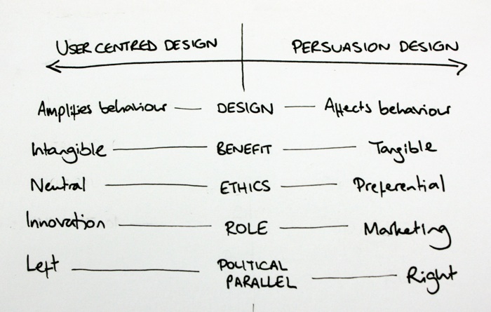
A political model of design
Interaction designers often advocate design as an agent of behaviour change. Jesse James Garrett frames this as an extension of the classic information architecture v interaction design debate, with IA optimising for the way people think, and IxD attempting to drive particular user actions.
When I try to make sense of this struggle, the crude model I keep returning to is a political spectrum. User-centred design, empathetic and inclusive, sits left of centre. Persuasion design, individualised and competitive, sits right of centre.
As with politics, one’s stance is a matter of preference and most mainstream modes are appropriate. The problems lie in the extremes: let’s call them radical UCD and radical persuasion design.
Radical UCD
Under radical UCD, the user’s priorities outweigh others. It’s here that we see the notion of design ‘dissolving into behaviour’ realised. Design becomes an ethically neutral activity whose role is to amplify and liberate the end user. The rewards are intangible, long-term and altruistic: we hope to engender loyalty and word of mouth referrals, but the effects are notoriously hard to measure.
However, as with the political equivalent, radical UCD is economically unrealistic and unworkable. At this extreme, design could only cause consensus-building timidity that reinforces current modes – an accusation already pointed at milder contemporary user-centred practice.
Radical persuasion design
Persuasion design doesn’t share UCD’s ethical neutrality. Instead, it makes an implicit but undeniable judgment that certain behaviours are preferable to others. We need only look at the vocabulary of persuasion design to see this. Jon Kolko’s infamous Johnny Holland article talks of design’s contribution “to the behaviour of the masses, [helping to] define the culture of our society.”
While I respect Jon’s intellect, I find this to be dangerous rhetoric from which we can draw uncomfortable parody: Fear not, huddled masses – the design elite will lead you to the promised land. Persuasion design’s assured ethical superiority is unfortunate. Although some of the cases put forward are compelling – guiding people toward better macroscopic decisions about environment, health etc – we must recognise that, for all the good deeds behaviour change can encourage, it is prone to murkier applications.
What privileges the designer to dictate desired behaviour? And since we’re for hire, does that mean we’re ethical relativists, bending people toward whatever agenda lines our pockets?
Whomever the paymaster, the common pattern I observe in digital persuasion design is that its values are uniformly technocratic. Science is better than faith. Action is better than reflection. Progress is better than the status quo. These values strike me as practically Futurist and, at the risk of invoking Godwin’s Law, I’m concerned that radical persuasion design is vulnerable to similar autocratic pitfalls as the Futurists themselves.
Persuasion design is marketing. UX isn’t.
I have struggled for months to unify my understanding of these two political wings, and now conclude that I cannot. I believe that persuasion design is not part of user experience design. It is marketing. Persuasion design prioritises business goals above those of the user, and its values are irreconcilable with empathy, the central value of UX.
That’s not to say that persuasion design isn’t highly valuable and attractive to business. After all, it matches the recognised business patterns of marketing, making its effects felt in tangible measures that UCD’s intangible altruism cannot: conversion rates, signups, and so on.
I subscribe to Peter Drucker‘s view that business has only two functions: innovation and marketing. Under this model, user experience design is innovation. It uncovers people’s needs and and gives makers the knowledge to develop new products and services that meet those needs.
This, finally, is why I disagree with Josh Porter’s assertion that UX is really just good marketing – however, my disagreement isn’t with his framing of marketing, but of user experience. As far as persuasion design is concerned, he is right – but the equation does not apply to UCD and UX.
Opinions and unwinnable arguments
I am of course straying close to two notoriously unwinnable arguments: semantics and politics. I have neither time nor inclination to enter into political debate or vanish down the rabbithole of Defining The Damn Thing, and I am all too aware that, like any model, the one I give is simplistic. It overlooks the complexities of authoritarianism and liberalism, which are not necessarily tied to economic left or right, and belies the greys that lie between black and white. I raise it instead as a way to highlight the risky territory I believe we are heading toward. All I ask is that the community considers these issues carefully and reaches its own conclusions. I’m happy if those differ from mine.
Even if my thoughts turn out to be at odds with those of the broader UX community, I’ll take heart from the words of Dieter Rams, who also took a stance against the involvement of persuasive techniques:
Braun categorically rejects the idea of motivating people to buy its products by adding features that toy with the psychological sub-terrain of the consumer’s consciousness. Braun refuses to swell sales by exploiting human frailties: neither its products nor its advertising use such seduction techniques.
Those who wish to employ persuasive techniques are welcome to do so. But my focus continues to be on striving to make better products by listening, not driving behaviour change. At times I will use tactics from the persuasion design toolkit, as I do with other tools of marketing, but I will do so only when I have fully considered the ethical implications. I hope that others will do the same.
[Minor edits to fix incorrect refs and typos, May 2017.]
Beauty in web design, part 3
However, the key to creating beautiful websites that our users actually love, rather than merely tolerate, is to think at the reflective level.
The final part of a 3-part essay, based on my presentation at SXSW Interactive.
In Part 1 we saw that the web presents an ideal vehicle for beauty, and in Part 2 I argued that beautiful design is reflective, exploring message and meaning. How can we use this knowledge to create beautiful websites?
Making the web beautiful
We are certainly making progress, and perhaps I’m being harsh on a field still in its infancy. The web is only 7,000 days old, after all. Technological improvements such as new authoring tools, better screen resolutions, more bandwidth and technical convergence will free us to experiment.
We’re already seeing fresh visceral approaches courtesy of developments such as CSS3, typographic tools like Typekit and Fontdeck, Canvas and SVG. Even the death of web-safe colours freed us to try new visceral design techniques. Better understanding of usability, better design patterns and better web education has also freed us to try new behavioural approaches, such as the horizontal, keyboard-driven navigation on Thinking For A Living. It’s too early to know whether these paradigms will stick, but it’s heartening to see previously locked-in approaches challenged.
However, the key to creating beautiful websites that our users actually love, rather than merely tolerate, is to think at the reflective level.
1. Get emotional
Appealing to emotion is an important way to create reflective design. It means we must understand people, not merely user tasks. What makes them tick? What would they never dream of asking for? How can we improve their life beyond this one visit? The focus is therefore on experience, not just usability. These days I see calling a website ‘easy to use’ as like praising a restaurant for serving edible food. It should be a given, not an exception.
One way to engender emotion is through stories – an area where what we patronisingly call ‘old media’ is streets ahead. Advertisers, writers and film makers have long known the power of narrative and created emotional content to reinforce their message. Content strategists in particular should therefore take centre stage in our quest for emotion, using not just text but other content types. Some of the most emotionally resonant content on the web today is photographic, such as Pictory or the Boston Globe Big Picture.
2. Think bigger
User and business form the classic duality of design. We’re well accustomed to solving for the needs of both, making compromises and tradeoffs where appropriate. I now believe this model overlooks a third piece of the puzzle: the ecosystem. We should design systems that are good for the surrounding web and for society.
Many experienced designers already consider this intuitively through their work, but there’s benefit in explicitly considering these issues in our design process. Are we trying to make a genuine difference, or just churning out more wireframes to keep the client happy?
3. Lead
When did you last see a statue of a committee? The classics of design have typically been created by one person with strong vision and the technical and political skills required to execute upon it. In film, this is known as the auteur theory: the director is regarded as the custodian of the creative vision and the final product is his or her realisation of it. At the least we need to appoint leaders who formulate and communicate a vision for the site.
Assuming leadership can be difficult in real business contexts and can foster problematic attitudes, but without strong leadership, clear vision and faithful execution, we have no hope of creating beauty.
4. Think long term
It’s relatively easy to make something viscerally attractive, but how can we maintain interest after the initial lust wears off? Just as in a romantic relationship, we should consider long-term seduction. The odd surprise can be rewarding, bringing joy in unexpected moments of the experience. By varying things we prevent over-familiarity and the contempt that this can breed.
Possible approaches include rewarding people who explore to deep areas of the system – a tactic frequently used by game designers – or something as simple as unannounced free shipping on your tenth order. Google’s holiday logos provide a real example of how the tiniest detail can keep users interested.
5. Notice everyday beauty
My mother, a retired teacher, told me recently of the ‘golden moment’ in education. It’s the point you always remember, when you discovered something and suddenly your worldview was shifted – that “one way valve to a new way of seeing” again. Educational theory suggests that to create golden moments, you must recognise them for yourself. So notice the world. Where’s the beauty around you?
As we previously discussed, there’s beauty all around us: art, writing, architecture, music, products, nature. We should breathe it in and learn from it. It may even be that inspiration lies close to home. Perhaps web standards specialists could take inspiration from developments in the Flash world, and vice versa. Maybe designers can be inspired by developers. We should be aware and scan the horizon to find our own golden moments.
6. Be brave
Finally, since reflective design is about meaning and message, we needn’t fear making statements. We should stand for something and convey ideals through our work: both ours and those of our clients. Surprisingly, the web design community seems reluctant to do this. At last year’s IA Summit, Jesse James Garrett asked why there are no schools of UX thought. Why indeed are there no major schools of web design thought? Our movements and sub-communities are, instead, almost entirely technique-driven. To me, it’s sad that we’re more interested in endlessly debating topics such as HTML5 v Flash, rather than exploring the important philosophical approaches that drive our work.
Caveats
There are of course some dangers to these approaches. The demands of client work mean we’d be unwise to blindly apply these rules, and there are some difficult questions left unanswered. The most important is whether beauty is always appropriate. I suspect not. When I’m filing a tax return, I don’t want the system to speak about who I am; I just want it to work. When getting the job done is more important than enjoying it, beauty is cruft. Better for designers to let the task and usability have priority.
Reflective design shouldn’t become dogma. Fortunately, when we take time to truly understand users and what they want, it soon becomes clear when it’s appropriate to strive for beauty in design.
Hero design
It would be easy to misinterpret our discussion of leadership and bravery and overestimate our authority. Designers aren’t heroes; instead we must serve our industry, our clients and our users faithfully, discarding ego. Too frequently, I see design that is more about impressing other designers than solving the problem and making the web better. There’s no beauty in hero design, only narcissism.
That said, I think web designers should appreciate that we can play an important role in society. We’re lucky enough to work on the coalface of the most exciting innovation of modern times. We’re on the brink of wonderful things. So yes, we’ve underachieved, but given the evolution of beauty and the tools now available to us, the web is an ideal vehicle for beautiful design. We’re the generation to turn that promise into action.
I hope in five years to look back on this essay and laugh. If we work hard, aim for reflective design, and believe in the power of the web, I’m convinced we can create our own beautiful design landmarks.
Beauty in web design, part 2
In Part 1 we saw that the web presents an ideal vehicle for beauty. But how will we know it when we see it? What is beauty anyway? I consider beauty to be presented in three main modes: universal, sociocultural and subjective.
The second part of a 3-part essay, based on my presentation at SXSW Interactive.
Three types of beauty
In Part 1 we saw that the web presents an ideal vehicle for beauty. But how will we know it when we see it? What is beauty anyway? I consider beauty to be presented in three main modes: universal, sociocultural and subjective.
Universal beauty
Universal beauty is based on timeless, globally accepted principles. It seems to hit at some innate response within us all, as demonstrated by the concept of human ‘averageness’. Here, we see a composite image of dozens of female faces created by Face Research. We might expect to see average attractiveness as a result, but this prototype is certainly more attractive than average. One theory is that prototypicality shows the mate has no defects and thus is likely to produce healthy offspring. Another theory claims that average faces are pleasing because the brain finds them easier to process. (Perhaps the average face is Plato’s ideal Form in the flesh).
Designing for universal beauty involves careful consideration of the fundamental aesthetic principles of design, such as symmetry, harmony, the rule of thirds and the golden ratio.
Sociocultural beauty
Sociocultural beauty is governed by the preferences of a particular time or place. This is most clearly seen in sexual attitudes.
Here we see Rubens’ Venus and a modern runway model: a clear depiction of changing sociocultural attitudes to beauty. (Please forgive these rather sexist examples. Since throughout history nothing has been studied for its beauty as much as the female form, it makes for clear illustration.)
However, there are more subtle examples: fashion, music trends and even philosophical interpretations of the world all go in and out of style, regardless of their inherent universal beauty.
Subjective beauty
Subjective beauty is the wholly personal encapsulation of one’s likes and dislikes. If you like big butts and cannot lie, you’re merely exercising your right to a subjective opinion on beauty. While Rubens’ work is reflective of the Baroque era, it also reveals his subjective preference for larger models.
These three types of beauty are hierarchical. Subjective beauty can overrule sociocultural beauty: we can individually find beauty in things that society considers out of fashion. Sociocultural beauty can in turn overrule universal beauty: universally beautiful things may simply not be en vogue in a particular time or place.
Three modes of design
So how can we design for these types of beauty? Don Norman’s book Emotional Design gives a deep exploration of the role of emotion & beauty in design. Adapting an established model of cognitive processing, Norman claims design typically falls into one of three dominant modes.
Visceral design is aimed at our gut. We experience a visceral reaction when we bite into a sweet apple, see a stunning sunset or hear a harmonious chord – it’s entirely sensory, before the brain has a chance to shape the feeling. A positive visceral response is often called attraction – it’s what draws bees to flowers, or babies to a beautiful face.
To design for visceral response, we should concentrate on immediate properties of a system: shape, colour and form. These can make the instant impact required for a visceral reaction – we know, for instance, that visceral response to a website can occur in fractions of a second.
Visceral design was an early frontier of exploration for the web, once the technology was sufficiently mature. This early landrush of artistic, highly visual sites was helped by the advent of visually-oriented authoring tools such as Dreamweaver, which helped graphic specialists make the leap into the web arena with familiar UIs.
It is easy to belittle visceral design as ‘eye candy’, but without this immediate attraction, sites struggle to succeed in other modes of design. That said, visceral design’s clear failing is that it rewards attraction over usability and real beauty. Command-Shift-3, which describes itself as the HotOrNot of web design, has all the depth of a wet T-shirt contest. Since we can’t use the sites it features, we must judge solely on aesthetics. Visceral sites often win awards (since awards are rarely concerned with use) and appear in those ‘Top 20’ lists we all know and dread.
Behavioural design
Behavioural design is concerned with use. Does the system work? Is it easy to perform my tasks? Does it sustain flow, or make us suffer constant interruptions by not doing what we expect? To achieve successful behavioural design, we can call on our nearest ergonomist or usability specialist. She will ensure our design has appropriate dimensions, is well mapped to user mental models, is forgiving of improper use, sends clear messages about function, and so on.
No one can deny that the web usability movement has been successful. However, understanding the user’s tasks and crafting a site around them isn’t sufficient to bring us genuine beauty. The reason is that behavioural design doesn’t always trump visceral design. Social psychologists have found, for instance, that women prefer prototypically attractive men (square jaws, broad shoulders etc) for one-night stands and flings, but they choose more feminine, ‘nicer’ men for commitment: the so-called “cads and dads” theory. This pattern is particularly pronounced at certain points of the female ovulation cycle. In short, we don’t always plump for reliability; sometimes we need something more exciting.
Perhaps the usability movement has created too many dads, and too few cads. Critics often claim it has ‘made the web boring’ – and it’s true that, when misapplied, usability approaches can create very mediocre products. For a slightly daft example, look at the work of artists Vitaly Komar & Alexander Melamid, who surveyed the musical preferences of the general public. They asked opinions on instrumentation, tempo, pitch, duration and lyrical subject and assembled these into two musical extremes: the Most Wanted Song and the Most Unwanted Song.
The Most Wanted Song features a soft rock / R&B sound, using well established instruments. To quote the artists, it creates “a musical work that will be unavoidably and uncontrollably liked by 72% of listeners”. Unsurprisingly, this crowdsourced composition, designed for maximum ‘ease of listening’, is anything but beautiful.
The Most Unwanted Song is 25 minutes long, veering wildly between extremes of loud & quiet, fast & slow, low & high pitch. It also features the world’s most hated instruments: the accordion, bagpipe, banjo & tuba, a rapping operatic soprano and a children’s choir. “Assuming no covariance, fewer than 200 individuals of the world’s total population would enjoy this piece.”
Listening to The Most Wanted Song, we can almost understand why some people equate usability with tedium. While it can help our sites to become useful and profitable, it can’t make them beautiful. For that, we should aim at the third, most complex mode of design.
Reflective design
Reflective design reaches beyond visceral and behavioural design to look at message and meaning. It asks difficult questions. What does this system say about who I am? Does it improve my life? Am I glad I did it? These questions are subjective and complex, and our responses will vary with experience, personality, culture and even mood. But there are strong benefits to asking them. Successful reflective design makes us feel good: we show it off, tell others and repeat the experience. It can even change the way we think about things. In short, I believe that successful reflective design and beautiful design are one and the same.

Consider the Nextime Word Clock. It’s made from two cylinders that rotate so that the time can be read from the face: “Five minutes to ten” or “It’s about four”. It’s less accurate than a cheap digital watch and hence less usable – and, while it looks good, it’s not as elegant as an analogue clock. But, to me, this clock is an excellent example of reflective design. Its accuracy is appropriate for the living room (do you really need to know the difference between 2:57 and 2:58?) and its unconventional design is a conversation starter. I see beauty in the concept, and the product says something about me. It’s for these reasons, rather than usability or attraction, that I count this clock as one of my favourite possessions.
Where usability focuses on behavioural design, reflective design is more the domain of user experience. It involves truly understanding what makes people tick and what makes them excited. It involves creating something meaningful that changes perceptions. Reflective design is a relatively recent focus on the web, which is perhaps why we’ve not yet created beautiful websites. But with sufficient focus on experience, I believe we will.
Rates of change
These three modes of design – visceral, behavioural and reflective – move at different speeds, creating shearing layers (familiar from Stewart Brand’s How Buildings Learn).
Visceral trends come and go in a matter of months. Top 20 trends are quickly dated, be they illustration, fat footers or any other pattern du jour. Behavioural innovation is slower. Interaction design patterns and de facto standards (search box in the top right, logo and link to homepage in top left) emerge over the course of years and require more traction and mass support to become established. Reflective design moves the slowest of all. This is best demonstrated by ‘movements’ that define how we interact with the web – social media, the realtime web and so on – which take many years to emerge and stabilise.
Concluded in Beauty in web design, part 3
Beauty in web design, part 1
The web is full of cool, impressive and useful sites, but beauty is missing from modern web design. This is a surprise, given its prominence in other design fields.
The first part of a 3-part essay, based on my presentation at SXSW Interactive.
I think we’re underachieving. And I’m not alone in that belief. Armin Vit’s Landmark websites, where art thou? contended that the web design field has created nothing to rival the greats from other design fields, giving the examples of the NYC subway map, the Se7en titles and Paul Rand’s IBM logo. Jonathan Harris of WeFeelFine fame infamously contended at Flash On The Beach that there have been no masterpieces.
These acts of criticism stung the community. “But the web has changed the world!” This protectionist instinct is understandable, but while the web has indeed shaped modern life, I agree with Vit and Harris. The web’s sum is substantially greater than its parts. No one site stands as a landmark of design. Looking at some likely candidates – Google, Amazon, eBay, Facebook – we would all agree that they’ve changed how we interact with information, commerce and each other, but are they truly design classics or, instead, disruptive business models?
The web is full of cool, impressive and useful sites, but beauty is missing from modern web design. This is a surprise, given its prominence in other design fields.
Automotive design gives us beautiful cars that arouse passion and extraordinary desire. Product design also gives us 1954’s Fender Stratocaster, one of the most important cultural artifacts of the last century.
We see beauty in architecture, for example the Beijing National Stadium, which inspired a city, a country and a global watching public in a way no website has.
In visual fields, Harry Beck’s beautiful 1933 Tube map (which I’ll take over the NYC subway any day) clarified the complexity of the Underground through the metaphor of wiring. Not only is it a classic of wayfinding, but it has become part of the collective consciousness and emotional fabric of the city.

We also see a more chilling beauty in Charles Minard’s map of Napoleonic advance, made famous by Edward Tufte. The beige line represents the French army’s advance to Moscow; the black their ignominious retreat. The width of the line demonstrates the size of the army and hence the appalling human cost.
The point of beauty
But why focus on beauty? Why does it matter that other design fields lead the way? Because beauty affects us in profound ways, however we may try to resist.
Studies have shown, for instance, that attractive people are more likely to be acquitted by a jury. We transfer this lenience to content, as demonstrated in the 1960 Nixon-Kennedy presidential debates. The radio audience believed Nixon to have won the debate, while the TV audience felt the more attractive Kennedy had the upper hand. Surprisingly, this isn’t a learned bias; it seems to be hard-wired, even seen in infants.
Beauty also makes things easier to use. Our brains literally work in a different way, becoming more flexible when using a thing of beauty. This is the aesthetic-usability effect. Apple know the value of this effect more than most. The colour iMac heralded the first mainstream melding of beauty and hardware. When combined with the good user experience of the Mac OS, the iMac brought previously unengaged users to computing for the first time.
Beauty is also infectious. Because it makes us feel good, we naturally want to share it. Why do we put art on walls and take photos of sunsets? Because it allows us and others to relive the experience. This pattern of telling others about beautiful things is the cornerstone of loyalty and advocacy, powerful and much sought-after concepts.
But I believe the most powerful aspect of beauty is that it can change our perspective on the world. In the classic How Designers Think, architect and psychologist Bryan Lawson describes this as a “one way valve to a new way of seeing.” Not only could a beautiful web make our users happy, productive and loyal, but it could help to change the way the world thinks.
But can the web, an abstract, impermanent and functional medium, truly be beautiful? Let’s answer that by looking at a common vehicle for beauty: art.
The evolution of beauty
In Greek and Roman times, art (and the ideals of beauty it contained) was mimetic: that is, intended to mimic and replicate nature. This is consistent with the philosophy of the day. Plato’s Theory of Forms proposed that there exists one idealised, perfect instance of everything in the world – the perfect cow, the perfect grape – that exists on a plane that none can see. With beauty resident only in these ideal forms, art and sculpture were a means to study them. Every (literally) chiselled jaw is an exploration of the heavenly ideal. It’s from the Roman era that the word ‘art’ originates, tellingly coming from the Latin ars, meaning ‘skill’.
This style continued into Renaissance times; but while religious influence continued the thought that beauty exists in a heavenly plane, the Renaissance also introduced the earliest stirrings of humanism. From this point, beauty became apparent in things that mankind created.

As we advance into the Romantic era, art is no longer literal. Representation becomes central. Turner’s 1839 The Fighting Temeraire is beautiful but not accurate. Instead, the viewer finds joy in the colours and emotive qualities of both the scene and the meaning. This abandonment of the literal was catalysed by 19th century technology. The invention of the daguerrotype, the microphone, and the printing press some centuries previous, allowed reality to be easily replicated for the first time.
As we reach the modern era, art takes a jarring yet consistent turn. Duchamp’s concept of objets trouvés (such as Fountain) mean anything can have artistic meaning in the right context. Subjectivity dominates: it’s beautiful if you find it beautiful.
Contemporary conceptual art now sees execution as secondary. Beauty lies within the thought, while the artifact itself can be banal and everyday. Tracey Emin’s Everyone I Have Ever Slept With 1963-1995 stitched the names of former lovers, friends and unborn children into the fabric of a cheap tent. Damien Hirst’s diamond-encrusted skull (For The Love Of God) was made by technicians and interns: Hirst himself was director and project manager only. Duchamp himself permitted several replicas of his work. The idea is all.
Finally, we can examine installation art, designed for a specific space and a specific duration. It is by its nature temporary, and often interactive. 2005 Turner Prize winner ShedBoatShed (Mobile Architecture No. 2) was disassembled and reconstructed as a boat and sailed down a river. Tate Modern’s helter skelter ‘Test Site’ created enormous school holiday queues. Is it art? You choose. (Although to my mind, the answer to “But is it art?” is always “yes”.)
Classification aside, it’s certain that many people find this work powerful.
So our understanding of beauty has broadened and shifted. Beautiful things can be abstract, temporary, duplicate and interactive.
The web is all of these.
Continued in Beauty in web design, part 2.
Happiness in numbers
I’ve learned that Sundays fill me with dread, that sleep makes no difference to my mood and that my leisure activities don’t make me happy. Am I wasting my time on them, or is happiness not my motivation?
Prompted by a mention in Stephen P Anderson’s recent article, I’ve been playing withTrack Your Happiness. Part application, part experiment, it’s an idea I’ve always found fascinating. A scrobbler for emotion so that, by matching patterns, we can try to understand what drives us.

I’ve learned that Sundays fill me with dread, that sleep makes no difference to my mood and that my leisure activities don’t make me happy. Am I wasting my time on them, or is happiness not my motivation? Let’s take the example of games, marked Playing at the foot of the graph.
Games can be infuriating. I’m frequently shot by teenagers, eaten by ravenous Turing machine monsters or beaten courtesy of a defensive howler. So why play? Because games provide other rewards. They’re an outlet for stress, and provide the challenge of competition and a feeling of mastery. By focusing on their unimportant syntax, I can break from quotidian thoughts without idly wandering into boredom, and experience emotions that contrast my collaborative professional work.
So do games make me happy? Apparently not. But they’re important vitamin supplements, making up for the deficiencies in my mental diet.
Announcing Undercover User Experience
At last, the big announcement. I’m delighted to confirm that Undercover User Experience, written by myself and fellow Clearleftie James Box, will be published by New Riders this autumn.
At last, the big announcement. I’m delighted to confirm that Undercover User Experience, written by myself and fellow Clearleftie James Box, will be published by New Riders this autumn.
Once you catch the user experience bug, the world changes. Doors open the wrong way, websites don’t work, and companies don’t seem to care. Fortunately, anyone can learn the UX remedies – usability testing, personas, prototyping and so on – but, unless your organization ‘gets it’, putting them into practice is trickier.
Undercover User Experience will show you how to do great UX work with tiny budgets, no time, and even without official clearance.
The idea came about in a Utrecht hotel, where James and I got talking about the early stages of our careers, when we didn’t have the luxury of doings things ‘by the book’. Through the IA Institute mentoring scheme I’ve met several people in the same situation. For them, what makes UX work difficult isn’t lack of skill, but not knowing how to make headway in companies that don’t appreciate the need. Pioneering UX and inspiring colleagues who’ve never cared about design takes improvisation, persistence and diplomacy. So we’ll cover guerrilla approaches to the UX techniques we know and love, along with frank advice on how to make them most of them in your business.
On a personal note, I’m thrilled to be partnering with New Riders. They were our first choice publisher due to their outstanding UX portfolio, including the classics Don’t Make Me Think!, Designing for Interaction and Elements of User Experience.
The writing experience is already demanding and rewarding. There’s been much to-ing and fro-ing over titles and much confusion over the US tax system and self-assessment, but we’re well under way and hoping to wrap the writing up by June.
But enough – I’ve no wish to turn this blog into a marketing vehicle. If you want to keep up to date with our progress and be the first to hear when the book’s due out, follow @UndercoverUX on Twitter or visit the Undercover User Experience website and sign up for updates.
!?
So far, so functional. However, chess notation also provides means of passing judgment on the moves.
It’s said there are more books about chess than all other games combined.
To non-players, a chess book is an arcane mystery of jumbled letters and references to openings with such exotic names as the Nimzo-Indian Defence, the Nescafé Frappé Attack, and the Sicilian Najdorf Poisoned Pawn Variation.
But notation is deceptively simple. Each move simply lists the moving piece and the co-ordinates of its destination. Be4 is a bishop move to a central square. Rxa8 tells us the rook is capturing whatever’s in the top-left corner.
(I’m talking here about algebraic notation. – the Pawn-to-Queen’s-Bishop-3 stuff of old movies – is deprecated as complex and ambiguous.)
So far, so functional. However, chess notation also provides means of passing judgment on the moves. Expert annotators earn their living by peppering games with punctational shorthand:
! – good move
!! – excellent move
? – bad move
?? – terrible move
These symbols can be combined. ?! denotes a dubious, but not awful, move. !? is used to mark an novel idea that looks promising but may prove to be unsound.
It’s the !? moves that I’m most interested in.