Looking back, looking forward
2009 has been kind.
2009 has been kind.
Professionally it’s been unsurpassed, despite the recession. Clearleft have grown to double figures, moved into a studio with decent wallspace, produced some great work, run two successful conferences and were humbled to be voted Agency Of The Year in the .net awards.
(Personally, I nominate UXCampLondon, Cardiff v Arsenal away and various ATPs, weddings and zombie crawls as additional highlights.)
As the office winds down, colleagues jet off overseas and lunches linger into the afternoon, thoughts turn to gifts and time off. Since I opt out of the commercial trappings of the season, I’ve chosen this year to make my annual donation to WWF and Reprieve, two fantastic clients I’ve worked with this year. I’ll be spending a unique Christmas on a military base. In lieu of ubiquitous WiFi, it’ll be an opportunity to spend time with family, read, write and get my breath back.
2010 will be a year of abundance – and the first casualty, sadly, will be my carbon footprint. I have three speaking gigs booked so far (South by Southwest, the IA Summit and UX London) and as a punter I’m hoping to grab a seat at Paris’s Content Strategy Forum, Berlin’s UXCampEurope and New York’s Design for Conversion. But of course 2010 is likely to be dominated by the book. Emails are a-flying and chapters are a-forming. More on that soon.
Thanks for sharing this year with me and here’s to the next one! Merry Christmas.
{PS. It’s also the done thing to list your favourite albums of the decade. In no order, I’ll throw out Michigan, Tarot Sport, Change, Turn On The Bright Lights and Leaves Turn Inside You.}
I blame the designer
In which Cennydd has a downright sense of humour failure over a silly web comic.
[In which Cennydd has a downright sense of humour failure over a silly web comic.]
Here’s an excerpt of a comic that recently did the rounds in the web design community.
You know what? I’m tired of this attitude.
Clients From Hell is admittedly pretty funny. Sometimes clients say stupid things; but hey, so do designers. I’ve said lots of them myself. But this sort of thing is different. It’s not an amusingly misguided email. Rather, it epitomises a harmful arrogance and entitlement that pervades the design community. It carries a bitter subtext that clients are idiots with no design skill, and it’s a designer’s duty to disempower them by any means possible.
And I’m tired of it. Of course clients aren’t skilled designers; that’s why they had the foresight to hire us. But you know what? They know business. They’re as passionate, committed and talented as anyone. Many of them put their livelihoods on the line to make the web happen. And let’s be blunt: they also pay our salaries.
If a web design project goes to hell this way, I usually blame the designer. He wasn’t skillful enough to make the situation work. He didn’t provide the force of argument required, couldn’t handle the politics, or couldn’t convince the client of the value of good design. On the rare occasion when the relationship with a client goes entirely rotten, the designer should end the relationship gracefully rather than passive-aggressively working to rule.
Unconvinced? I suggest you read Scott McCloud’s excellent post about criticism and the equally insightful comment from Mike L:
“The most common misconception about criticism is that one has to be on a similar skill level as the creator in order to have a valid opinion. I read stuff from many different artists from many different disciplines who cannot abide ramblings of people that couldn’t compete with them in some way. If said person is not an artist, their opinion doesn’t matter. But isn’t art, all art about communication? And who is the artist generally trying to communicate with? … My #1 critic is someone who cannot draw at all. He tells me things I can’t see because I overthink them as an artist.”
(Oh, and here’s what ‘pop’ means.)
Statistical significance & other A/B pitfalls
It’s logical and laudable that designers should seek data in our quest for verifiability and return on investment. But data must be handled with care, and mathematical rigour isn’t a common part of a designer’s repertoire.

Photo by snellgrove.
Last week I tossed a coin a hundred times. 49 heads. Then I changed into a red t-shirt and tossed the same coin another hundred times. 51 heads. From this, I conclude that wearing a red shirt gives a 4.1% increase in conversion in throwing heads.
A ridiculous experiment (yes, I really did it) with a ridiculous conclusion, yet I sometimes see similarly unreliable analysis in A/B testing.
It’s logical and laudable that designers should seek data in our quest for verifiability and return on investment. But data must be handled with care, and mathematical rigour isn’t a common part of a designer’s repertoire.
Here’s an example from ABTests.com, a worthwhile project that I feel slightly bad to pick on.
The two versions are subtly different:
- Version A: Upload button bold, Convert button bold, Convert button has a right arrow
- Version B: All buttons regular weight, no right arrow on Convert button
Although minor changes can cause major surprises, I wouldn’t expect these small differences to improve the form’s usability. With the caveat that I don’t know the users or product, I’d even speculate that Version B could perform worse since it reduces the priority of the calls to action and removes the signifier of progression.
The designer claims that version B showed a 30.4% conversion improvement in an A/B test. Here’s why this isn’t quite accurate.
The role of chance
Any A/B test is a trial, so called because we’re observing evidence gained by trying something out. I can never truly know that there’s a 50% chance of a coin landing as a head or a tail – I can only run trials and observe the evidence. Similarly, we can never truly know that a design leads to higher conversion – we can only run trials and observe the evidence. If that empirical evidence is strong enough, we conclude that the design is an improvement. If not, we don’t.
To be valid, trials need to be sufficiently large. By tossing my coin 100 or 1000 times I reduce the influence of chance, but even then I’ll still get slightly different results with each trial. Similarly, a design may have 27.5% conversion on Monday, 31.3% on Tuesday and 26.0% on Wednesday. This random variation should always be the first cause considered of any change in observed results.
The null hypothesis
Statisticians use something called a null hypothesis to account for this possibility. The null hypothesis for the A/B test above might be something like this:
The difference in conversion between Version A and Version B is caused by random variation.
It’s then the job of the trial to disprove the null hypothesis. If it does, we can adopt the alternative explanation:
The difference in conversion between Version A and Version B is caused by the design differences between the two.
To determine whether we can reject the null hypothesis, we use certain mathematical equations to calculate the likelihood that the observed variation could be caused by chance. These equations are beyond the scope of this post but include Student’s t test, χ-squared and ANOVA (Wikipedia links given for the eager). Here’s a site that does the calculations for you, assuming a standard A/B conversion test with a clear Yes or No outcome.
Statistical significance
If the arithmetic shows that the likelihood of the result being random is very small (usually below 5%), we reject the null hypothesis. In effect we’re saying “it’s very unlikely that this result is down to chance. Instead, it’s probably caused by the change we introduced” – in which case we say the results are statistically significant. Note that we still can’t guarantee that this is the right interpretation – significance is about proof only beyond reasonable doubt.
Running the calculations on the above data shows that the results aren’t statistically significant: the evidence isn’t strong enough to reject the null hypothesis that the difference in conversion is simply down to luck. The main problem is the small sample size (128 and 108 users respectively), so I would advise the designer, Johann, to repeat the test with more users. Assuming the observed conversions seen didn’t change (a big assumption) a sample size of approximately 200 users per variant should be sufficient for significance. He could then either reject the null hypothesis or the results would remain inconclusive, in which case there’s no evidence the design has made a difference. In Johann’s defence, he recently posted that he takes the point about significance, and I’m looking forward to seeing more conclusive data for this intriguing test.
Percentage confusion
Significance isn’t the only slippery problem A/B tests face. For starters, quoting conversion improvements is always fraught with difficulty. Since conversion is usually measured in percentages (in this example, 31.3% and 40.7%) there are two ways to quote improvements. We can say that conversions increased by:
- 9.4% – the difference between the two
- 30.4% – the amount that 40.7% is bigger than 31.3%*
Any percentage improvement quoted in isolation should be challenged: which of these two calculations has been used? It’s dangerously easy to assume the wrong figure without sufficient context.
The A/B death spiral
A/B tests also suffer from a common quantitative problem, in that they tell us what but not why. I’ve written about this previously in What if the design gods forsake us. It’s wise to back up numerical tests with qualitative evaluation (eg. a guerrilla usability test) so we can make informed decisions if data suggests we need to rethink a design.
Even with backup, sometimes A/B tests are simply the wrong tool for the job. They can provide powerful insight in some cases, but in the wrong place they can be a blind alley or, worse, a weapon of disempowerment. Logical positivism and design don’t mix – not everything we do can be empirically verified – yet some businesses fall back on A/B testing in lieu of genuine design thinking. I call this the “A/B death spiral”, and it plays out something like this:
Designer: Here’s a new design for this screen. You’ll see it has a new navigation style, tweaked colour palette and I’ve moved the main interactions to a tabbed area.
Product owner: Wow, those are pretty big changes for such a high-risk screen. I tell you what: let’s test them individually to see which of these changes works and which doesn’t…
As the proverb suggests, sometimes you can’t jump a twenty foot chasm in two ten foot leaps. Cherry-picking only those design elements that are “proven” by an A/B test can be a route to fragmented, incoherent design. It may earn marginally more money in the short term, but it becomes hard to avoid a descent into poor UX and the long-term harm this causes.
Being faithful to data
Given the potential hazards, I’m concerned about the naïveté with which some designers approach quantitative testing. The world of statistics rewards an honest search for the truth, not dilettantism, and I’d advise any designer moving in statistical circles to pick up some basic stats theory, or at least partner with someone knowledgeable.
A flawed A/B test, be it statistically insignificant, misapplied or misquoted, is nothing more than anecdotal evidence. It’s the same crime as making a website red on the feedback of one user. Yet an impatient designer, seeing the example I quoted above, could quickly jump to a false conclusion: “I should remove arrows from continue buttons: it’s 30.4% better.” Perhaps this designer deserves what he gets. It’s likely he’s only really interested in shortcuts to good UX, and linkbait lists of “Twelve ways to make your site more usable.” Since he understands neither the mathematics nor the context of this trial (timescales, userbase, surrounding task) he will inevitably grab the wrong end of the stick. Nonetheless, he is out there.
Don’t let yourself be that designer.
* subject to rounding
Q&A: getting into user experience
It’s not that surprising to find that a room of similarly qualified students share similar concerns. What’s more interesting is that many of them can also help to answer each other’s questions.
For the past few years I’ve given an annual talk at UCL to students of the HCI with Ergonomics M.Sc. It’s always a pleasure to share my questionable world view with impressionable minds, and I look forward to the sessions in much the same way as one secretly enjoys a visit from a drunken uncle.
In an effort to make this year’s session a little more interactive, I pulled out an old Knowledge Management set piece:
- Distribute post-its
- Ask everyone to write one question they wish they knew the answer to (preferably about the topic at hand).
- Stick the post-its on the walls. (It’s surprising how much people group them, despite your invitation to use any of the three free walls)
- Ask everyone to read each post-it.
- If they too want to find out the answer to a question, tell them to mark the post-it with a question mark. If they think they have an answer, mark it with a tick.
It’s not that surprising to find that a room of similarly qualified students share similar concerns. What’s more interesting is that many of them can also help to answer each other’s questions.
The purpose of this exercise is of course to show that networking and collaborating is valuable, and not just a case of awkward conversation and limp handshakes. However, having made this slightly facile point, I realised that most of the posted questions were damn smart and deserved to be shared more broadly. So here are a few that were particularly interesting, and some proposed answers from myself.
Is the graphic design of a site more important than usability when initially attracting users to the site?
I say yes. Research shows users form an opinion on the credibility of a site within milliseconds of visiting it. To form a valid opinion on usability takes use, which may not happen if those impressions are negative. However, the line between the two is of course blurred, and a site can successfully convey usability through layout, visual design and information hierarchy. There are plenty of other factors that have an impact too: load times, content and proposition spring to mind.
How many hours do you work a week?
Define “work”. I’m paid for 37 hours, and most of that is spent on billable client work. But add in commuting, writing articles and conference talks, mentoring, and reading about my field and it would exceed 60. Yes, I’m aware that’s a little unhealthy. Good thing I enjoy it.
What’s the most useless skill you think we’ll learn from this course?
Probably rifling through academic papers to find an authoritative source that proves or disproves a detailed HCI argument. Truth is, not many people in industry will care. It’s more important to judge the the problem at hand and make the right design decisions based on context. HCI theory can give a strong advantage here, but you’ll need to state your case with something more real: usually how your client will make more money by following your advice.
How much do you get paid?
Not telling. But here are some approximate London figures: £25,000 is fair for a graduate-level position, rising to £35–40,000 with a couple of years of experience. Senior people should be looking at £60,000 and up (seven years and above, probably managerial responsibility). Freelance rates typically range between £275-£400/day.
What are the best design tools in HCI?
Thinking, conversation, sketching, software. In that order.
Can you be a good UX designer and a good programmer at the same time?
You can be good at both, yes. But who wants to be just good? Deep specialists tend to better than jacks-of-all-trades, and only extremely rare superheroes can be world class at both. I do, however, strongly recommend that all designers learn to code to a reasonable standard, and that all developers learn the fundamentals of design. Speaking each other’s language is the easiest way to ensure good designer-developer relationships, and one of the easiest ways to become substantially better at your job in a short time.
Do you need to draw well / be arty to be a user experience designer?
Some drawing talent helps, but sketching well is a skill that can be learned and that comes with practice. Its main value is when communicating with clients – a well-crafted sketch can simply convey more information than a poor one. However, it’s more important to develop a designer’s mindset. As Jason Santa Maria says, “sketchbooks are not about being a good artist, they’re about being a good thinker.”
EuroIA 09 in review
This sense of mutual destiny – two nations connected by a single structure – feels entirely European. EuroIA was similarly interwoven with shared experiences of linguistically awkward networking and untold cultural unity.
It’s important to accrue tactics to cope with the disruption of travelling. Quick currency conversions, self-conscious squints at unfamiliar coins, departure lounge distractions (ask Alain de Botton). In Scandinavia, I’ve learned to open clearly with “Hello” to announce myself as a foreigner, since the local salutation “Hej” is a homophone with informal English equivalents.
Copenhagen, site of EuroIA 2009, and Malmö, where my evening sofa awaited, share more than greetings, efficiency and cost of living. They are joined by the 7.8km Öresund Bridge, a zoetrope giving glimpses of distant wind turbines in the water.
This sense of mutual destiny – two nations connected by a single structure – feels entirely European. EuroIA was similarly interwoven with shared experiences of linguistically awkward networking and untold cultural unity. The sessions ranged from poor to intriguing (I’m still no fan of the blind review process) but there was something of a BarCamp atmosphere of willing each other to succeed. EuroIA is a gathering of the underdogs, feisty and proud, and it doesn’t have to be the way they write it in the States.
I particularly enjoyed Joe Lamantia‘s peek into the architecture of fun, Sylvie Daumal‘s struggle for acceptance in a hostile environment, and Andrea Resmini‘s intricate analysis of how IA can bridge the real and digital worlds. Perhaps it was a shame that these sessions were book-ended by an American keynote and closer. Their sessions were undoubtedly interesting, but I hope to see a European presence in these elevated slots next year.
My talk The Future Of Wayfinding seemed to be well received. The topic fitted well with the conference theme of Beyond Structure. Topics such as the Semantic Web, ubiquitous computing and what I can only clumsily label ‘unhierarchy’ were prevalent, and I fully expect them to be reflected in next spring’s US circuit.
Next year we visit Paris, capital of a country almost entirely oblivious to user experience work. It seems we Europeans really do pull together in the face of a challenge.
dConstruct 09 in review
At its best, the fifth dConstruct was simply outstanding. In its rare low points, it disappointed. As such, it’s at a crossroads.
‘After you build forty or fifty websites there really isn’t any magic in it.’
dConstruct’s comfortable niche as the thinking person’s web conference was quickly disrupted by Adam Greenfield’s early remarks. Decrying web and UX design is a risky strategy in a room made largely of web designers and developers, yet it was a thought entirely consistent with our theme of Designing For Tomorrow. The phrase wrapped topics that have been of recent interest to us Clearlefties: ubicomp, gestural interfaces, networked devices and what lies beyond our familiar digital horizons.
Adam led us into a world where information is omnipresent and persistent, where actions stick to identities and the presentation of self is a largely forgotten luxury. A world where objects become services, shared not owned, implies a post-capitalist swing perhaps alluded to by recent economic events. As a recent and voracious reader of Everyware, I was thrilled by Adam’s talk. I’m sure the imminent podcast will reward careful re-evaluation.
Mike Migurksi provided a practical counterpoint with a case history of Stamen’s information design work, with subsequent colour commentary by Ben Cerveny. Ben’s dense, rapid idea stream was perhaps a step too far after such an analytical opening; although Stamen’s work is undeniably excellent, many felt a gap between the metaphysics and the design output, and some of Ben’s more elaborate statements seemed hard to grasp.
Brian Fling explored the mobile field with characteristic flair and pace. Focusing on the future lives of the post-millenials native to the digital age, Brian proposed that history will judge the mobile (and the iPhone in particular) as the flying car we have been waiting for. We are living through a second industrial revolution, based on the portable, personal power of bringing people closer through technology.
Next up, an elaborate Gaia theory of sci-fi and interaction from Nathan Shedroff and Chris Noessel. In an entertaining presentation, the over-used Minority Report example was only (multi)touched upon once, and Jurassic Park’s ridiculous UNIX scene was rightly used for cheap laughs. Of particular interest was the pair’s evidence that anthropomorphism can exist at non-visual levels (consider R2D2’s bleeps and Amazon 1-click servant), although, like Ben before, some other claims seemed rather hazier.
Robin Hunicke, known for her work on “the Maslow’s Hierarchy game known as The Sims”, unfortunately alienated her audience with a spoiler (albeit well meaning) for a film still on general release, and struggled to recover favour. Her West Coast bubbliness sat awkwardly at odds with her academic subject matter, which was coincidentally recapped by August De Los Reyes. Any Microsoft speaker knows he has an uphill battle to win over a sceptical audience; fortunately August’s self-deprecating humour was an instant hit. We imbue objects with intelligence (slide rules, other technological tools), so why not emotion too? Heartbroken families insist on the repair, not replacement, of their Roombas – can we conjure similarly powerful dynamics in the systems we create? August closed with Office Labs’ concept video, a surprisingly rousing vision that raised hairs on necks across the Dome.
The stage was set for a wonderful denouement from Russell Davies, who produced a performance straight from the traditions of British music hall. Russell predicted that digital buildings will give us “Blade Runner brought to you by the makers of Cillit Bang”, and that as technology matures the only way we will escape cliché is to redomain, appropriating ideas from other fields. Russell provided a marvellous reminder that, despite the intelligent contributions of the day, as an industry we are prone to hubris. We’d be daft to disregard the marvellous infrastructure our media predecessors have created.
At its best, the fifth dConstruct was simply outstanding. In its rare low points, it disappointed. As such, it’s at a crossroads. The trend has certainly been cerebral, and this year’s theme certainly encouraged abstract exploration. Early feedback says our audience is happy with this, and that the differentiation from other conferences is an important part of dConstruct’s appeal. Yet there’s always a danger of vanishing into pretension, and the conference must of course appeal to 700+ attendees.
I’m sure Clearleft won’t be taking any snap decisions. dConstruct has become part of the fabric of our company and hopefully the annual schedule, and, in line with our chosen theme for the year, we’ll be thinking carefully about what happens next. I’d love to hear your thoughts on the day and your preferred direction for dConstruct 2010.
Photos: Matt Biddulph, FriiSpray, Tom Jenkins.
Sweating the small stuff
Outrage. Ikea recently switched corporate typeface, moving from Futura to Verdana across all their marketing, including their printed catalogue and ads.
Outrage. Ikea recently switched corporate typeface, moving from Futura to Verdana across all their marketing, including their printed catalogue and ads.

To typography enthusiasts, this is like Mozart announcing a kazoo concerto. Futura is a type classic, skilfully designed by a master craftsman and demonstrating real artistry. It’s excellent for distinctive identity and brand work – so much so that Ikea had practically made it their own until now.
Verdana was created to act as body text on low resolution computer monitors. And it’s well designed for that purpose, but it doesn’t suit print work or any size above petite. At large sizes it looks plain fugly, with characters that appear juvenile at best. Use of Verdana in this way definitely constitutes bad typography.
The slight is all the greater coming from a company that has, to an extent, brought design into the lives of many people who previously believed it was the domain of turtlenecked pseuds.
Ikea’s reason was ostensibly to ensure consistent use of fonts across web and print platforms, and to ensure global compatibility across all languages. A strange choice, given that Verdana has notable deficiencies in its character set. However, it’s possible that Ikea isn’t as naive as we think. My colleague Paul Lloyd hypothesises that the switch is a deliberate ploy to make the company appear less expensive. It’s an old strategy: cheapen the aesthetic and the perception of price goes down. Plausible, at least.
By all means we can point, laugh and lament the lack of design skill at the company. However, some of the outrage has been ridiculous, particularly since we can never truly know the reasons behind the choice. Hell, there’s even a petition to reverse the change.
I believe that if companies make bad design choices that’s their prerogative. If I worked for Ikea, I would have fought tooth and nail to dissuade them from this choice – but no, I won’t sign a petition. Let them eat cake, and if design is as important as we say it is, the market will prove their mistake.
Herein lies my bemusement at the design community’s reaction. Behind the indignation, does any of us really believe that this typographic gaffe will affect Ikea’s sales? Is it really as egregious an error as we make out? Or are we merely acting out the stereotype designers fight so hard to shake off: the aforementioned turtlenecked pseud complaining that their soup isn’t hot enough?
Typography matters. Used well, it can elevate communication in astonishing ways. But, asAegir points out, there are bigger design challenges facing Ikea and indeed the global manufacturing industry than choice of corporate typeface.
Design is about sweating the big stuff; hopefully even changing the world. Often that involves the small stuff too, but focus solely on the trivia and it’s hard to avoid becoming trivial yourself.
Lessons from UXCampLondon
Since Saturday’s UXCampLondon I’ve been thinking about what I took from the experience.
Since Saturday’s UXCampLondon I’ve been thinking about what I took from the experience.
One
The devil is in the details. With such a discerning audience, we had to offer something well run and as seamless as possible. We succeeded, thanks to accurate estimation of various factors including no shows, time between sessions, budgets, and the apparently inevitable delay caused by a GPS-less taxi driver. This attention to detail was entirely down to the commitment of our wonderful volunteers, upon whom I relied to orchestrate the minutiae. Delegation was my preferred tactic, as noted by Johanna in her closing notes.

Two
You can’t live blog a conference you’re running.
Three
There’s something about user experience designers. We took an early decision that UXCampLondon would be a one-dayer since the field is generally slightly older, more interested in spending a Sunday with their family than slumming it on an office floor. This upset a few purists (“It’s not a BarCamp if you don’t stay over!”) but was indisputably the right choice.
Many people commented that UXCampLondon had a unique atmosphere: enthusiastic, yet mature and urbane compared with the (admittedly enjoyable) rough bluster of most BarCamps. It further convinced me that user experience folk are my people: highly likeable but intelligent and well balanced; opinionated yet open to alternative views.
Four
Free alcohol cures all ills.

Five
The best lessons are often hidden. In some ways, I didn’t get that much from UXCampLondon because my mind was always elsewhere and I attended few sessions. But that overlooks the other benefits I took from the day. In particularly, I got further proof of the growing strength of our community, and further experience in handling difficult situations (we had plenty).
A couple of people have asked if I’m planning a sequel. It’s possible, but not for a while. I’m taking some time off, and I’m sure there are many other people well suited to running UXCampLondon2.
Thanks to our volunteers, our supporters and of course all the attendees for making UXCampLondon a success.
Photos: Rob Enslin and Adam Charnock.
Please start from the beginning
Busy with final UXCampLondon preparations, so light on time to blog. However, I did manage to find 30 min to be interviewed by Ryan Taylor for his “Please start from the beginning” series.
Busy with final UXCampLondon preparations, so light on time to blog. However, I did manage to find 30 min to be interviewed by Ryan Taylor for his “Please start from the beginning” series.
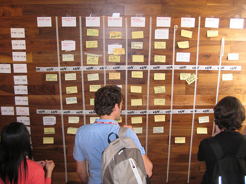
Blank canvas
A blank wall is an invitation to a designer. As soon as the paint dries, I’m sure we’ll drown in post it notes and poorly-taped flipchart sheets. Heated debates will be held at the sharp end of a marker pen.
We’ve been busy. Not only have we taken on ‘leftie number nine, but we’ve also moved into larger studio. Obviously this means higher overheads, which takes careful thought in the middle of a recession, but it also means (amongst other things) we finally have wall space.

A blank wall is an invitation to a designer. As soon as the paint dries, I’m sure we’ll drown in post it notes and poorly-taped flipchart sheets. Heated debates will be held at the sharp end of a marker pen. The war room of my most recent project featured 20’ of whiteboard, which became a great way to sketch and walk through design concepts before stepping into prototyping. Drawing on the walls has thus become a minor fetish. It’s highly visible, and thus brilliantly suited to critique. It keeps you moving and alert, rather than immobile in your chair. And it also has the marvellous appeal of finally being able to do something you never could as a kid.
I hope to to share some of our scribblings in due course.
The angst of the user experience designer
While the web makes it easier for one person to reach millions, it doesn’t make the relationship easier to comprehend.
My work is used by millions.
When the thought first struck the numbers were lower, but I was stunned. I quickly surmised the only way I could retain objectivity and impartiality was to bury this thought, but it wouldn’t leave me alone. I’m hoping that I can now make sense of it by voicing it.
Of course the scale of the web excites me; I’m delighted and humbled that my work can communicate with so many people. Very few roles have such scale. Architecture, perhaps. Journalism. Politics too, although I’m hardly comfortable with that comparison.
While I admit that it’s something of an egocentric thrill, I’m no household name and nor do I wish to be. Web design is far less important than, say, teaching or healthcare. What matters more to me is that I do great work, and having a large canvas provides me with fascinating ways to achieve this.
However, while the web makes it easier for one person to reach millions, it doesn’t make the relationship easier to comprehend. My excitement is tempered by vertiginous apprehension. From these millions, there will be thousands who love my work. There will also be thousands who hate it: people who relied on the old site, who appreciated a section I removed, whose needs I’ve overlooked in the hurry to get the job done.
With such scale, these users are anonymous to me, just as I am to them. While I work hard to understand them and design to support their needs, there’s no way I can know I’ve improved things for an individual user. I hope I’ve done right by them.
The angst of the user experience designer.
UX London in review
There are things we want to improve for next year (I’m particularly keen to involve a greater diversity of speakers), but we think the important stuff was more or less right. We hope others agree.
What a week. Turning thirty is an event on its own, without the hard work of running and speaking at a major conference. However, either despite or because of the stress, UX London was a fantastic experience and one I can’t wait to repeat. Due to hurried tweaking of my slides I missed several workshops, so here’s a rundown of the opening day.
The talks
Opener Peter Merholz implored us to expand our mandate from digital user experience to other touchpoints across the entire customer experience. This shift towards service design requires a patient collaborative and strategic approach, familiar from recent ‘getting a seat at the table’ discussions.
Many design-led companies are blessed with a visionary, customer-focused CEO: think Disney, Apple, Southwest. Leadership begets culture. Culture begets user-centred service. Those of us who lack such a figurehead can kick-start a design culture by espousing a clear set of design principles – a topic that arose numerous times. We must also encourage others to see design as more than aesthetics and stereotypes. Instead, design should be an activity: a means of getting ideas out of people, and of honing those ideas until they are useful to customers.
Eric Reiss revealed that Brits are now the angriest people in Europe, and clearly wanted to emulate our success. In a continuation of the service design theme, he poured scorn uponWine.com, eBay and that easiest of targets: airlines. By illuminating the theory and history of customer service, Eric also pointed out how easily we are ruled by complacency. A company can have 90% satisfaction with no discernable increase in loyalty. 83% is nothing to be precious about.
Quoting liberally from Matthew Frederick’s increasingly popular 101 Things I Learned In Architecture School, Luke Wroblewski explored the Yahoo! homepage redesign by way of the parti, a site’s central concept stated in the language of design.
Pointing to parti’s “non-architectural” derivation (market factors, resources, company strategy), Luke led us through the quagmire of 10,000 stakeholders and 590 million users. In the midst of the politics, parti remained a sanity check for UI components – “do they bring us closer to our concept?” – an elegant way to avoid the religious and political debates with which we are all so familiar.
Dan Saffer channelled Dreyfuss in his new talk, proselytising the benefits of behaviour as a major competitive advantage, both more appealing and harder to replicate than me-too featuritis. Since the interface is the product, we should look beyond form (we’re looking at you, Motorola RAZR) and focus on motivations, expectations and actions. Our behavioural system needs close attention to the details of feedback and transitions, coupled with a laser-like focus on the product’s key function or ‘Buddha Nature’.
Carefully appointed to the graveyard shift after lunch, Jared Spool‘s brand of humour had the desired effect. When not regaling us with tales of incompetence and poor process (his workshop later yielded the classic “You can always look at what your competitors are doing. That way you’ll always be a step behind them!”), Jared focused on intuition. As did Don Norman later, Jared sung the praises of complexity, where users have sufficient knowledge to embrace it. A design is intuitive if the gap between user knowledge and target knowledge is small; therefore we can improve our designs by increasing the former and reducing the latter. A powerfully simple message cloaked in trademark wit.
Jeff Veen covered ground previously trodden by Tufte, but was at his most interesting revealing some of the design decisions involved in the development of Google Analytics. Skilfully sidestepping the inevitable Doug Bowman question from the audience, Jeff gave a fascinating insight into the design process at the Googleplex. It turns out that a t-shirt reading “Math is easy, design is hard” does not go down well on the campus.
Even amid this array of talent, Don Norman was still for many the main attraction. I was lucky enough to sit opposite Don at the previous evening’s speakers’ dinner and found him to be a genial, quietly spoken man with a ferocity of opinion unsurprising to any reader of his classic books. Opening philosophically (“It is now time for questions…”), Don made the case for complexity in a deeply intelligent and observant address. Tesler’s Conservation of Complexity means a certain level of complexity can never be eliminated, merely shifted around a system. We shouldn’t fear this. Without complexity we become bored. Without complexity we wouldn’t have music and games. Therefore, seek simplicity but distrust it.
We were, of course, treated to an analysis of everyday things including light switches and, yes, doors. But the graphical user interface came in for the most critical insight. Norman believes that we are approaching a point at which the GUI is no longer scalable (consider trawling through icons of 15,000 photos on your hard drive). No doubt bringing a smile to Google’s face, Don believes search will become the dominant paradigm of the next age of UI.
Further thoughts
While the level was deliberately high to act as balance to the practical workshops that followed, I left with some conflicting thoughts. Monday’s talks were excellent, expansive, and expansionist. It’s important that we understand the context of design, but I firmly believe we must balance strategic interest with staying true to our own Buddha Nature: designing stuff. While there are occasions to broaden our scope, we should be mindful of diluting our message through landgrab. Our biggest mistake would be to believe our own hype too much; we are still seen as web designers, not saviours of the corporate world. We must prove our value if we are to be valued.
I also question our use of examples. As is typical of a UX conference, examples of what not to do abound. They’re a pure form of entertainment: funny and flattering to those in on the joke. However, there’s benefit in talking about good examples too – yet our portfolio is wearing sadly thin. Tivo (never popular in the UK), ClearRX and the ubiquitous iPod can only take us so far, and I hope we can soon talk about other successful examples of user experience design. If we can’t find any, perhaps we aren’t as effective as we hope?
However, these are all minor thoughts lingering after what I think was an excellent opening for our new conference. There are things we want to improve for next year (I’m particularly keen to involve a greater diversity of speakers), but we think the important stuff was more or less right. We hope others agree.
To close, an anecdote from Dan at White October. At the beginning of Leisa Reichelt‘s workshop, it appears she asked her audience to introduce and tag themselves, in the traditional BarCamp way. The most common tag? “Inspired”.
May links
In the absence of sufficient time to finish my drafts, some interesting reading
In the absence of sufficient time to finish my drafts, some interesting reading:
- The Dice-O-Matic — guy runs games server. Players complain of pseudo-random number generation. Guy builds gigantic dice rolling machine, capable of 1.3 million rolls a day.
- Burnout — new A List Apart article by Scott Boms. “Know thyself, but be gentle.”
- The Maturity Gap — thoughts on nurturing new UX talent.
- Please Say Something — wonderful animated short from the creator of Octocat.
- The ultimate ways to test your site — the official version of my previously-published article for .net. I didn’t choose the title.
- Caring For Your Introvert — a paean to the quiet underclass.
- Examining Game Pace: How Single-Player Levels Tick — fascinating analysis of pace and flow within game design.
I wouldn’t have got round to reading many of these if it weren’t for the marvellous Instapaper iPhone app, which I highly recommend. Having my to-read backlog to accompany my daily commute has been a godsend. More thoughts on the commute later.
Announcing UXCampLondon
Just a quick note for anyone who’s not heard: UXCampLondon will take place on Saturday 22 August at the Gumtree offices in London.
Just a quick note for anyone who’s not heard: UXCampLondon will take place on Saturday 22 August at the Gumtree offices in London.
For anyone unfamiliar with the BarCamp model, it’s a grass-roots ‘unconference’ born from the desire for people to share and learn in an open environment. All attendees give a talk, demo or some kind of session, and all are treated equally. No headliners, no product pitches, just a friendly (if intense) event focused on sharing and socialising as well as learning new stuff.
Although I’ll talk about it occasionally on this blog, most info will end up on the website (to be announced), the wiki page and on the UXCampLondon Twitter account. More info, including a website and ticket details, will be announced in the next few weeks.
Following up
I am not writing off the UK user experience scene. Far from it. I see UX as my calling, not just my career, and I’ll work as hard as I can to help it thrive here. And we are clearly on an exciting upward swing.
In a previous life I juggled a role that was equal parts information architecture and knowledge management. The fields are closer than you may think, both revolving around codifying, transferring and assimilating information.
Knowledge managers strive for the ‘watercooler moment’, where a colleague mentions in passing something that saves you weeks of work. There’s plenty of thought on how to engender this culture – even interior design has a role – but it can only ever come about by getting people talking. Sometimes, particularly in a fledgling community, this can be achieved via a social object.
My post last week (“Complex inferiority – user experience in the UK”) certainly generated the discussion I hoped for, with opinion split on whether I had a valid point and even whether my points were helpful or harmful. To that end it served its purpose, but I would like to clarify a couple of points.
I am not writing off the UK user experience scene. Far from it. I see UX as my calling, not just my career, and I’ll work as hard as I can to help it thrive here. And we are clearly on an exciting upward swing. However, I’m convinced that we need to be honest about where we must improve, and until we have (amongst other things) widespread mentoring, closer ties between academia and industry, more vocal discussion and a body of excellent work I will always see room for improvement.
Let me also be clear that I don’t advocate empty self-promotion. We don’t need rockstars. We need excellent people contributing to the community. My definition of a leader is someone who goes first, and encourages others to follow. Obviously I hope to contribute in whatever small way I can, but I urge anyone who cares about this scene to take the reins and try out new things to help our nascent community.
Complex inferiority: user experience in the UK
I think it’s time to examine why the UK hasn’t made its mark in user experience.
It’s a time of reflection in our field. However, as the drama unfolds on the mailing lists, I’ve been thinking closer to home.
Clearleft committed to UX London knowing that it would be the first major user experience conference on British soil. To an extent this made the decision easier, and gave us confidence that we’d meet our two main goals: first, to stimulate a buzz about user experience in the country and second, to create a profitable and worthwhile conference. That said, our predictions were conservative, particularly once the economy hit training budgets, and we expected steady sales right up until the event.
To sell out four months early was a wild surprise. The reason for this success (inasmuch as an event yet to take place can be called successful) is undoubtedly the calibre of speakers we’ve attracted. We targeted those acknowledged as pioneers of the field, through a simple selection process of debating, budgeting and arguing.
We soon realised that most speakers on our rapidly-expanding fantasy list were from the US. The chance to see luminaries from across the pond is a strong selling point for the conference, but I for one was disheartened that there weren’t stronger contenders based in the UK.
After all, Brits are major players in the web world. We’re the second most represented nation (10.8%) in the A List Apart survey, and in other areas of web design – particularly standards – we’ve built a strong community of practitioners and leaders, many of whom I’m lucky to know and work with.
I think it’s time to examine why the UK hasn’t made its mark in user experience.
Whither the rockstars?
Let me first explain that I hate the “rockstar” label. I use it only as an accepted term for someone widely admired who inspires others to success. Although the UK has some excellent practitioners, none has the profile or level of respect that, say, Messrs Norman, Merholz or Spool enjoy.
I recently posed a question on a couple of local forums: “Who is an inspiration in our field?”. It seemed innocuous enough and elicited interesting responses, but I must confess an ulterior motive. Totting up the nationalities of the names proposed quickly dispelled my concerns that I was merely projecting personal bias:

It seems safe to say that even we don’t see our community as a centre of user experience excellence.
It is hard to disagree. I consider the canon of UX literature and can barely think of a notable British author. Even online we’ve never produced an article with the impact of ia/recon, The Cognitive Style of Powerpoint or even The $300 Million Button.
Yet our practitioners are plentiful; just watch the steady stream of job ads and recruiter phonecalls. The London IA group has grown to nearly 500 members. Fifty people regularly dedicate their spare time to UX Book Club. Yet none of us has made a lasting mark on the field.
Perhaps it’s not rockstars we need. After all, it was only last month that JJG admonished the user experience field for celebrating those famous for talk, not action. So let’s look at that action. Can we find world class user experience work on these fair shores?
Our work
Happily, I think isolated pockets of excellent UX work exist: moo.com, the impressive new graze.com, and many national news organsations can all hold their heads high. However, if we examine some of Britain’s best-known dotcom successes – let’s say Lastminute, Betfair, last.fm, Gumtree, confused.com – none is by any means a paragon of user-centred design, although some are improving.
I am also struck by the level of our community discussion. We seem stuck in the domain of tactics: deliverables, Visio vs. Omnigraffle, “are there studies that prove x?” This is the bread and butter of UX, necessary but not sufficient, and I’m surprised at how few people are aiming higher. For all its infuriating problems, the IxDA list is full of discussion that truly stretches the limits of our environment: UX as design activity, getting a seat at the strategy table, the future of interaction. It seems these issues aren’t yet being taken seriously in Britain, which I believe greatly limits our scope to take user experience to the next level.
Education and mentoring
Although it’s a truism to say that education doesn’t meet the needs of the technology market, Britain has few post-graduate courses that adequately prepare students for a career in user experience.
Our best-known Masters courses include UCL’s HCI and Ergonomics, the RCA’s Design Interactions, and City University’s Human-Centred Systems. I’ve interviewed, spoken with and befriended many graduates from these programmes, and have even spoken a couple of times at UCL. My conclusion is that although these courses have some praiseworthy elements, British higher education seems stuck in the mindset of human-computer interaction. Think CHI papers, Jakob Nielsen, eyetracking; interesting stuff for sure, but of little relevance to practitioners. Only the RCA is perhaps an exception, although by some reports it too has fanciful flaws.
We need universities to offer practical design tutelage alongside the important theory. Ideally, education should be challenging industry at its own game and contributing directly to today’s practice. In the US, this is becoming a reality. CMU’s Interaction Design Masters is highly regarded, with alumni including Dan Saffer. New York’s School of Visual Arts has kicked off an MFA Interaction Design with a fantastic roster of industry talent.SCAD runs an Industrial Design Masters with a healthy Interaction Design component.
Although educational protocols are different in the US, it is nonetheless notable how so many American HE courses have such strong links with industry and leading-edge practice. We are far behind, and many British students are left struggling to catch up in their first role.
Our higher education needs to change its focus towards practical design, not Jakob andCHI papers. Responsibility for this lies not just with university staff. As practitioners, we need to take an interest in the activities of our educational system. It creates the future of our profession, and we cannot afford to abdicate our responsibility to help new entrants thrive.
We must also look at the needs of those who don’t or can’t take the formal route. Mentoring is an important way for our young field to grow, yet the IA Institute’s mentoring scheme lists just four mentors in the UK, compared to 49 in the US. It’s disappointing that there aren’t more people offering this kind of support, since many new UX designers need guidance and reassurance that in an emergent field like ours we are all to some extent learning it as we go.
Job market and culture
The vast majority of British user experience jobs are based in London, a notoriously fragmented city. There are few other British cities with the critical mass to sustain a community, so it’s essential that the capital has an active scene if the national community is to take off. Yet for years it lay dormant, with only the occasional UPA event to keep things ticking over. Fortunately this is changing, and I hope London can soon serve as a community example for other cities.
Britain also faces subtle issues around the culture of entrepreneurship. Entrepreneurial aspiration and startup rates are measurably lower than in the US. Although I have no data to confirm this, I suspect that user experience designers in Britain tend to work in larger companies where their influence may be limited. Certainly there have been few high-growth British startups with a strong UX focus, and despite the country’s strong design heritage, 43% of Britain’s businesses don’t invest in design at all.
Personality
Finally, I believe there’s a personal angle. The self-deprecating British nature and user experience designers’ tendencies toward thoughtful introversion means this is never going to be a group eager to shout from the rooftops. However, it is time for us to ignore the shackles of cultural norms and become more comfortable with minor self-aggrandisation. We won’t get far unless we share confidence in our work, our values and our worth to business, and to do this we need to become more vocal. No one will talk about our successes but us.
A silver lining
I’m sure there are causes beyond these infrastructural deficiencies. However, the combined effect has helped to create what until recently I described as an anaemic British user experience community.
Fortunately things are changing, and I’ve grown increasingly excited at the stirrings we’re showing. We’re starting to come together socially, and are organising new events to share what we’ve learned. The recent IA Mini conference and this summer’s UXCampLondon are important grass-roots continuations of this. UX London will hopefully cause some related get-togethers, and I’m also encouraged to hear that the UPA is looking to engage further with the community.
This activity is all to be welcomed, so long as we coordinate these efforts to avoid the harmful divisions currently seen in the US. It’s important to recognise those involved in setting up, attending and talking about these events, but we can’t leave it to a few. We need others to get involved and suggest new ways to foster our community.
The future of British UX
We’re finally showing some great momentum, and we desperately need to sustain it. To this end, we need community, and we need leaders. Not rockstars, but people who can help to spearhead the user experience movement in this country. In short, we need to get Britain talking about UX if we want the UX field to be talking about Britain.
We need to be visible and vocal. We need people to share their work and their thoughts. To debate, organise, write and present. We need more people to step forward both to organise events and act as mentors. We need to foster grass-roots activity and encourage cross-pollination. Designers across the country should mix, swap war stories and become friends. Practitioners and academia should be discussing how we can be more useful to each other.
After so long in the nest, it’s time our community took wings.
IA Summit 09 – days 2 and 3
The adversarial mood, no doubt exacerbated by economics, meant that the majority of off-stage discussion focused on the politics. However, it was mercifully balanced with a determination to unify and move on.
Maybe we’re finally getting back at all those cheerleaders.
The closing comments of Eric Reiss’s session A house divided summed up the IA Summit’s descent into angst, self-doubt and jealousy.
The tenth year of the Summit saw our field struggling with the onset of puberty. We’re stumbling towards an adult identity, while battling the conflicting voices amongst our ranks. It won’t be pretty but, like puberty, the necessary transformation will take us to new maturity.
But first, the content. Conference highlight Karl Fast used analogies from Tetris to describe usability testing. Studies show that skilled players over-rotate blocks to get a feel for how their shape will integrate with the current board. Yet classical usability theory would regard this as inefficient. How do we discriminate between errors and this epistemic action?
Fast also gave an overview of embodied cognition. In short, Descartes was wrong. Cognition is not just in the head; we also use our bodies to help shape our thoughts. This new theory of cognition presents problems. Our tactics, metaphors and patterns have been set up for a mind and body isolated. A finger here, an eyeball there. Mice, keyboards, touchscreens. None reflect the monism of embodied cognition.
Miles Rochford discussed the under-reported issues of IA for the rest of the world. It was a fascinating and sobering session that, like Fast’s, showed us how far we still have to go. Fred Beecher and Jared Spool also gave popular talks, but the Saturday focus was Eric’s. In this notorious session, he mixed mild personal censure with more welcome criticism of the IxDA’s divisive tribalism and the cult of ego over community. Applause and anger from the audience, which was probably the desired effect.
A similar sentiment was picked up by Jesse James Garrett in his closing plenary, in which he sounded the overdue death knell of division by job title. The information architect and the interaction designer are no more: we are all user experience designers, and we always have been. Amen.
JJG also called us out on our flimsy cult of celebrity. We have practitioners famous for what they say, rather than what they do. What great works of user experience have there been? Who made them? How have they made a difference? It’s a polemic that will surely go down as an important turning point for our profession. Every practising information architectuser experience designer should listen to it at the soonest opportunity.
The adversarial mood, no doubt exacerbated by economics, meant that the majority of off-stage discussion focused on the politics. However, it was mercifully balanced with a determination to unify and move on.
I’ve little interest in the petty politics of job titles, of IA Institute versus IxDA. However, I do care strongly about our combined future. It’s natural and healthy to air and resolve these conflicts rather than pretend there’s nothing wrong. Indeed, I see it as a mark of our growing maturity. But we must unify. In times of weakness, we need the strength of numbers, and this can only come from reversing the entropic breakdowns we’ve seen in recent years. Indeed, at the Sunday night meal there was a grass-roots movement to rename the conference (“The Memphis signatories”?) to simply The Summit, to reflect our new common agenda. Whether it works is to be seen, but I agree we need to change and broaden our focus if we are to find our true place in the world.
IA Summit 09 – day 1
It’s just one day, but it’s been fascinating and I’m sensing the stirrings of a breakthrough. Perhaps the pendulum of specialisation is swinging back, and the days of arguing over job titles and definitions can soon be dropped in favour of discussing what we have in common, and how we can all be better.
Seriously, 8.30am for a keynote? Not easy, particularly for those still getting used to Central Standard Time.
Michael Wesch‘s “Mediated Cultures” started laboriously, making points we’re all hopefully familiar with by now: changing media changes relationships, and so on. To quote the disillusioned Generation Y-er Wesch frequently referenced, “Whatever”. However, he soon livened up as we dived headlong into his preferred territory: internet counter-culture. Any keynote featuring 4chan’s Pedobear has to be deemed pretty interesting, and a welcome tone of openness and iconoclasm was set for all.
These themes have continued throughout the day. There does seem to be a genuine willingness here to tackle the issues and neuroses of the IA community, and perhaps even to overcome some of the divisons that we’ve so carefully constructed over the last few years. Whisper it quietly, but some even posited that, you know what, IA has been design all along. Eric Reiss’s session “RoI: Speaking the Language of Business” broke through some of the voodoo economics our forefathers* have been passing off for years, and implored us instead to sell the value of our services. The conclusion – focus on close, trusted relationships rather than mythical dollar values – seems dangerously close to that employed by design consultancies for generations. Similarly, Donna Spencer‘s Design Games session was pithy and direct, skillfully ignoring any nervous questions of process (“Why design games?” “What’s the deliverable?”).
Other sessions were patchy, as is to be expected of a blind review process, but the breaktime discussions as ever proved to be the really valuable moments. It’s been fantastic to connect with some very smart people, and I hope to continue in the same vein tonight and throughout the weekend.
It’s just one day, but it’s been fascinating and I’m sensing the stirrings of a breakthrough. Perhaps the pendulum of specialisation is swinging back, and the days of arguing over job titles and definitions can soon be dropped in favour of discussing what we have in common, and how we can all be better.
*Well, Jakob.
At the IA Summit
After six years, I’ve finally made it over to the Information Architecture Summit. This year it’s Memphis, and again it’s drawn an exciting group of people whose names (but not faces) are so familiar to me from all those articles, mailing lists and Twitter streams.
After six years, I’ve finally made it over to the Information Architecture Summit. This year it’s Memphis, and again it’s drawn an exciting group of people whose names (but not faces) are so familiar to me from all those articles, mailing lists and Twitter streams. Of course I’m here to learn from them, but I’m also here to network. As local UX types may know, I’m frustrated with the coy nature of the British scene and am hoping to pick up some tips on how we can raise our profile.
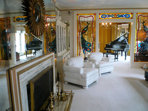
As the conference proper starts tomorrow, today was mostly set aside for settling in and meeting people. Inevitably, this included a group trip to Graceland, 8 miles down the road. Graceland is everything you’d expect: garish, crassly commercial, yet strangely intriguing. Part of the fun is analysing whether the lack of taste on display is representative of Elvis or merely the decade that dominates the property.
I’m hoping to give a daily wrap-up once we’re underway (liveblogging is too much like work, I’m afraid). If there’s sufficient demand, I might look into a quick “IA Summit recap” session back home for those unable to make it
Architecture of the stadium
This post is clearly an excuse for me to indulge a slight stadium fetish; however, I do think they provide great examples for how our identities, attitudes and actions can be shaped by the built environment. A branding exercise writ large in brick, if you will
People are often surprised to hear I’m a devoted football fan and Cardiff City supporter. Perhaps it doesn’t gel well with people’s perceptions of me (whatever those may be); however, I find football gives me an exciting break from daily concerns, and a chance to be part of the tribal culture inherent within us all. It’s a way to feel friendship with total strangers, an outlet for anger, joy and happiness, and an opportunity to mix with a wider cross-section of people than my limited horizons otherwise offer.
I also have a huge love for the stadiums and they remain one of the reasons I prefer to follow Cardiff at away games.
Stadium architecture has a clear effect on the physical presence of the club and atmosphere at games. The psychological effects on fans, referees and players are well-documented, but home advantage is also believed to give a genuine physical edge, hypothesised to be caused by testosterone increases in players. This effect is especially strong in defenders and goalkeepers, for whom the battle is particularly territorial.
Stadiums must also have logistics and facilities for up to 80,000 visitors (around the population of Shrewsbury), hundreds of police, stewards and officials, media and players. The range of requirements is pretty astonishing.
Clubs are known by the reputation of their grounds and the atmosphere they inspire. Some teams are known for poor support and quiet games (the “prawn sandwich“ brigade). Cardiff, on the other hand, have a reputation as a very intimidating club. There are many reasons for this: passionate fans, unfortunate hooliganism, and the constant battle to be noticed against Wales’ supposed national sport of rugby. However, the stadium plays a huge part too.

Ninian Park is a classic ‘old style’ stadium, well beyond its useful life yet still possessing the hallmarks of bygone eras: terracing, woeful facilities, and some intangible ‘character’. High among Cardiff fans’ many concerns for the future is the worry that atmosphere and indeed a piece of the club’s identity will be lost as we move into our new stadium (at top) in May.
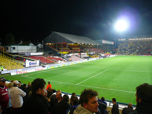
On my travels with Cardiff I’ve been to some dismal grounds, and loved them all (a foggy January week night in Mansfield where you couldn’t even see the other end of the pitch comes to mind). Below, Watford’s stadium: ugly and an easy target for ridicule, but possessing far more character than many other grounds I’ve visited.
And then there’s always the rare occasion when your team performs and suddenly you find yourselves part of something huge:
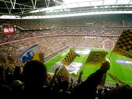
This is my best shot from last year’s FA Cup Final, which Cardiff pretty much fluked our way into. Wembley is of course enormous, and again the atmosphere is shaped by the architecture. Expensive facilities and location make for expensive tickets. This (and the sponsorship derived from TV coverage) means money spare for banners, flags and other paraphenalia. Huge crowds make for huge expectations, high ceremony and lengthy big build-ups, but they also make co-ordinating singing impossible. Many Cardiff fans said they didn’t get the same sense of atmosphere as at a traditional away game, since the noisiest fans were spread across the ground rather than, as is common, concentrated in a group.
The nosebleed-inducing height also changes one’s experience of the match. From here you can see the sweep of the game, like a general, but not the blood and sweat of the touchline.
This post is clearly an excuse for me to indulge a slight stadium fetish; however, I do think they provide great examples for how our identities, attitudes and actions can be shaped by the built environment. A branding exercise writ large in brick, if you will.