The incoherence of Black Ops 2
I finished Black Ops 2 yesterday. Is it too much to ask that games make some sort of sense?
I finished Black Ops 2 yesterday. Is it too much to ask that games make some sort of sense?
Treyarch clearly wanted to differentiate itself from previous, formulaic Calls of Duty, but has instead created an awful mess. The contents of my brain after the credits, unencumbered by such things as post-hoc verification:
The year is 2025, but sometimes 1970 or 1989. There’s Noriega, baseball-capped, slouching like a teenager against a wall. He’s oily and diminutive in the way these games usually depict Hispanic people.
The main villain wears a light sports jacket and a facial scar: Abu Hamza with a subscription to Monocle. He planned to be captured, of course. He plucks out his eyeball and smashes it to reveal a SIM card containing a virus that cripples the world’s militaries.
Touchscreens, holograms, and hacking: all drain any sort of momentum (“Wait here while the techs override the door lock!”). A “data glove” whose function is unclear. After rescuing a pilot, you commandeer her plane for a tediously death-defying dogfight over downtown Futureville. When you fly off the unmarked map the scene resets, and you sigh.
A regrettable flirtation with top-down strategy hampered by dopey AI. A gunfight in a nightclub (dancing is still the uncanny valley of CGI) that is still pretty cool because it was ripped off Vice City and has – yes really – a Skrillex soundtrack.
A wheelchair-using veteran clearly cost money. The camera lingers on his expensive, expressive face. He does anguish, then rage. After the credits, he rocks out with Avenged Sevenfold in an embarrassing tie-in that proves that adults weren’t expected to finish this game.
Big Dog evolutions and Parrot drones that kill you from fucking nowhere. Bullets fly fast and penetrate walls but enemies still absorb a few gutshots before falling. A scene featuring horseback riding and Stinger missiles, like a mundane Shadow of the Colossus. The horses shoot lasers from their eyes and are made entirely of QR codes.
And amid this drunken Millennial incoherence, a game engine that, while functionally competent, lacks any kind of embodiment. Rather than being immersed in this ridiculous action, you sit atop it. Even the futuristic guns are limp. A grenade explodes behind you with a flat pop. The grenade indicator is so faint that you find yourself tripping over the damn things at random. You get shot, but it’s not really clear by whom, from where, and why you should care.
For all their gung-ho predictability, the Modern Warfare games feel great. They give great feedback. They throw you into the noise and the light. Their undeniable set-piece excess is still bounded within sensible limits of intelligibility. Black Ops 2, by contrast, is wild, flabby and virtually unfathomable.
On failure
I’m no longer writing Designing The Future Web. Even after 18 months and 25,000 words, the well of knowledge is filling faster than I can draw from it, and it’s become clear that I can no longer make the sacrifices a book demands.
I’m no longer writing Designing The Future Web. Even after 18 months and 25,000 words, the well of knowledge is filling faster than I can draw from it, and it’s become clear that I can no longer make the sacrifices a book demands.
It would be emotionally easier to let the spark fizzle out, dodging questions until no one thinks to ask them any more. But that seems dishonest. It’s right that I should admit failure with the same fanfare as I undertook the project.
Although my research and ideas have resisted being captured in words, they’ve made me a better designer. They’ll still allow me to tell my story and influence the profession through my work.
However, I do plan to publish some of my ideas. I think I have something to contribute, and after so long hoarding opinions for the big reveal, it will also be a relief. At the very least, expect blogging: joyful tracts with occasional idea-flecks.
Failure is embarrassing, of course – but it can also clear the path to other kinds of success. My editor and publisher have both been fantastic, and I thank them for the support they offered me. Now, I’m looking forward to looking forward.
Line management by numbers
Here’s something I was taught a few years ago about how to adjust your management approach.
Here’s something I was taught a few years ago about how to adjust your management approach. I’m paraphrasing slightly.
Score your employee out of ten for:
- Current motivation
- Experience in the role
- Skills
Then look at the lowest number of the three.
- 0-3: adopt a tight, management-heavy approach until performance picks up.
- 4-7: take a supervisory, mentoring approach.
- 8-10: occasional coaching is all you’ll need. These are the good times.
It’s a useful shorthand that reminds you to keep a keen eye on someone who’s green, sub-par, or struggling, and allows you to step away as they find their wings.
A changing tide
It is the hybrid designer – not the specialist – who is most in demand, and every capable visual designer has picked up interaction design fundamentals. The specialists’ differentiation and competitive advantage is shrinking.
(Some half-thoughts based on hunches and radar blips. Go easy.)
I’m starting to feel that we’ve reached an inflection point in digital design.
Specialisation and consultancy were the dominant trends of the last 5–10 years. Experts thrived in high-profile agencies or lived comfortably as independent consultants, while in-house design teams were largely seen as downtrodden, pulled in too many directions, and unable to establish themselves as genuine authorities.
But now the polarity is reversing, and I sense a drift toward centralisation. It is the hybrid designer – not the specialist – who is most in demand, and every capable visual designer has picked up interaction design fundamentals. The specialists’ differentiation and competitive advantage is shrinking. The result is a swing toward direct intervention rather than consultancy, and companies that value breadth and flexibility over individual expertise.
Judge for yourselves whether you think the evidence is strong enough. Peter Merholz – formerly of Adaptive Path, the original UX supergroup now boasting a much-changed lineup – recently listed some noted interaction designers who have made the transition, and we’re all aware of Facebook’s aggressive pursuit of design talent in recent months. Perhaps my joining Twitter is another illustration of my hypothesis. I also speak with many senior interaction design agency staff who dream of the ideal startup role, or of transitioning into product management (which I suspect is far more challenging than most anticipate).
A great agency is still a strong asset to the industry and its clients, just as a bad agency is still harmful – and there are undoubtedly counter-examples to my evidence. However, one thing is clear: the design industry’s focus is no longer on agencies. It is on products.
Perhaps this is a natural evolution. Now that clients understand the value of design, it’s entirely logical for them to build their own capabilities. And maybe we’re also experiencing the limitations of our previous approaches. Responsive design and Agile have forced us to re-evaluate our methods, and we’re finding there are simply no tactical short-cuts for cross-channel and service design: the entire company itself must be designed, which demands internal influence. Money’s certainly a factor too; stock options and acquisition deals can be hard to resist.
But I also wonder if there’s a deeper motivation: a collective mid-career crisis, if you will. A household brand in our portfolio no longer appeals. No one wants to make another campaign site or Groupon clone. Instead, I see a community questioning whether it’s had the impact it dreamed of in its idealist youth. The ‘make the web better one site at a time’ mindset is really just treading water at this point.
One reason I found last year’s Brooklyn Beta so compelling was that I met many attendees who were struggling with this angst, as I was. The sense of shared cross-examination was palpable, and the unspoken conclusion was clear. If we truly believe in the power of design, it’s our duty to apply it where it can have the biggest impact.
I’ve been thinking a lot about scale recently. How can we amplify the effects of what we do? I see three methods:
- Example & education – sharing ideas, successes, and opinions through case study, mentorship, speaking, writing.
- Leadership – assuming positions of authority in organisations (executive level, internal champions), or in public office (politics, pressure groups, professional associations).
- Reach – finding ways to increase the number of users/citizens our designs affect.
I see many recent changes in the design community mapping to the latter two goals. We’ve never had any problems with Example and Education, and long may that continue. But I sense a new attitude of buckling down to change entire organisations, to increase public and governmental awareness of the importance of our work, and to seek out opportunties to affect the lives of millions. This is music to my ears.
A lot’s been written about the alleged decline of client services, and plenty of people are now rushing to its defence. As always, “it depends” is the only reliable answer; context is the key factor in deciding whether to work for, or hire, external consultants. But I do wonder how the agency world will respond to this shifting community focus. How will they manage to stay an attractive option for designers and organisations who are increasingly internally-focused?
There is another possible interpretation: namely, that I’m projecting my own assumptions onto behaviour that could be interpreted any number of ways. But I spy a pattern – however faint – that’s worth further examination. Am I onto something, or just seeing ghosts?
Joining Twitter
Later this month I’ll be joining Twitter as a senior designer, working on the evolution of Twitter’s apps with the London team. It’s Twitter’s first full-time design position in Europe, and as such has huge potential – and undoubtedly some intriguing challenges.
Self-employment has been a great experience. I’ve worked with excellent clients, learned to swim in the deep end of business, and enjoyed the flexibility to balance my time as I wish. I could be comfortable doing it for many more years. But who wants to be just comfortable?

Later this month I’ll be joining Twitter as a senior designer, working on the evolution of Twitter’s apps with the London team. It’s Twitter’s first full-time design position in Europe, and as such has huge potential – and undoubtedly some intriguing challenges.
To me, Twitter is more than just a technology company. It’s a company that is shaping global culture; but one that also appreciates the ethical implications of its work. In short, it’s an irresistible opportunity.
For the next few months I’ll join the curmudgeonly ranks of commuters, until I move up to London later in the year. I’m planning to stay active in the British and European design communities, and will continue work on Designing the Wider Web. Oh, and I’ll finally get to visit San Francisco, and spend some time with one of the best design teams around.
But of course there are plenty of unknown unknowns, and my excitement is mixed with gentle terror. I’ve no doubt it’s going to be fascinating, difficult, rewarding work. Wish me luck.
Why I don’t wireframe much
I was going to write a long post, but I think a rough diagram suffices.
I was going to write a long post, but I think a rough diagram suffices.

My life as a unicorn
Last year, the UX uniform I’d worn for a decade started to feel like a straightjacket. I wasn’t learning as rapidly as I once did, and my work had plateaued. I felt I was coasting, and falling victim to dangerous nouns like boredom and arrogance.
Last year, the UX uniform I’d worn for a decade started to feel like a straightjacket. I wasn’t learning as rapidly as I once did, and my work had plateaued. I felt I was coasting, and falling victim to dangerous nouns like boredom and arrogance.
I think the UX industry has found a local maximum; undeniably comfortable, but somewhat short of what it could achieve. I voiced these concerns at the 2011 IA Summit, suggesting that corporate recognition wasn’t the endgame, and that the community should refocus and magnify its efforts on the world’s most pressing problems. One year on, there’s very little I’d change about the talk. While the UX industry has been very successful, and I adore the friends and peers who make it up, I worry it too has begun to coast.
UX no longer felt quite like home, and I yearned for open waters. So I dived in. Moving away from the labels and language of UX, I adopted the title Digital product designer. Great experiences are still my objective, but I wanted to explore beyond the boundaries of what the UX role had become; to use my interest in writing, typography, brand, and graphic design to enhance my work. Not a wish to generalise so much as a wish to specialise in more areas. In particular, I’d come to view the gap between UX and visual design as arbitrary: “You take the wheel, I’ll do the pedals”.
Over the last year I’ve spent long hours studying graphic design, learning more about its techniques and tools, and creating a new role for myself that combined my interaction design expertise with my new visual design skills. In popular digital parlance, such a designer has come to be known as a ‘unicorn’: a rare, flighty being never encountered in the wild. It’s a cute label, and a damaging one. It reinforces silos, and gives designers an excuse to abdicate responsibility for issues that nevertheless have a hefty impact on user experience.
There are of course different flavours of UX person. From the design-heavy position I occupied, the leap to digital product design has been feasible. The mindset is virtually identical. A senior UX designer with practical knowledge of the design process, excellent client skills, and an understanding of ideation and iteration already has many of the key skills required in visual design. Someone whose strengths lie more in research or polar-bear IA may find the gap a bit more daunting.
I’ve found I now have a deeper involvement in a product’s lifecycle, from inception through concept to the end product. I feel far closer to the product than I did previously. This has meant I’ve been taken more seriously on issues of product strategy, seen less as a user-centred advocate and more as someone who can bring a client’s vision to life, and shape a complete product over time. I also can’t deny the ego-massaging pleasure of presenting work that elicits an immediate ‘wow’ – something a wireframe could never do.
I was already well-read about the theory of graphic design, but improving my technical skills has taken no small effort. I’m still working hard on my sketching and visual facilitation skills, but thankfully the software knowledge has come easier. Forcing myself to finally master design software has been a blessed relief. For all the flak Adobe get, Fireworks or Photoshop are so much better suited to UI work than Omnigraffle – although of course they too have serious limitations in an era of fluid design. I’ve also started to experiment with print design, and have enjoyed poking my fingers into more of the Creative Suite.
I’m creating fewer of the classic UX deliverables, and have tried to forge a wider variety of tools for each situation. If the situation demands visual detail, I’m able to pull together a detailed comp. If we need speed, a sketch suffices. For interactivity, I’ve been knocking together scrappy image map walkthroughs, or more solid HTML prototypes. I’ve also spent a lot more time worrying about words and labels, and have again been reminded of their importance in design. I firmly believe that any designer who overlooks the importance of copy, thinking it someone else’s job, is missing a powerful way to improve his work.
But I still have plenty of angles to figure out. My design process has become more pliable, which confers both benefits and disadvantages. I still practice UCD frequently, but I’ve also become more familiar with ‘genius design‘. There’s been lots of expert opinion and less recourse to the user, although in part this is also a property of the startup market I’ve been working in. My clients appear to have enjoyed this flexibility of process. Certainly some companies still believe UCD to be unnecessarily bulky; and it can be hard to disagree (hence the rise of Lean UX). I genuinely don’t know yet whether taking a more fluid approach to process has led to better outputs – I’m still evaluating – but it has certainly broadened my viewpoint.
In moving away from UX, I’ve taken a hit to my reputation. Previously I was fortunate enough to be seen as someone near the top of the UX field; now, I don’t fit so well into established mental models. Some members of the UX community have noticeably edged away from my views, and I don’t get added to the same lists or invited to speak at the same conferences now. I expected this, and have no problem with it, but I do feel sometimes that I’ve lost the safety in numbers that an established community offers. It’s also been difficult at times to explain my angle and how my service differs from others’. However, this has upsides. I’m no longer hired as a UX-shaped peg to fit a UX-shaped hole; instead, my clients hire me for my individual skills.
I’ve also had to fight against expectations of speed, from both clients and myself. Time moves more slowly at the quantum levels of pixels, and my broader remit has meant that my work takes longer. It’s made estimation and project planning trickier, and has also raised issues around pricing. The obvious response to my shift would have been to raise my rates. However, I no longer have a clear market rate to price against, and I’ve been very conscious of not asking for too much while I was still making the transition. Right now I’m undercharging. That will change in due course.
So was my move the right one? For me, yes. I’ve found a far deeper appreciation for the craft of design, and I’ve rediscovered the excitement that had started to ebb away. In this period of massive change in the digital world I feel more flexible and valuable, and I’m positive that I’m a better designer as a result.
However, the digital product design role isn’t for everyone, and I shudder at the thought of this being seen as a manifesto, roadmap, or one of those odious ‘[Discipline X] Is Dead’ posts. Specialisation is still highly important, and many projects will be better off with separate UX and visual roles, rather than chasing unicorns. But personally, I’m glad I made the leap.
Ephemeral ennui
It’s an exhausting treadmill. No wonder ours is largely the domain of the young.
I still love what I do. But on days like today, when I’m woozy and tired, it gets too much.
The grinding of definitions cogs. The all-new responsive adaptive interaction experience. Do Ninja Brogrammers have a collective noun? Change the world! The promise, the plateau, the privacy violations. Five Things Designers Can Learn From X Factor. Make it like Pinterest. Update the firmware, then wait for the bug fixes. Do Not Reply To This Email. Klout scores and expanding Instapaper waistlines.
It’s an exhausting treadmill. No wonder ours is largely the domain of the young.
I still love what I do. But every now and then I have to remind myself that these ephemera – the words, the whirlwind, the white heat – don’t matter.
What matters is making beautiful things. Always.

Low-budget responsive design
“If you have a client that won’t pay for responsive design, get a client that will.”
Today I’m at Responsive Summit, a last-minute gathering of some folks who are interested in responsive web design and its effect on our industry. It’s obviously a topic close to my heart. Martin Beeby has been live-tweeting some snippets of what’s been said, including this one:
“If you have a client that won’t pay for responsive design, get a client that will.”
This quote has, unsurprisingly, not gone down well on Twitter. Responsive Summit has already been accused of being an elitist gathering. The website was tongue-in-cheek but the joke perhaps fell a bit flat, and the attendees are generally a high-profile bunch. So quotes like this, facile and arrogant, make for easy targets.
The quote originated from something I said. I can’t remember my exact words – I’m rushing this post out over lunch – but let me give some context, so you can judge for yourself whether it was as dumb as it sounds.
One of my fellow attendees was explaining to the group that her client budgets generally didn’t allow her to practice RWD, and she was having a tough time explaining the business benefits.
My response was that our is an industry with overwhelming competition at the low end. Everyone’s neighbour’s kid can bash out a site for £100. Companies like 1&1 will sell you a templated site for not much more. However, the companies that are typically practising RWD on large client sites operate at the top end of the market. They’ve carved out a niche as craftspeople creating bespoke solutions. The time and budgets they’re afforded allow deeper work, including some of the detailed intricacies of thorough RWD.
So my point was that, providing you have the skill, it can be easier to find market space and freedom to practice newer techniques by heading up the value chain, not down it. If you desperately want to practise responsive web design and your budgets don’t allow it, you have two options:
1) Do it anyway. This is an attitude close to my heart, and formed the bulk of Undercover User Experience Design’s ethos. There’s been lots of talk today of how RWD has already become a natural part of many people’s workflows.
2) Negotiate higher budgets. This may require working with different clients.
Some people have assumed from the quote that the Responsive Summit has decreed that RWD is the only way a site should be built, and that we should ditch any client who doesn’t drink the Kool-Aid. This is definitely not the case. We’ve already spent a fair bit of time agreeing that for some clients, RWD is a waste of time and money. But if you’re insistent you want to do RWD, you’ll have to either take the resultant budgetary hit yourself or find someone who will fund it.
So that’s the story behind that quote. The day so far has been smart, thoughtful, and useful – it would be a real shame for someone to judge it because of one out-of-context soundbite. Hopefully we’ll be able to share some more of the discussions so that people can build on them, and argue against them, in their own ways.
Out of sight?
I’m sure “Great design is invisible” looks fantastic on a crisp Helvetica poster but, like all slogans, it whitewashes complexity.
I’m sure “Great design is invisible” looks fantastic on a crisp Helvetica poster but, like all slogans, it whitewashes complexity.
The phrase is a favourite of the UX industry, which generally advocates the suppression of a designer’s personal style in favour of universal functionality. The idea of the designer as a benevolent force, steering the user toward her own goal, is appealing – but it’s a mindset that belongs more to the usability era than the voguish age of experience.
Sure, sometimes great design is invisible. But sometimes great design is violent, original, surprising. To deny design’s ability to ask difficult questions, to shock, to flatter, to belittle, is to squander its potential. We mustn’t be afraid to let design off the lead once in a while. In a marketplace of bewildering clutter, products that take a stand – that have a damned opinion – become the most visible.
On travel
But this year – and I suppose this is my 2011 retrospective – I’ve visited five continents and spent a quarter of the year overseas. I’ve visited places I always dreamed of and perfected my security choreography: belt, laptop, liquids in under ten seconds.
I was twenty-seven before I boarded an airplane. As a boy, our family holidays in Wales and Cornwall meant that my GCSE French could only be unleashed on the occasional orchestra tour: memories of sweltering coach trips on which someone always forgot their viola.
But this year – and I suppose this is my 2011 retrospective – I’ve visited five continents and spent a quarter of the year overseas. I’ve visited places I always dreamed of and perfected my security choreography: belt, laptop, liquids in under ten seconds.
The disorientation of travel is humbling. I have to learn the customs, the new machines, and the subway maps. I queue in the wrong places, and walk down the wrong roads. I learn to say sorry in a dozen languages. It’s a valuable lesson that mental models are created the hard way.
It’s also fascinating to see how other cultures interact with each other and with technology. Johannesburg’s barbed wire and Tokyo’s vending machines left a particular impression. Travel reminds me that not everyone has a MacBook and fast WiFi. This year I saw some amazing applications of mobile technology: people making do with the tools they have, routing around infrastructure problems rather than blaming them.
Travel also gives me space to think. For all their bustle, airports and hotels are also places of disconnection. However much I try, I can’t work or sleep on planes, so I take the opportunity to read, or squint at forgettable films. And although a hotel bar and a late night can be fun, I’m often at my most productive after I’ve exhausted the local TV channels and set about something that’s been on my list for weeks.
But perhaps the happiest aspect of travel is that it helps us appreciate what we have. The delicious Heathrow relief of finally being able to express myself with a full vocabulary. The coolness of my pillow on my jetlagged, unshaved face. The more I travel, the more I love this petty, depressed country.
I’d hate to become weary of travel, or so privileged that I see it as a burden. Nor do I want to become one of those terrible bores who travels a lot and wants you to know it. So next year I want to travel less but better. I want to learn the character of the places I visit, not just collect the sights and the hurried snapshots.
What bugs me about content out
Recently there’s been much talk of “content out”, the idea that web design should be inspired by the qualities of the text and images of a site. It’s a healthy idea, but like any slogan, it is open to misinterpretation.
Recently there’s been much talk of “content out”, the idea that web design should be inspired by the qualities of the text and images of a site. It’s a healthy idea, but like any slogan, it is open to misinterpretation.
The web design industry has only recently afforded content its rightful status. We were wrong to relegate content to the role of a commodity – something we could pour into beautifully-crafted templates. In our rush to rectify this balance, we mustn’t overcorrect and deprecate the role of truly creative design.
From an algorithmic perspective, the idea that style and substance are separate is appealing. It allows us to code markup and stylesheets independently, and fits the logical mindset shared by so many techies. But it’s a falsehood. Style and substance are irretrievably linked. Like space and time, they are neither separable nor the same thing – there exists no hierarchy between them, no primacy. One informs the other. The other informs the one.
It’s impossible to perceive content and presentation separately. The two combine to create something more valuable: meaning.


The same content, with very different meanings.
Some of the best-known examples of the content out design principle are blogs from today’s leading digital lights. These sites feature expert typography, harmony and balance. They are undoubtedly beautiful. They also look terribly similar. Book design is the dominant aesthetic, meaning that the content does indeed shine. However, individuality surfaces only in esoteric flourishes. The people who have made these sites are diverse and bold, but these qualities often struggle to surface.
It’s a mistake to let content drive design, just as it was to let design drive content. We mustn’t let the pendulum swing too far. If we are to go beyond mere information and style to create meaning, the two must be partners, feeding from and influencing each other.
Until we see more diversity in the sites that espouse a content out approach, I worry the movement could be too simply characterised as one of minimalism – or worse, faddishness and elitism:
The idea that content can act as the interface is noble. But sometimes you need interface. The interactivity and responsiveness of the digital medium means it excels at interface. Text can often suffice, but it possesses limited affordances. It conveys information and gives instructions well, but it’s poor at conferring mental models, creating subconscious emotions, establishing genre, and suggesting interaction capabilities: things crucial for brand-driven sites or functional applications.
Overly-literal interpretation of content out could create a web of homogeneity. A web that conveys little that a book could not, save for hyperlinks and videos. A web that fails to take full advantage of the digital medium. For all our talk of breaking free of the print design mentality, content out risks reducing the capabilities of the digital medium, in favour of fetishising the craft of print design. That would truly undermine the intent of the approach.
Enter title here
Today I changed my signatures, my profiles, and my label to “digital product designer”.
Today I changed my signatures, my profiles, and my label to “digital product designer”. It was a move I’d planned for a while, but during what became a day of contemplation for the whole industry, I decided the time was right.
I no longer see sufficient distance between what’s labelled “visual design” and what’s labelled “UX design” to limit my specialism. The rhetoric of designing experiences no longer works for me. For now, this new label encapsulates my desire to work on things that people find valuable (as opposed to things that advertise value elsewhere), whatever the channel.
But no big manifesto; it’s a personal choice. They’re just words. Let’s see where they take me.
“Why aren’t we converting?”
A friend from a successful e-commerce site got in touch recently. He’s been steadily redesigning the site, with the help of an external design team. I know the company he’s working with. They’re good. But he hadn’t yet seen the bottom-line rewards he’d hoped for, so he asked for my thoughts.
A friend from a successful e-commerce site got in touch recently. He’s been steadily redesigning the site, with the help of an external design team. I know the company he’s working with. They’re good. But he hadn’t yet seen the bottom-line rewards he’d hoped for, so he asked for my thoughts.
Here’s my response, edited for confidentiality. Perhaps it’ll be useful to others, and I’d also love to hear any suggestions you have.
From: [xxx@yyy.com] to Cennydd Bowles
The site looks a million times better, but unfortunately our conversion rates have actually dropped. There is certainly noise in the data and an increasingly competitive environment but […] do you have any idea why our conversion rate would be worse?
From: Cennydd Bowles to [xxx@yyy.com]
The short answer is “I don’t know for sure”. The long answer is, well, a lot longer and needs me to talk a bit about the nature and philosophy of design. Please bear with me.
Design is inherently less predictable than most other product fields, since it closely involves emotion, comprehension, taste and all those complex, deeply human attributes. That means that design is a gamble. A good designer will improve your odds, but there’s always a chance that their hypotheses (which, after all, is the most any designer can provide) will prove to be false. A solution that works in one context may fail in another. Because there’s not this replicability of process, there can never be scientific ‘truth’ in design; experiments, observation, and iteration are the only way forward.
Much to the design community’s chagrin, sometimes “good design” doesn’t provide the commercial benefits we all expect. Sometimes “bad design” performs better. If I knew why, I’d be a millionaire by now :) I’ve been bitten by this myself – design changes that were “better” by all recognisable theory and good design practice performed worse than the original design. It’s frustrating for all concerned, and embarrassing for the designer.
Figuring out the cause can be difficult too. Introspection of design doesn’t tend to work well – barring major usability problems, it can be tricky to isolate specific points of a design that cause certain actions. The design as a whole has a certain irreducible complexity. So sometimes these surprises just happen, and it’s hard to diagnose the cause. Does that mean design is a poor investment? No. But I would say that it can be riskier than, say, marketing or SEO, which are more linear: generally, put more in the funnel and more trickles out of it.
However, I do suggest seeing user-centred design as something wider than just a means of optimising a conversion rate. While there may not be a noticeable uplift in any specific metric, the raw material of design is frequently intangible: trust, loyalty, engagement, etc. These things are much harder to measure, but they still make themselves felt indirectly in other metrics: support costs, referral rates, customer retention, and so on. Separating the effect of design from these long-term figures is, of course, pretty much impossible, but the long-term aggregated data makes it clear that the effect is genuine (see Apple, etc). Strong design also gives you a better platform to innovate from, and all that good biz school stuff.
But all this philosophising doesn’t answer your question, and I appreciate that the pressures of the bottom line mean you’d hope for a more realisable output for your investment. So let me take a stab at some more direct suggestions:
Natural dip
There’s always a performance dip after releasing a new design, no matter how good or bad it is. This is probably because existing customers’ mental models of how things work have been broken, and it always takes a little time to reestablish those patterns. What can be surprising is the length of this pattern – I know of a company that allows six months to pass before they evaluate the success of a redesign, so the smoke has truly cleared. This particular organisation has a very high number of users, so the effect is naturally prolonged, but do make sure you’re confident there’s still not a temporary effect lingering.
Details
The things that could make the difference in a design might be the little details. I don’t know exactly what your designers gave you, but check to see whether you’ve overlooked small points that might reduce friction. The easiest way to do this would be to ask your designers to run a quick review on what you’ve put live, to make sure it’s working the way they expected it to.
Usability testing
The major problem with metrics is obviously that they tell you what, not why – hence the existence of this email, I suppose. A well-designed round or two of usability testing would give you qualitative data that should help you understand the sticking points. If your designers have already done this, it might be worth asking for the videos so you can go over them yourselves. (I’m not suggesting they’d underreport anything – just that the time pressures of a project mean details can slip under the radar.)
If you haven’t done any face-to-face testing or don’t want to, it might be worth throwing the site into a remote usability testing programme like usertesting.com or usabilla.com. You’ll get some cheap feedback on what’s working and what isn’t. The feedback can sometimes be variable, but as an extra source of data to investigate an issue they can be useful.
Other data
Are there other data points that might guide you to the answer? e.g. have complaints gone up or down? About what? Have you seen a conversion drop among just a particular group of customers, or particular groups of products? (As above, it’s often the existing customers who have to adjust the most, while a new design is often targeted mostly at attracting new customers, who convert well.)
Analytics config
I’ve heard of a surprising number of companies that have reprimanded their designers, saying “Hang on, what’s happened…?”, only to finally admit that their analytics software was looking at the old URLs and conversion funnels. Once or twice that’s even happened only after they’ve spent thousands of pounds to fix the non-existent problem. So it’s worth triple-checking everything is in the right order there.
I wish I could be more specific but for the reasons given that’s inherently quite difficult. What I can assure you of is that that the effects of great design will make themselves felt throughout your business, even if those effects are indirect.
Cheers,
Cennydd
Editing tips for designers
Even a talented wordsmith must first clarify his thoughts and eliminate ambiguity to make a convincing argument. Editing is integral to this thought process.
“Perfection is achieved, not when there is nothing more to add, but when there is nothing left to take away.” — Antoine de Saint-Exupéry
Most designers will recognise the quote, but it’s a shame so many fail to follow its advice in their writing. Good writing conveys information more clearly, of course, but the reader isn’t the only beneficiary. Writing also makes us better thinkers. Even a talented wordsmith must first clarify his thoughts and eliminate ambiguity to make a convincing argument.
Editing is integral to this thought process. Yet we often overlook it as the unglamorous relation; perhaps it doesn’t flatter our mental model of the creative scribe giving birth to a masterpiece.
Designers know well that we often miss problems until we review our intended solutions. Similarly, we may think we have a clear argument until the blank page forces us to find the right language to describe it. Therefore, just as we appreciate the power of iteration in design, we should embrace the power of editing. In essence, editing is critique for the written word: review, question, revise. Like its design counterpart, it involves attention to detail, viewing the problem from many angles, and even the familiar outflanking death-spiral: “Why is this section even here? Why am I even writing this piece?”
Here are a few tips I’ve found useful when bringing the iterative mentality to the written word.
Read lots
The best writers are inquisitive readers, just as the best designers are attentive users. We need only look at our terminology to see the parallels: “design vocabulary”, “design literacy”. So a good writer reads incessantly. Absorb different styles and approaches: quality, trash, everything. Find writers whose style you admire, and consider what attracts you to their style. Find writers whose style you loathe, and again consider why. Deconstruct their language to understand better how to use it in useful ways.
Make every word matter
Every wasted word is an unnecessary design element. In fixed-length pieces, you lose space to tell your story, but even in open pieces an unnecessary word distracts the reader’s focus, diluting your message. The data-ink ratio isn’t just for graphics.
This rule applies at many levels in parallel.
- If a word doesn’t notably improve a sentence, remove it.
- If a sentence doesn’t notably improve a paragraph, remove it.
- If a paragraph doesn’t notably improve a text, remove it.
Screenwriters know that every line, page and scene should either
- advance the storyline, or
- provide depth to the characters and setting so that the storyline can advance later.
Adopt a similar mentality.
Cut adjectives and adverbs
Superfluous adjectives and adverbs are the staple of the pedestrian writer. It’s easy to see why: they appear to add spice to bland text. But adjectives and adverbs are often mere props, and editors I’ve worked with tend to slaughter them without mercy. This can be alarming: without this seasoning, where is my flavour going to come from?
The answer? Replace your adjective and adverbs with richer nouns and verbs.
- “Apple’s auteur”, not “Apple’s demanding CEO”.
- “The barman snarled”, not “The barman replied gruffly”.
- “An environmental obscenity”, not “A dreadful environmental accident”.
Memorable nouns are the nodes in your story. The static components; the space; the architecture. Nouns form mental models and associations: Apple’s leader is talented, painstaking and difficult.
Lively verbs describe the interactions in your story. The dialog, the motion, the time. They drive the text, giving it momentum and feel.
A broad vocabulary – a happy by-product of regular reading – will help you choose better nouns and verbs, but don’t be ashamed of a good thesaurus too. However, the most convincing language may not lie in synonyms but in creative parallels that help the reader to make unexpected associations. So use your inventive, lateral instincts to think of descriptive metaphorical words. A lothario might ooze across the dancefloor. A face mightmelt into tears.
Active, not passive
Active verbs encourage vigorous writing. It’s dogmatic to decree the passive a sin, but you should have a good reason in mind if you use it. Scientific writing rewards use of the passive – presumably to discourage the appearance of individuality (and hence subjectivity) within the scientific process – but non-scientific writing needs individuality. So rephrase passive sentences by focusing on the subject of the sentence – the thing or person that’s doing something. Then rewrite the phrase, putting the subject first and choosing the verb that correctly follows.
- “Designers overestimate the power of research”, not “The power of research is overestimated by the design community”.
Easy targets
Kill these redundant phrases on sight:
- “blah blah blah is that” – for example “One such issue is that…”
- “In my opinion” – It’s obviously your opinion, you’re the writer.
- Clichés – The Comic Sans of writing.
- “As X, we Y” – “As UX people, we must have empathy”, and so on. A well-targeted piece doesn’t need to remind its readers who they are; so know your audience and address it directly.
Prepositional phrases
From the Longman Guide To Revising Prose:
“One of the factors that limits and warps the development of a theory of composition and style by teachers of the subject is the tendency to start with failed or inadequate writing”
Here, we have a string of prepositional phrases (phrases beginning with “in”, “of”, “by”, “with” etc) linked by a non-descriptive verb “is”. It’s easy to inadvertently chain together these monster sentences, but they’re a clear warning sign of overloading. To untangle the knot, follow the same principle as for passives: identify the subject first, then the natural verb. Split into multiple sentences if you like. Here’s one way to rewrite the sentence above:
“Teachers tend to start with inadequate writing. This limits students’ understanding of composition and style.”
(Note the apostrophe. If you’re not certain of the rules of apostrophes, learn them now.)
Singulars and plurals
Look at the subject of your sentence, and make sure that your verbs and pronouns match.
- “The user (singular) might not understand why she (singular) needs to enter her password”, not
- “The user (singular) might not understand why they (plural) need to enter their password”.
English has no gender-neutral singular pronoun. Cater for this by alternating gender where appropriate – just don’t change someone’s gender mid-paragraph.
For added bonus points, remember that in British English, companies and teams are usually plural: “Microsoft have released an update”. In American English, they’re singular: “Microsoft has released an update.” (Also note the placement of punctuation around inverted commas. The idiosyncrasies of global grammar.)
Occam’s Razor
In short, choose the simple explanation over the complex one. Again, a sentiment we recognise in design, but it should also apply to language. Simplify, simplify. This doesn’t spell the end of rich verbs and nouns – instead, use Occam’s Razor to eliminate redundancy and buzzwords:
- “Use”, not “Utilise”
- “Quickly”, not “In a timely manner”.
The design industry is, of course, as ridden with jargon and gobbledygook as any specialist group.
- “Make the logo bigger”, not “Increase the visual hierarchy of the masthead brandmark”
- “Make it obvious what to do”, not “Expose the primary function of the interface”.
The Plain English Campaign offers a range of free guides that can help those with a jargon affliction.
Vary pace
Just like music, language has a tempo. An album of songs at the same speed quickly becomes boring, so use different sentence lengths to vary the pace of your writing.

The paragraph on the right mixes long, detailed sentences and short, punchy ones. Different sentence lengths give rhythm and variety to your writing. So mix it up.
Proofing your work
Some people say writing should be like speech. I don’t agree – I believe writing presents more scope for density and precision – but a writer must find her own voice.
However, the common tip of reading your work aloud is definitely helpful. It will help you to draw out clumsy phrases, and show where you need to quicken the pace or elaborate on a point. Some swear by reading their work backwards, from the last paragraph to the first. Other suggestions include proofing on paper, or changing the typeface to force you to re-parse the text.
What works for you?
For further advice, I recommend Austin Govella’s (More) tips for writing well.
Writers’ ego
Is a book a relic, or a canvas? Is this defacement or annotation?
I’m scrawling on a book. I’ve convinced myself that if I don’t make notes now, my thoughts will evaporate. But still it feels like sacrilege – like taking a dump in the Sistine Chapel. Is a book a relic, or a canvas? Is this defacement or annotation? Outside of religion and the inverted Y-axis, I can barely think of a more divisive issue.
My mind turns to the fate of the books I write. I want them to be nurtured and handed down through generations. Kept in natural light and controlled humidity until a far-future fingerprint releases them for 25th-century superbeings. But I also want my books to be abused. Ripped, dog-eared and spat on. I want broken spines, corrections and appalling profanity. I want them to be discovered in dusty charity shops and used to prop up poker tables.
I want my books to be loved.
Simple harmonic motion
At the point of largest displacement – when you’re deepest in a particular phase – you’re actually at a standstill. Only when swinging from one phase to the other do you reach your top speed.
Knowledge work is a pendulum. Think. Do. Think. Do. You can use other labels – act/reflect, execute/measure – but gravity is the same everywhere.
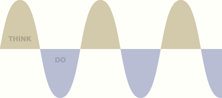
Oscillation is a natural part of every system, of course, but let’s look closer. Here’s the speed at which a pendulum travels, superimposed on its motion.

(The mathematically-minded will recognise this as the modulus of the first derivative: |d(sin θ)/dθ|, i.e. |cos θ|.)
At the point of largest displacement – when you’re deepest in a particular phase – you’re actually at a standstill. Only when swinging from one phase to the other do you reach your top speed.
Why personas should use real photos
When choosing a picture for a persona, use a real photo, not a cartoon. A cartoon doesn’t add life to a persona; it drains life from it.
A quick opinion about personas, prompted by a question from a friend.
When choosing a picture for a persona, use a real photo, not a cartoon. A cartoon doesn’t add life to a persona; it drains life from it.
It’s easy to think that the deliverable itself is the persona. It’s not. Your deliverable should create a shared mental model among your team; that is the persona. Mention a persona by name and you don’t want people to remember the paper stuck on the wall. You want them to remember a lifelike person. Only then can the entire team have a stable, realistic reference point for design discussion.
A cartoon doesn’t create this realistic mental picture. Viewers have to fill the gaps between the drawing and the reality, and tend to fill it with something close at hand – an extension of themselves (see Understanding Comics), or a crude stereotype. Therefore a cartoony persona often creates a rubbery, clichéd representation of a person, easily bent into whatever shape is needed to use as false evidence.
(Most people already have this mental model of users anyway, so your efforts will have been wasted.)
That’s not to say cartoons are useless. I use them often in high-level sketches to represent users we don’t yet know enough about. I’ve also used them to extend an existing persona, particularly when illustrating how a specific persona uses a product through a storyboard.

The storyboard isn’t photorealistic, so it follows that the protagonist should be hand-drawn also. But I only use this shorthand once the team has grown to know and love a photorealistic persona; that is, once the mental model has been established.
Work in progress
I’m itching to get started full-time, but right now I’m having so much fun that a few more weeks is worth the wait.
Last year I strongly considered studying for an MBA. It turns out that self-employment is also pretty handy for plugging gaps in business knowledge. The empty spreadsheet column marked Salary still gives me the odd scare, but it was the right choice. I’ve even enjoyed the aspects that others advised would be a chore. Sales. Cashflow. Pricing. Tax and VAT (I repeat my advocation of the marvellous FreeAgent). Politely telling the bank I don’t need their gratuitous insurance. Learning to equate my time with earning potential. Some small mistakes, of course, but nothing serious.
My first major project is fascinating, working alongside smart, experienced people on a cross-device curation service that offers real potential. I’m learning a great deal and hopefully offering a lot too. But the book is still the thing. Client work now is a means of avoiding client work later, so I can dedicate myself to the role of full-time writer.
To that end, it’s great to announce that Designing the Wider Web will be published this winter by the good-looking folk at Five Simple Steps. Their previous releases are already staples of the digital design canon, and it’s marvellous to be working with a UK-based team so committed to quality.
I’m itching to get started full-time, but right now I’m having so much fun that a few more weeks is worth the wait.